when we got home after the first crit I wanted to take more photos to portray poverty within homes. Therefore I used jack as an extra model and gathered some mor photography symbolising home poverty.
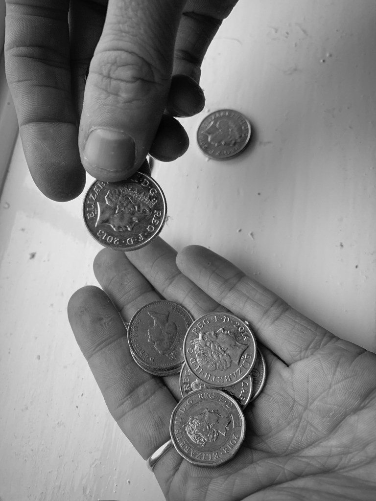
From experience, in our home we have a change pot you use it for bread and the basic essentials, however sometimes this is actually what people only have to provide them with the basic needs.
The first photo I took was this one below. This displays someone looking for lose change. I did not want to look like begging so he isn’t sat on the street, he is trying to collect lose change for bread and milk (as an example)
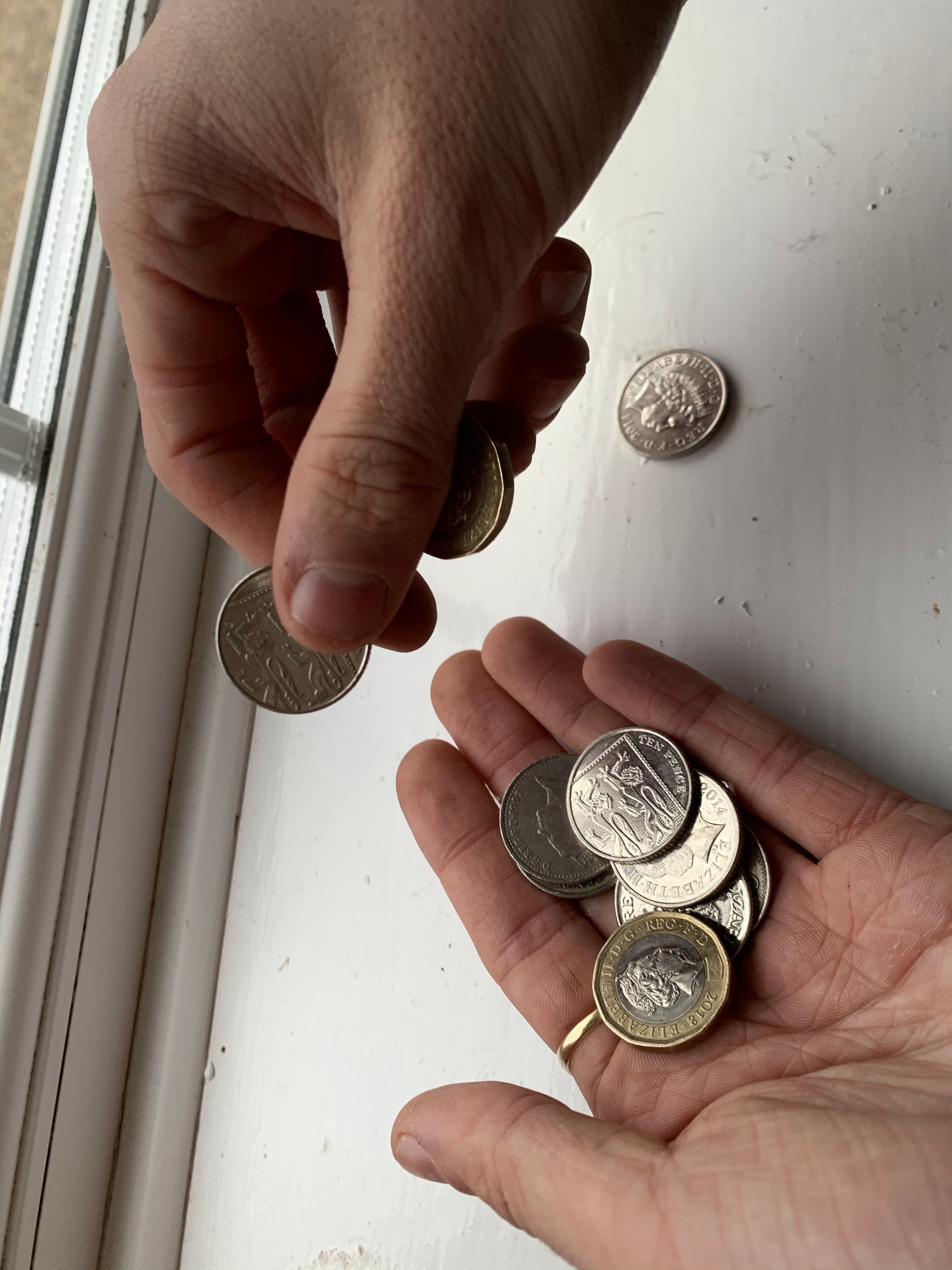

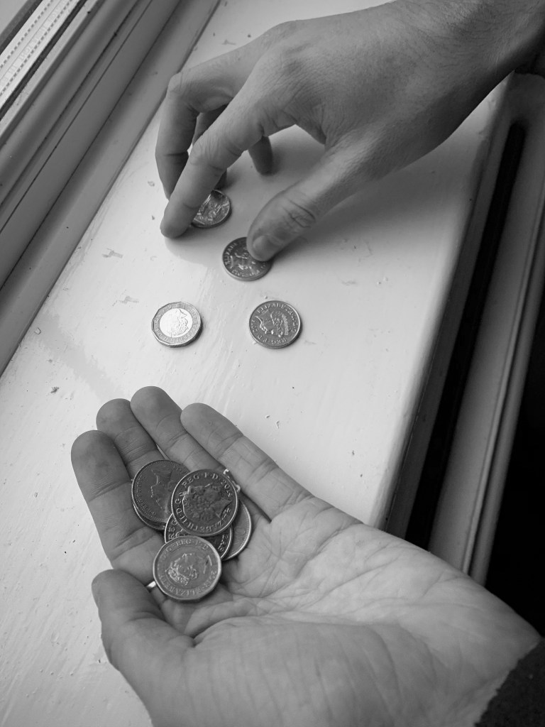
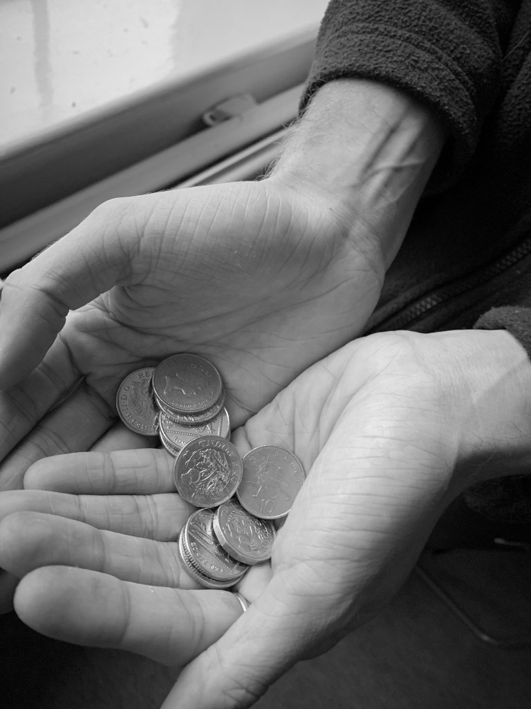
I wanted to photograph someone holding the money but not begging for money, to indicate people living on lose change. Therefor explains the next photograph. Within this photograph the subject displays him holding some loose change, and this spreads over both his hands. this indicates looking for loose change for essentials, and not begging or really asking for help.
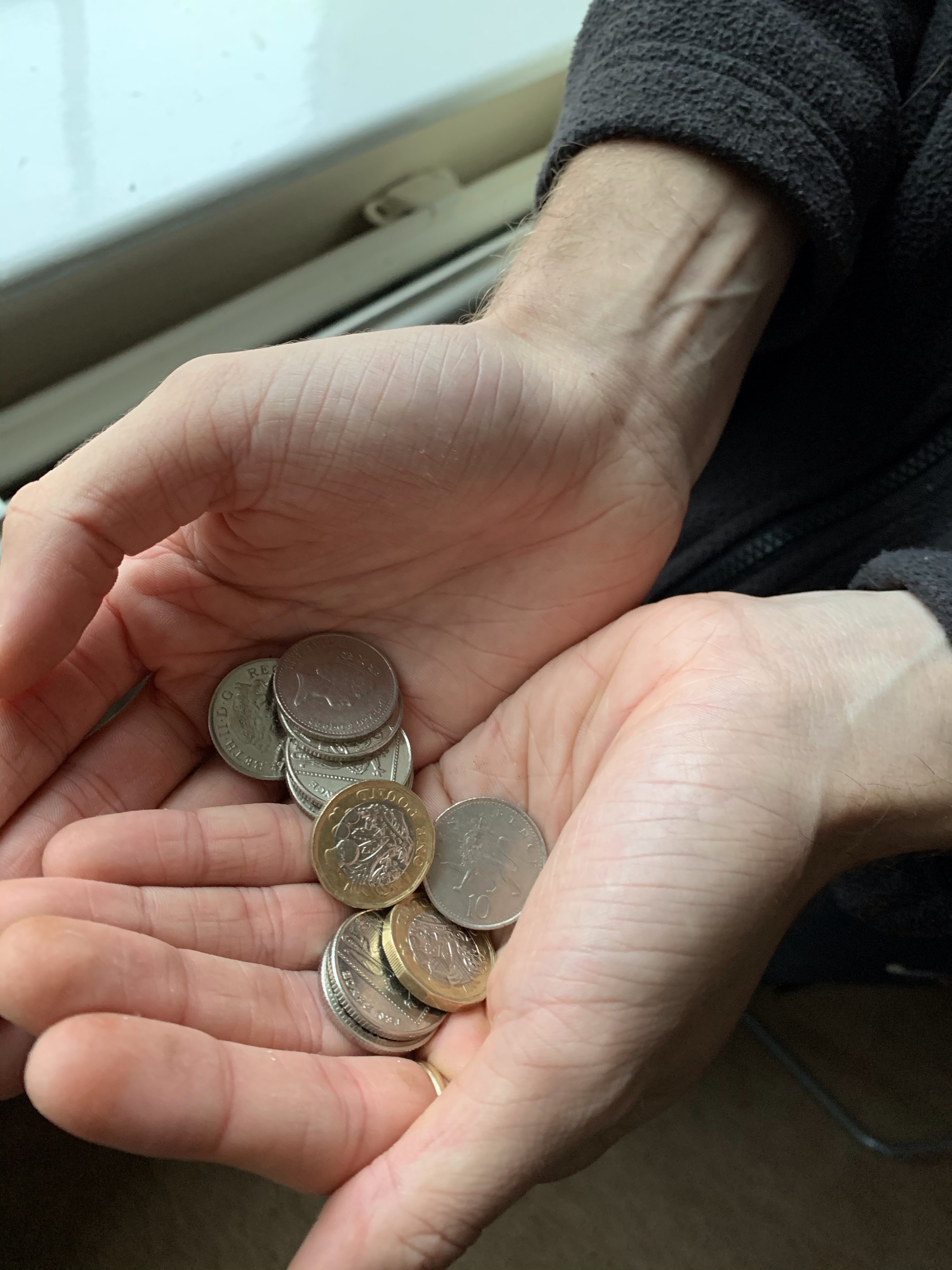
I then like the other photographs decided to make these images turn into black and white as this then portrayed a continuous meaning through the designs. I used the same PS app on my iPad to make the black and white theme so I knew there would be consistent through the deigns. At this point I was unaware of what photos I would use but to me they all portrayed life of poverty in the house gold and portrayed emotion through the colour choice and subject choice.
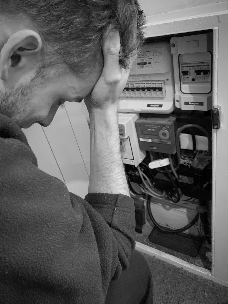
I then decided to take photos of gas and electric. From personal experiences this was something that happened a lot at home, and gas and hot water was an issue. I remember coming home when little from my nan and grandads and we would have to wear our coats until the boiler would heat up providing us with heating. This is something you do not think about when suggesting poverty therefore I thought this would be beneficial for my design as its all about making awareness. In the living room there was a gas box and jack was sitting near it I turnt my head after taking the first set of photos and thought “this could be a perfect way to capture life in poverty to people”
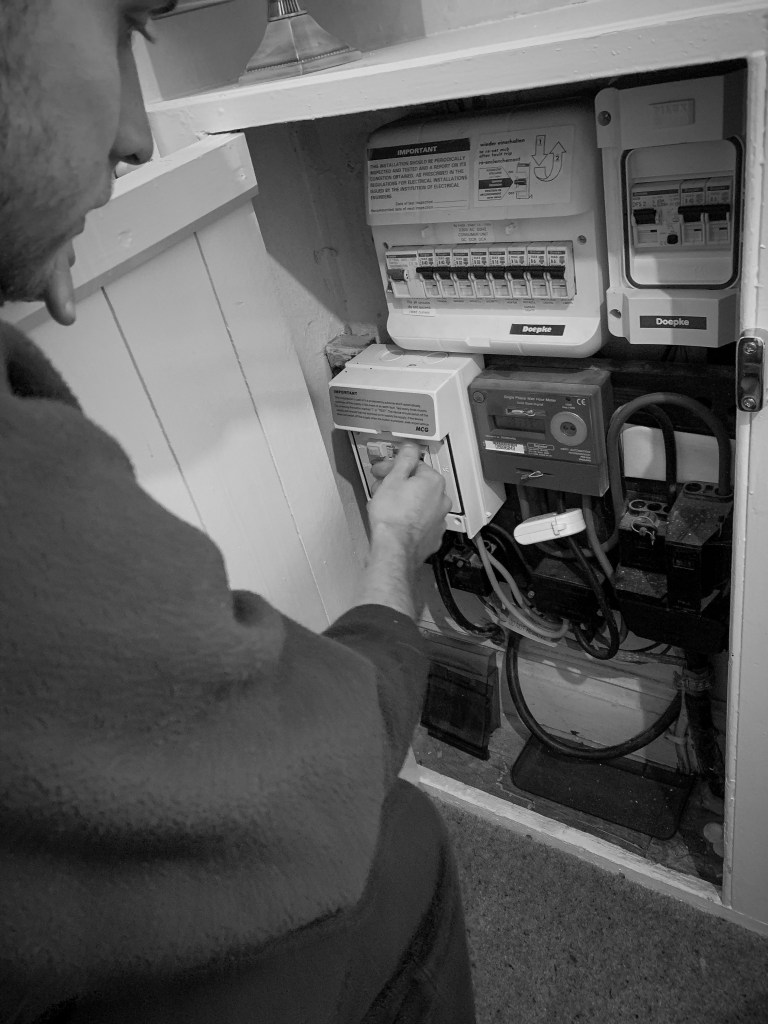
The first image displayed at the top shows the subject fixing elements of the metre. I wanted it to look like he was trying to fix a problem with it. Therefore I think this showcases that well.
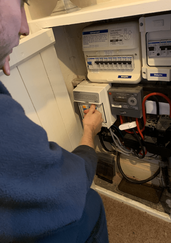
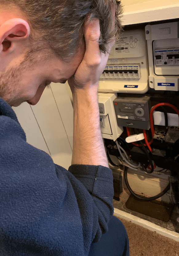
I then thought that the first photo did not show the emotion that comes along things like this not working. Some of us take gas and electric and heating for advantage and do not actually think about the cost and the issues that some people face. The top image displays a problem with the metre and the subject trying to fix it, then the bottom one is almost displaying the after effect it has on the subject because it cannot be fixed. I made jack put his hand on his head as this indicated a sense of struggle and desperation. I wanted to portray through my photography the sense of alone and the need of help and this was going to be continued through all the photographs I would off taken.
Again, it was time to make these images black and white. When I made them black and white it enhanced the emotion of struggle and desperation. You could still see al the elements but the black and white made it more depressing and created a atmosphere around the design.
Out of the two, the bottom one had the biggest affect with adding black and white personally speaking. You could feel the emotion pouring off the rage, indicating desperation and being tired of living like this. With the subject leaning on the floor, with his hand to his head, with his head down made this photo tell a story without any words needed to be presented and that was the aim of all my photographs together.
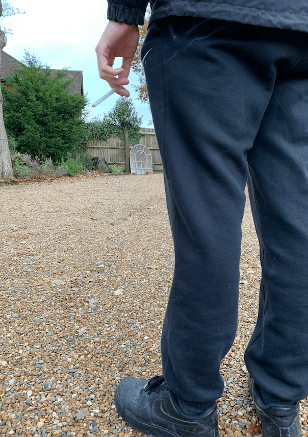
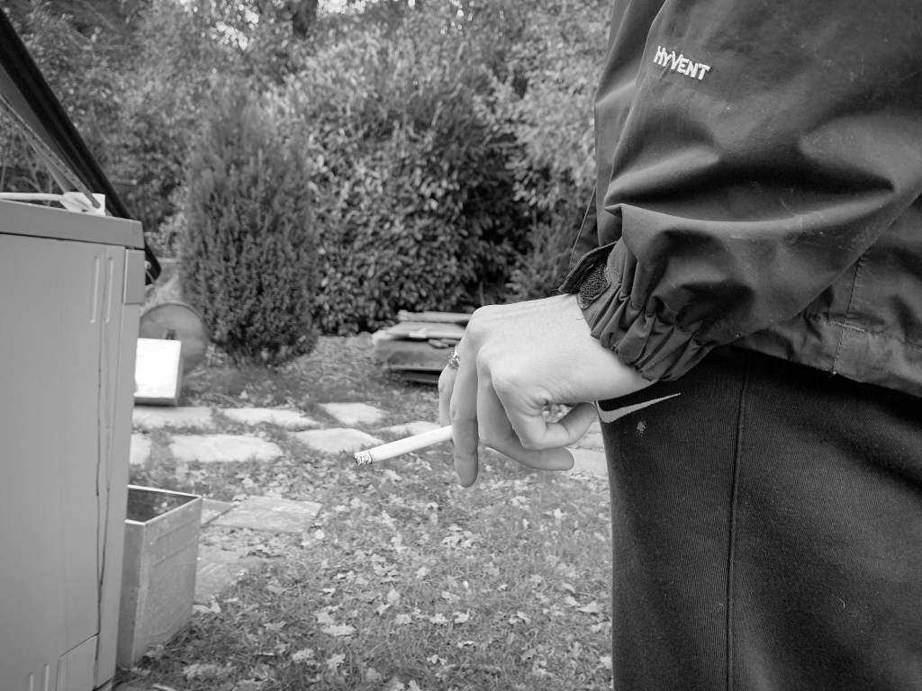
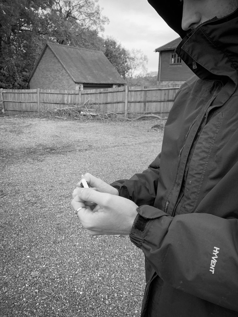
I then decided to take a few outside, to be featured in the magazine and show a link between the posters. (this is when I took the photograph of jacks eye used in one of the main posters) All these images below were taken in the garden, and the camera was angled a certain way to make sure you caught the right elements that portrayed poverty in the UK.
Few of the non edited photographs:
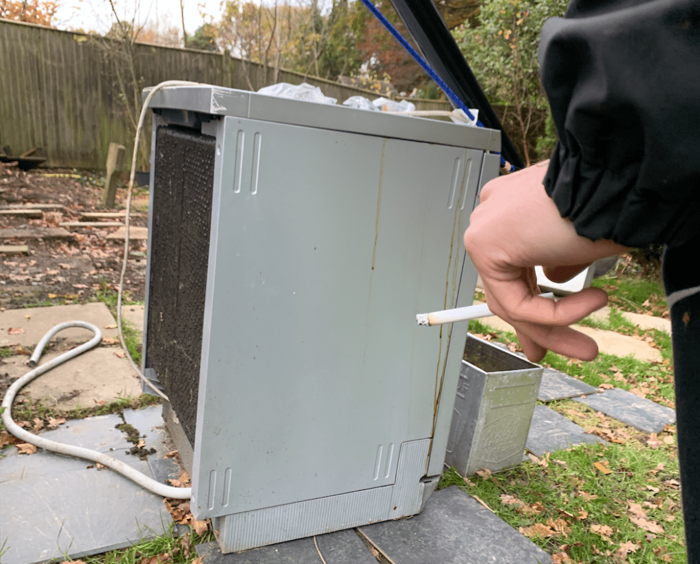
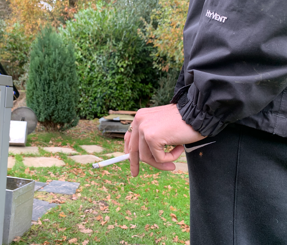
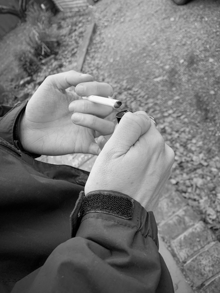
Below are just a few that I took to give you an understanding of the type of atmosphere I was going for within these designs. When I took the first set of pictures there was one of my brother with a fake cigarette and it was angels up so you could just see the cigarette and the background was blurred creating depth of field. I then wanted to continue this through some of the designs and use this as sort of an act of boredom displayed. the cigarette symbolises boredom, and wasting money on the not so important things in life. I shot different photographs in different scenarios to display this, I made sure it looked rough in the background. I wanted to create more photos that displayed objects and materials instead of emotion in faces of what life was like, and these would then feature within the magazine aspect of the campaign.
Some black and white edits
Again, the cigarette was part of the photograph and some of these are from the non edited images above. I shot it from alternative angles, and I wanted to showcase that not everyone in poverty looks like they are and this stereotypical aspect has too stop. This boy has a coat and has a ring on, but his home income makes him sit on the poverty line, And I hope these photos all showcase this some how or another.
Where would these photos feature?
I wanted all these photos to feature within the magazine. I did not want to use them for posters just because personally did not think they were as powerful with emotions compared to the poster designs. I wanted photos that indicated poverty in house hold and I think these photos achieve that well.
