mock ups
mock ups

I stupidly forgot to write how the design process for the presentation actually enhanced my designs therefore would discuss this at the end of my design process. I think that having the 3 presentations, total of 2 achieved at the moment allowed us to develop ideas. I have noticed in the pass I have achieved work without discussion of others and tutors then lost marks because I did not ask. This time round, the I got opinions at the start middle and end.
I thought I would analyse the designs displayed within the power points and discuss the development through them and how the power point has helped me achieve that.
First presentation:
The first presentation was simple, it was displaying the research we have looked in to so far and this then allowed us to undertake ideas and elopements for further investigations within design research. I displayed the research I had found, and the designs so far. The designs were not as good as the finals now and this really shows as development achieved through the designs.
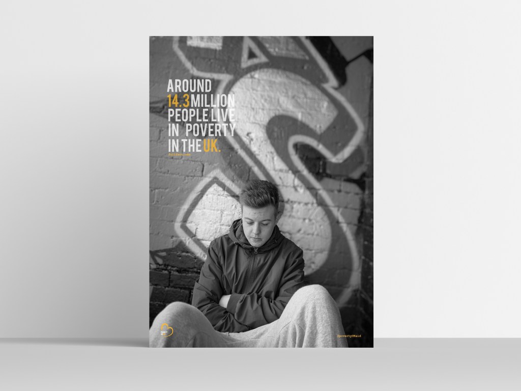
At this point in the design process, this was these were the designs I had created. I HATE THEM. looking at them now. the type is off, the logo is off everything is off. This shocked me so much, as I had no idea the presentations had so much of an influence towards my final designs, but they have. The logo is absolutely massive, and sits so awkwardly almost like its floating. The type is kind of there and has no source from where it’s from. It just fills a bit rushed. When we had this critique, the suggestions was to take more photographs inside the house for the magazine because at this point no magazines had been developed or design. At this point there was a hashtag that I was going to develop, I think it looks so childish and makes it look unprofessional the way it has been positioned and designed just doesn’t work in comparison to my finals now.
Second critique.
The second critique was an entire month after therefore the designs developed a lot more and the magazine began happening. This powerpoint just featured the designs currently made at this point but this was only a week ago and the development is crazy. I have developed so much more professional and I am so proud of that.
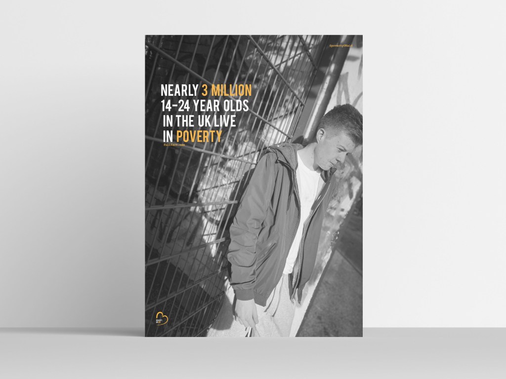
I won’t discuss every poster but this one as they all follow the same techniques but this one changed the most. The type made absolutely no sense when I did the first design, it looked so cramped and oh my goodness its awful cannot deal with it. I clearly did that over night on lack of sleep. I then changed the entire sentence which was recommended by my tutor and this then allowed this design to come alive and become so much better. I would not of even noticed this if my tutor didn’t say it, ( I probably would have but at the time I didn’t)
HOW CLEAN DOES THIS LOOK IN COMPARISON TO THE FIRST DESIGN. I cannot get over it, how my designs and little tweaks made this poster come alive. Making the logo smaller, making the hashtag turn into an @ and smaller in the corner. Just by adding a source from where the information came from made this such a realistic poster and so iconic and reliable for the reader.
Within this powerpoint, I showcased some of my magazine finals. Considering this was a week before hand in, they are so different in comparison to the final mock ups I handed in. The development of my magazine was not shown as much in the presentations just because I made this after the posters, and from the posters kind of knew what to do and what not to do.
do you hate these mock ups as much as me? its ok yes me too. They are awful. They look so tacky and the colour why on earth have I put an orange in the background. Sometimes you do not realise until its on a big screen infant of everything. I remember this slide coming on to the page and thinking why Katie. I did not like how the angel of the mock up sat and if you compare it to the mock ups I have achieved now its completely different and 10000 x more professional. The colour background makes it to kid like.
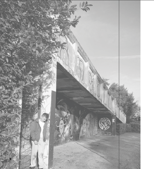
The last thing that helped me through this critique was this photograph and this page of the magazine. I thought that this page was ok, and again until it was on a big screen and I had people analysing it; only then I realised it.
Now looking at this page, it makes me want to scream at past Katie. Why does that type sit over the image, and forgot sake get rid of that lamp post. Sometimes you get so lost in your own designs you do not pick up on these things as soon as my tutor said about the lamppost it was the only thing I could see. And if I had no shown this in the presentation I probably would of handed it in like this.
All these designs are a massive comparison to the final designs that I am going to display in the next blog posts. You can see for yourself, how much these presentations have helped me develop my skills, and professionalism. I have studied graphics for 5 years, and this is the first year I have actually learnt from my presentations, benefitted from doing them more than once and think we should do it more. Doing test prints is a big thing I need to continue. I have developed so much in my own work and finally found my style and found the process to achieve to that.
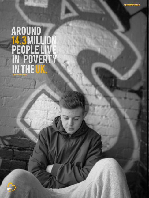
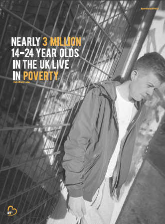
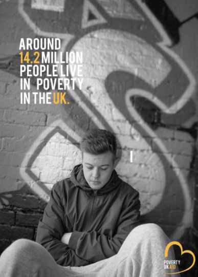
One thing to discuss through the design process was the alternations for the posters once printed. Not everything had to be changed but one poster in particular needed to be altered due to the wording. Within each poster there is a fact, this fact has been taken from full fact . com which has been displayed on posters and in the magazine as a reliable source. When i was printing this final indicated below, I was sure this was the final design; however after reviewing it once printing the type just made no sense to me.
Within the mock up the statement used is ’14-24′ year olds living in the Uk,2.7 million live in poverty. for me this made absolutely no sense there needed to be a use of punctuation or rephrase the entire sentence. I then decided to ask my tutor what she thought and we came up with a new phrase to use through the design.
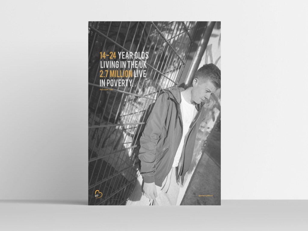
“Nearly 3 million 14-24 year olds in the uk LIVE IN POVERTY” This automatically sounded so much better in comparison to the first poster. The purpose of all these designs was to make it stand out to people and be in peoples faces. I wanted the information to stand out to people and really make them think and wonder how they can benefit from helping. I wanted to facts to be shocking and this one defiantly achieves this. I decided to highlight the words 3 million and poverty and these were the key words for me within this design. Comparing this to my first design type you can already see as a reader that it stands out more and hits you a lot harder than previously.

I have always loved billboards, and the idea of these posters created was to be featured in either a billboard on a bus stop, or on the street. For the time being I decided to showcase two of my posters on a billboard so you can understand what the purpose is of these designs.

As the years have progress through my graphic design learning, the main thing that has stuck with me and I will continue as the years go on is design for good. Advertising can be an industry filled of negativity and portraying the wrong message; however personally speaking using a graphic platform to change the world, or design for a goo dppurpose is what graphic design is all about.
I wanted to create this poverty aid campaign, because near Christmas you see more and more families struggling and it made realise how lucky I am. I now live with my boyfriend and his family, but I go home at least once a week… I do not forget what my parents went through when I was little therefore this was a design not only for design for good, but also a design to make my parents realise I do still know what its like.
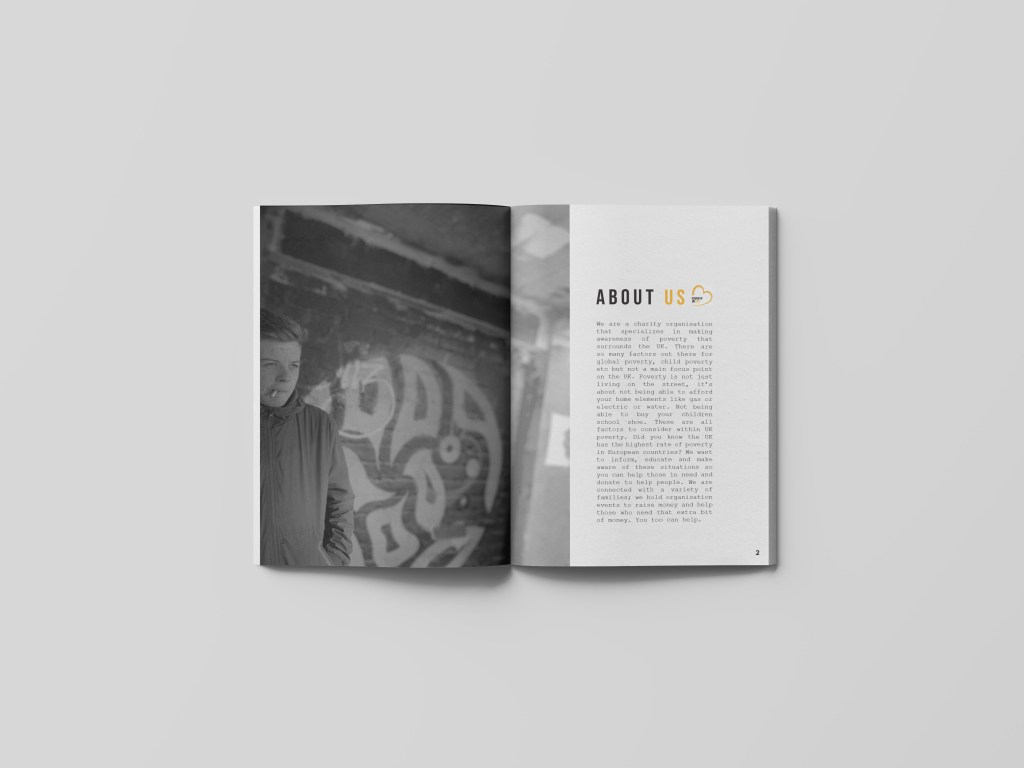
I think the UK is surrounded by this persona, of being a rich country and having elements of homeless people, there is not a lot out there that describes life of a family, and an individual going through poverty, which is not just living on the street. I want to enable people who have it all the help those that do not; we are turning into a very selfish country and that’s not what I am about, and design for good has taught me a way to help others through my designs.
The main purpose through my design process for this project was to portray poverty in a sensitive like but make people aware that poverty in the UK is a thing and is right under your noses. Poverty is a depressing subject and the designs had to represent that however, I incorporated the colour orange to signify some sort of hope within poverty and then the design. poverty is a extremely sensitive topic therefore within my designs I wanted to showcase this. This being within the photos the colour and the style that was presented.
When you look at poverty cases they are always depressing and sometimes makes you want to walk pass it and not bother taking action, therefore it was key for me to have a clean design that portrayed hoped and happiness as well as the depressing side of poverty.
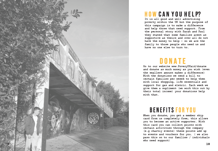
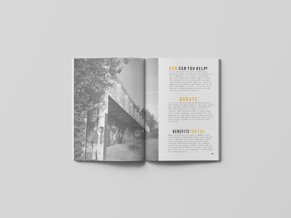
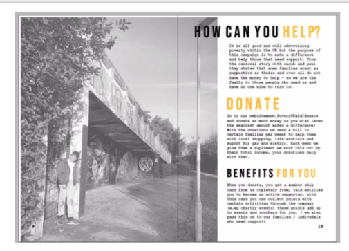
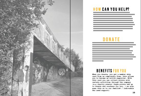
The final page for the editorial design was one in which enabled the audience to understand ways in which they could help the families and people who struggle with poverty in the UK. It is all good and we’ll designing to make people aware of poverty but what are you actually going to do to stop it. I make designs to benefit people and help communities and issues in the world. I hope these designs show that.
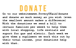
I made this page about how you can help, how to donate and how it benefits you. A lot of the time if a company says to you donate, you go ok yes but what do I get out of it. Not me personally I think its nice to donate without getting anything back. But when advertising big companies I feel as if you need to portray a benefit the consumer gets so they actually take action.
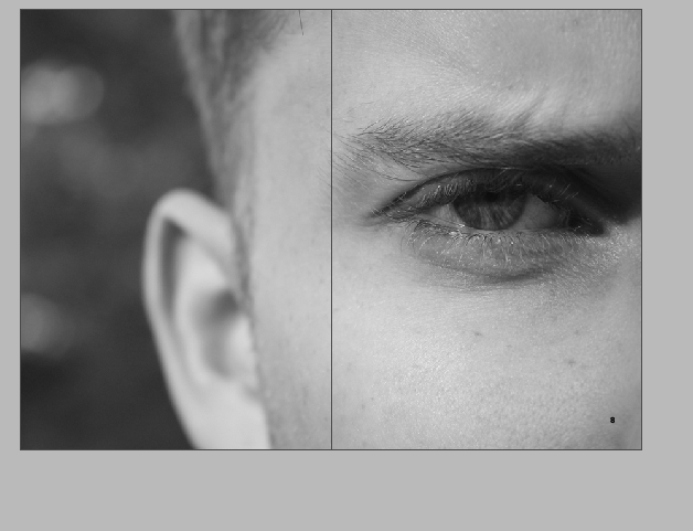
Within this page there was not really a certain photo I would use, just one that pretty much I haven’t used already and one that sort of summed out poverty as a hole. I decided to use a picture that was taken in the first set of photos. With the subject leaning against a rough area and him looking slightly sad. What I think makes this photo work, is the fact that it is not portraying living on the streets it portraying getting on with your day like everyone else but showing that glimpse of poverty that surrounds you, preventing you from doing certain things. At first this image had a lamp post in it however after the second critique I got advised to remove that and since I did that it made the page become more professional. I decided to make the image sit on the left hand side and continue over the gutter to be seen slightly on the right hand side. I lowered the opacity of this image just I felt as if it was way too bold when a 100% opacity was displayed – it gave the design a nice sensivtive vibe about it and did not clash with the other design elements that I later added.
I wanted to make sure this page involved all the important information that was needed to be displayed to the audience. The key aspects I wanted to display was ‘how can you help’ ‘donate’ and ‘benefits for you’ Each of them sit in the separate BEBAS type face ad feature colour usage of black and white. I wanted the key words that I thought would stick out toe the audience therefore the words ‘how’ ‘donate’ and ‘for you’ as then the eyes automatically see these words and can have a brief description of what they can do etc.

Within each one you can see quite clearly what each one is about therefore I am not going to over it however I am going to discuss what the benefits are for the audience as this is quite unique.
When you donate, you get a member ship card form us completely free. (as I have typed this I noticed a spelling mistake within the benefits for you section which I am now currently changing), this entitles you to become an active supporter. With this card you can collect points with certain activities through the company (e.g charity events) these points add up to events and vouchers for you. ( we also pass this on to our families / individuals who need support)
At work, we have member ship cards and this was something that then inspired me to create for this company in order for people to actually make a difference. (this will be discussed at the end of the blog)
The final design:
This design process was actually quite easy as I did not spend so long on it due to the fact I knew what theme I would be using knew what I wanted to portray therefore was quite a simple process. This is the final page… On the left sits the image which continues over top the right hand page to display that the two pages are connected and telling the same story. Then on the left sit the titles of ways to help and donate. I made sure each paragraph had the same amount of space between the designs and made sure everything was in line with one another. The audience want to quickly navigate ways they can help not read a long winded paragraph therefore the titles allow them to navigate it quickly and efficiently and help poverty Uk quickly.
Mock up of design
The final mock up turned out so well. The way the image continues over the gutter makes the page have a story and a meaning. Not only do you see the subject in the photograph but also the surrounding which portrays a lot of emotion. Removing the lamppost worked wonders and made it go from tacky to professional on minutes. I think the type is easily navigated for the reader and overall a simple clean effective way to end the magazine.
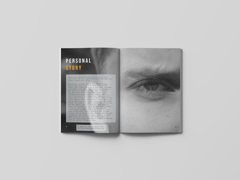
The next page featured an image that has already been displayed within the posters. I wanted to show a link between the magazine and the posters and I thought by using one iconic picture that feature on the poster as well as the imagine would show the link. creating this page also made the picture have more a story and a real personal meaning and that’s explained when you see the design process.
Within the magazine, I thought of the idea of presenting personal stories so people could get an understanding of what it’s really like and how it effects the norm. When I used this photo for the poster, I thought it presented a lot of emotion within Jack’s eye and symbolised a more personal approach towards poverty. I then decided to use this within the magazine as the photo to me displays life through poverty and relates well to personal stories and struggles. I made the photo go across the entire page as it gave it a bigger and deeper effect to the audience.
I used a personal story from my mum and dad this would then be featured over the entire page. Even tho the story is not related to the image, the image it self portrays what is said in the story.
At firs I wrote personal stories, but then I wanted a one story that I felt was personal and more heartening then random fake small ones. I made the type agains sit in the space BEBAS type face therefore would so consistency. I then decided to make the ‘person’ in white so it was easier tor reader and the ‘story’ in orange as this is what the type is like on other pages. I decided to make this type sit on the left hand side because this is where there was no image contrasting the type, and I wanted the left hand page to be vigilant to the eye at all times.

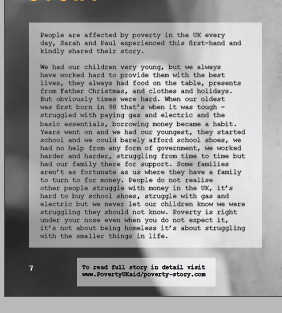
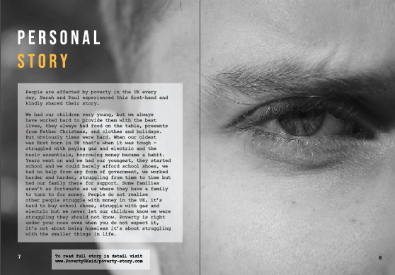
The person story:
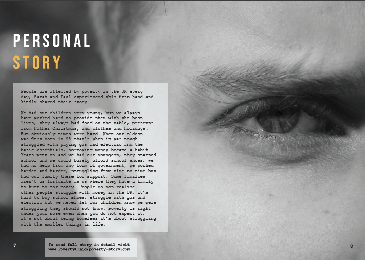
People are affected by poverty in the UK every day, Sarah and Paul experienced this first-hand and kindly shared their story.
We had our children very young, but we always have worked hard to provide them with the best lives, they always had food on the table, presents from Father Christmas, and clothes and holidays. But obviously times were hard. When our oldest was first born in 98 that’s when it was tough – struggled with paying gas and electric and the basic essentials, borrowing money became a habit. Years went on and we had our youngest, they started school and we could barely afford school shoes, we had no help from any form of government, we worked harder and harder, struggling from time to time but had our family there for support. Some families aren’t as fortunate as us where they have a family to turn to for money. People do not realise other people struggle with money in the UK, it’s hard to buy school shoes, struggle with gas and electric but we never let our children know we were struggling they should not know. Poverty is right under your nose even when you do not expect it, it’s not about being homeless it’s about struggling with the smaller things in life.
my mum and dads story 🙂
The design aspect was actually quite simple for this type. I thought I would put it in a white lowered opacity square so you could still see the image in the background and read the information clearly. As you can see from the image below, there is a lot of type but it fitted nicely within the box and onto the left hand page well. The type sits in courier 10 like the other designs. Below the box sits another box, that indicates a link to the website (that would be made in near future and if we had longer on this project) I wanted to use this page as an advertising technique as well as an informative page. With the personal story it connects to the reader and the understand it more, then linking them to the website allows them to read the story in full and promote the brand more.
The final page:
This is the final page for my designs. This presents personal stories from my mum and dad but not the entire article as the idea is people go and visit the website to find out more. The image portrays emotion so well and indicates what life feels like to people in poverty just by the squinted look in his eye. I think this page goes against all the stereotypical aspects of poverty and really makes the reader engage with the issues the UK face today.
mock up of design:
Out of all the pages, I think this is my all time favourite. Obsiouly what I think is irrelevant but when I showed this page to my family and friends, they felt connected to the page and the story got told through the picture before even reading about it. my mum said she looked at this page and cried as the picture captured so many emotions and the story melted her heart and that’s why I design and do what I do. When compressed into this layout it makes the two pages come together and tell a story, and fills the entire page with emotion. its eye catching tot he audience and says for them to understand.

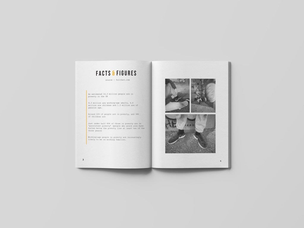
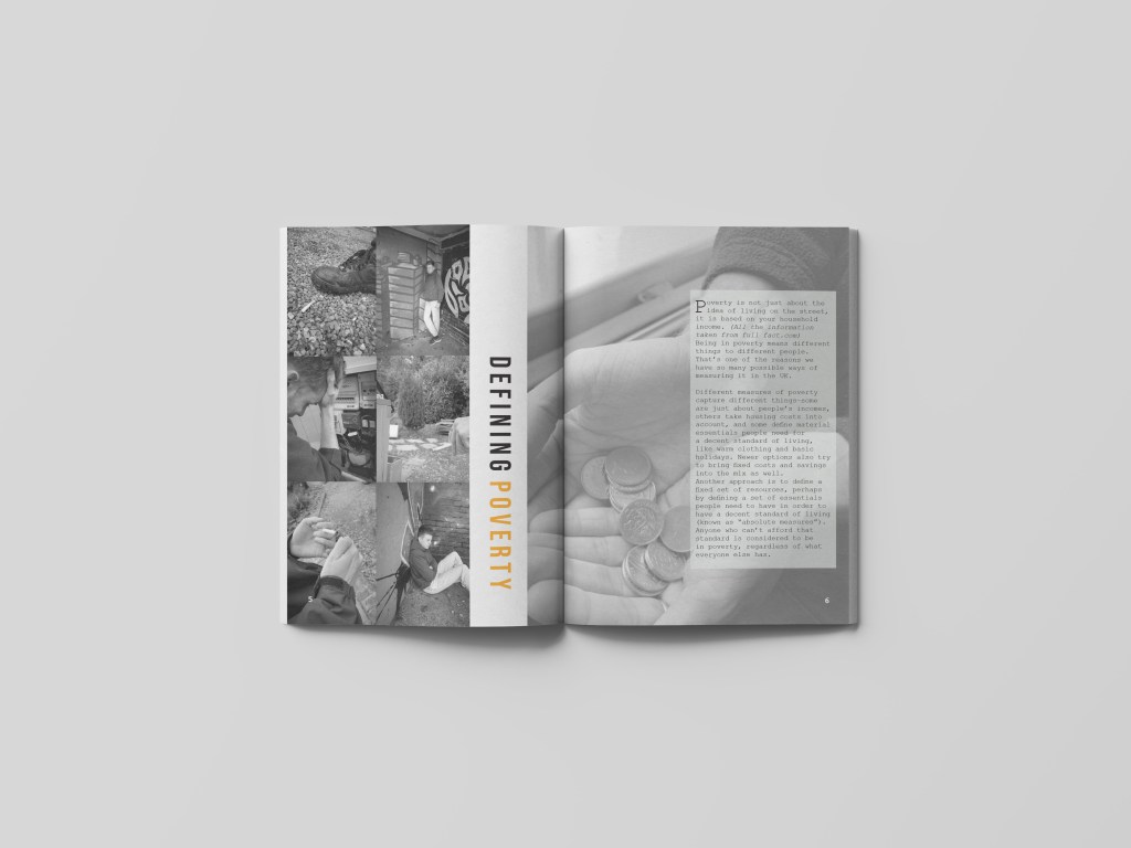
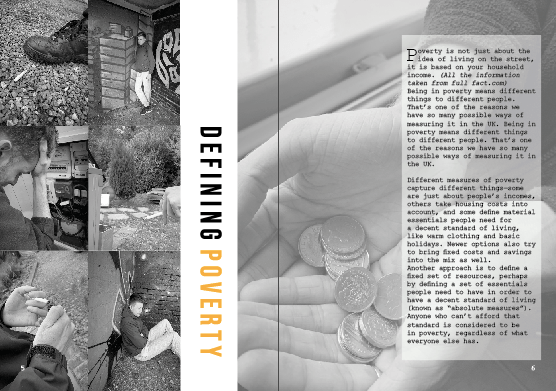
The first two pages have been short with information and did not want to go not a lot of detail within poverty. I did this so the reader would have to read on and want to continue to find out about UK poverty and ways in which they could help. Therefore the next page is “defining poverty” Again all the information is taken from full fact . com and this has been said in the type.
left hand page:
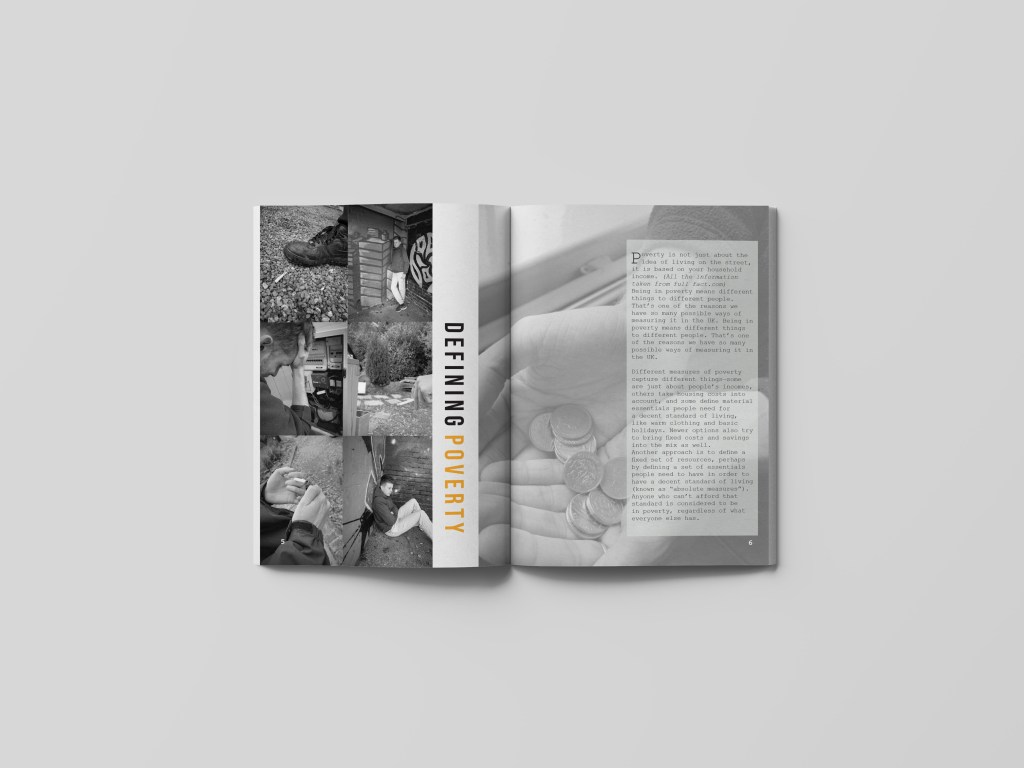
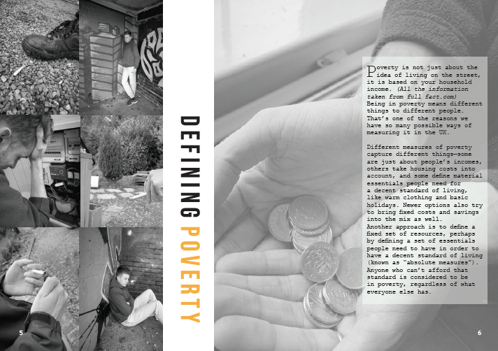
I wanted this page to be slightly different; meaning it would still have all the elements the other pages would have like the orange and black and white colour theme but the layout to be slightly different. This page is all about poverty and defining it therefore was a perfect platform to showcase all the elements that fall on the poverty line. On the left hand side I wanted to display a column of photographs that represented poverty within the UK and try my hardest to show case that well. I used the images that I felt represented the idea of struggling and desperation through photography… as you can see they are all black and white and the theme. At first I was going to make the entire left hand page a collage, but then felt as if it would become too over crowed in comparison to the other pages within the magazine already designed. Therefore, I stuck with the idea of collage but then moved the two columns right over to the left hand side so no gaps were shown, this then allowed me to have a bit of negative space left on the left hand page and follow through to the gutter to allow more images or text to be added. I am not sure if you can notice but when I screens hotted this to add It to my blog, I noticed a white gap that was between the two images which automatically made me change it. I did not change the design just made sure this white gap was gone (however I already did mock ups therefore had to change them also) this made me realise I NEED TO DOUBLE CHECK EVERYTHING!!!!!
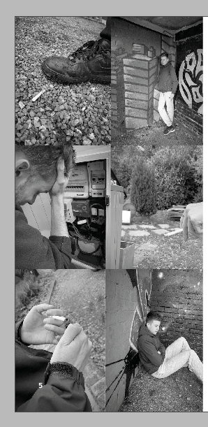
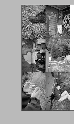
this is the updated one without that annoying white space between the two photographs at the bottom just to showcase that. I made them slightly thinner and this then made the white space disappear and no longer annoyed me.
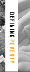
I then thought about making the title slightly different in comparison to the other designs. This page was different already due tot amount of images used so why nit make the type slightly different. I enjoy making posters and editorial visualise that are unique and different and that’s what Made me design this editorial spread like this. The aim was to make this page more about the photographs, therefore I did not want the type to over power that. by making two column collage it enabled me to create negative space between the left hand page and gutter and this then made a perfect space for the title. The type spaced BEBAS is that sort of typeface that can be read from any positioning therefore this made me want to alternative the positioning. With the negative space it worked so well and was readable still. I made the working defining in black and the world poverty in orange to follow the colour scheme that follows through the magazine. I was worried this would not be seen but it breaks of the images from one another creating negative space, and does not make it over crowded giving it that minimising effect.
I could of easily left white negative space over the gutter to the next page, but I felt as if this was then separating the two pages and not continuing the story. due to layout of text I thought it would be appropriate to put an image over the gutter next to the text following through to the next page. Within the image below, you can slightly see this image coming over the gutter and links the pages well together.
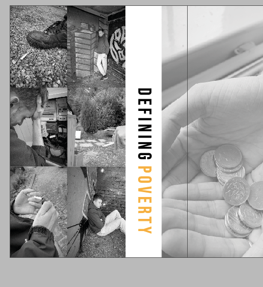
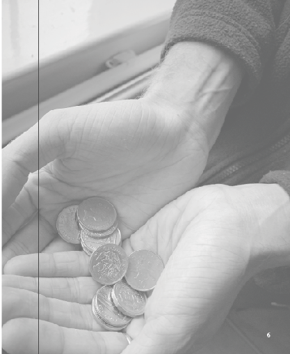
On the right hand side I wanted the entire page to be filled with an image and then the text to sit over the as this page was all about portraying life in poverty. Out of all the images I had taken one stood out to me the most, and that was the money holding, it represented the idea of living on what you have and not beyond your means therefore thought it was a perfect choice of larger scale image to fill the page. Because, I knew I was going to add type over this image I lowered the opacity to around 70 so the image could still be seen but did not contrast against the writing. I was worried that it would look weird lowered just because the other photos were not but I actually think it worked well and they told different stories but linked together through their meaning.
Adding type:
The type was an issue, but I got there in the end it just took a few stages to end up with it. I wanted all my information to be from the same website and source therefore again it was from full fact.com.
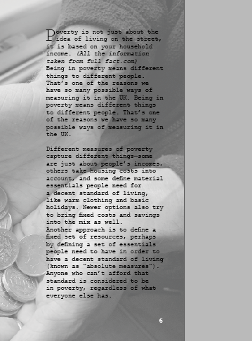
Poverty is not just about the idea of living on the street, it is based on your household income. (All the information taken from full fact.com)
Being in poverty means different things to different people. That’s one of the reasons we have so many possible ways of measuring it in the UK. Being in poverty means different things to different people. That’s one of the reasons we have so many possible ways of measuring it in the UK.
Different measures of poverty capture different things—some are just about people’s incomes, others take housing costs into account, and some define material essentials people need for a decent standard of living, like warm clothing and basic holidays. Newer options also try to bring fixed costs and savings into the mix as well.
Another approach is to define a fixed set of resources, perhaps by defining a set of essentials people need to have in order to have a decent standard of living (known as “absolute measures”). Anyone who can’t afford that standard is considered to be in poverty, regardless of what everyone else has.
SOURCE FULLFACT.COM/POVERTYUK
This was the first attempt of adding type to the page. I really wanted to use a drop cap due to research I had found and to me they make the text stand out so much more so the reader wants to find out more about what you are discussing. I made the type sit in courier and followed a column structure like magazine portray within their designs. However when we had the critique one of the comments was that this was hard to read in the mock up and the editorial design therefore I created a test print to see if that was the case.
test print
Below is an image on a4 the printed editorial layout on this page. I wanted to see if the writing was hard to read. and it was. I positioned this design in different places and stood away from it then close up to it and it was difficult to read on both aspects. I think it’s because the picture is black and white, and the type is so thin and small they contrast with one another. I showed this to my tutor and she suggested adding a block like some of my other pages and see bow that would look therefore I did just that and thought it worked 100000 times better for the reader to visualise and understand the writing.

I decided to add a lower opacity white block behind the writing – and automatically this made the type stand out and become more easier for the audience to read. I could off easily made it a solid white but then yo would not see elements of the image as much and would clash with the rest of the design.

Final editorial design:
Below is an image if the final editorial design. I think this design works so well with the message I am trying to portray which is poverty in the UK. The photos on the left hand page are an indication of what life is like for the everyday person struggling with the small things some of us take for granted. I think the type in the middle separates the two images but weirdly connects them together well. The page indicates sensitivity to the topic and does not portray any stereotypical images that surround people in poverty. The image on the left also portray more than one person, as I wanted to ensure I was displaying what life is like through a variety of people not just one person, I also think not using the same image twice makes it stand out a lot and not a relative element going on in the design.
Mock up of design
Like all the pages I wanted to create a ,mock up for the audience to see what this would look like when featured in a magazine spread. When looking at this mock up you can see all the key elements well and they all tell a story in their own way but connect well with one another. There is a lot of imagery going on but its not too cramped to the readers eye. Having the image on the right be more lowered in opacity makes the page present more sensitivity towards the topic and not too in your face filled with images. The title works so well when featured in the spread, and this is due to the image on the right going over the gutter allowing the type to be seen well.