Analysing gin bottles – Brands & their marketing platforms

JDO - bomb project

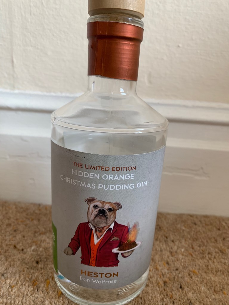
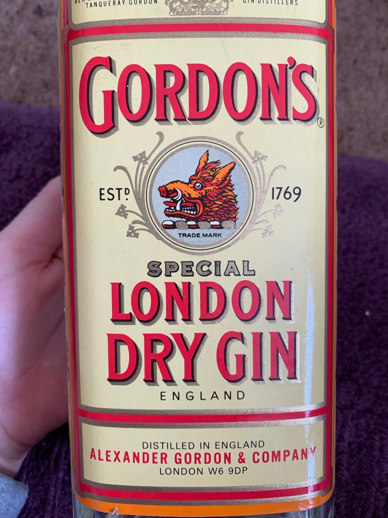
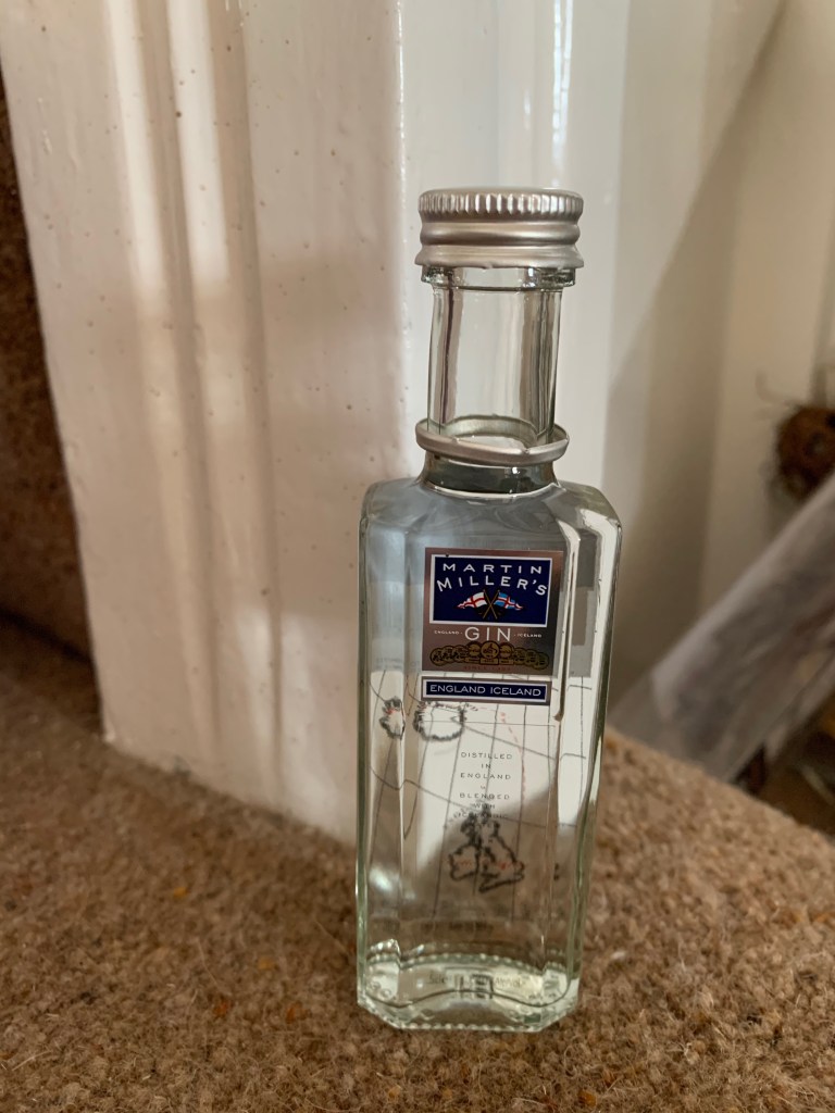
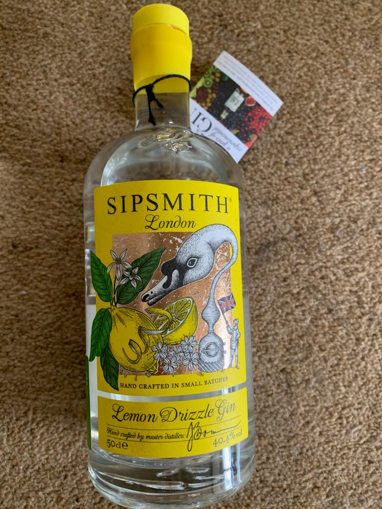
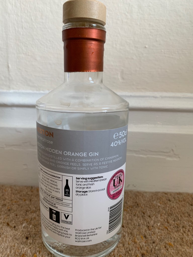
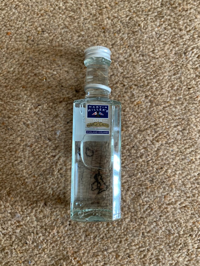
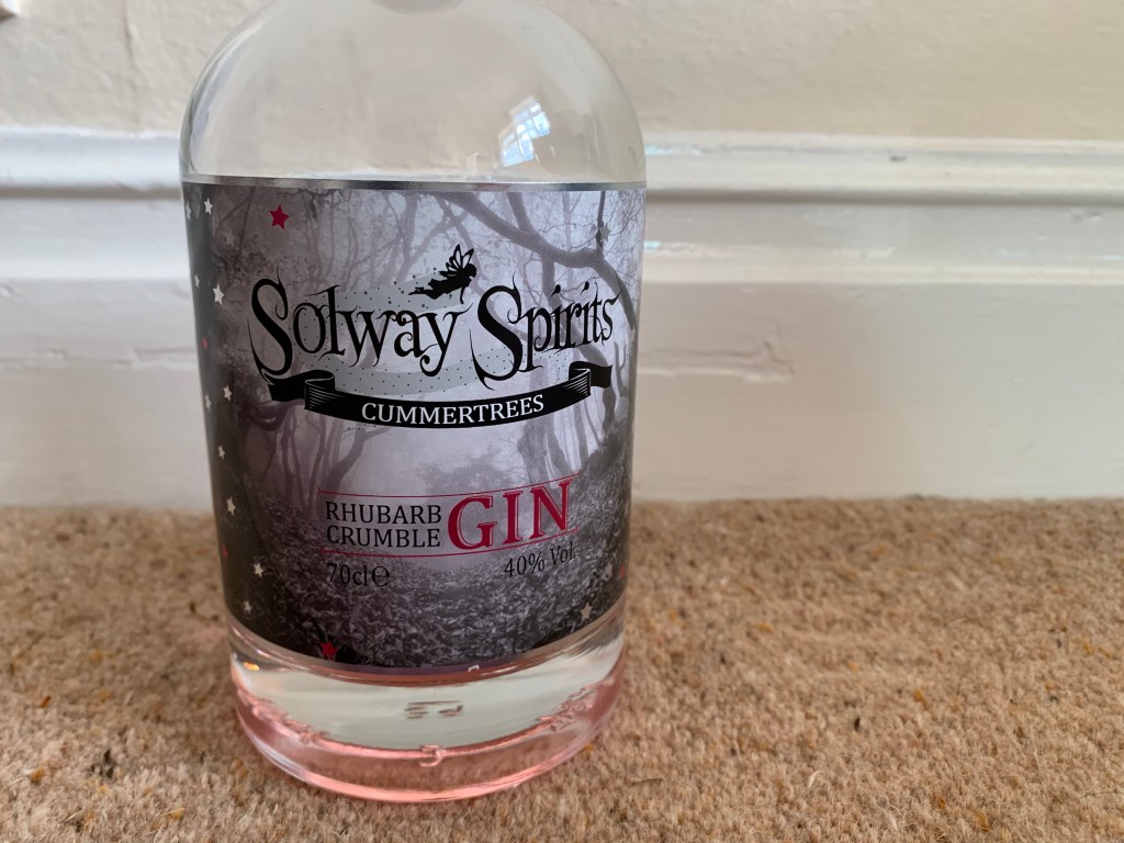
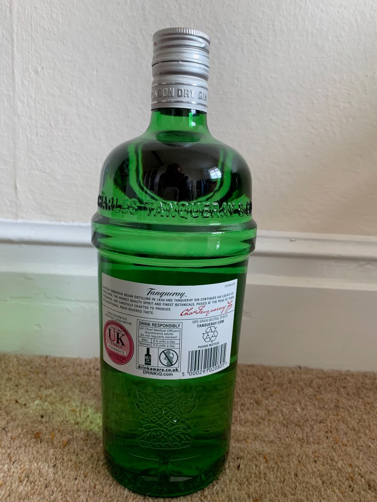
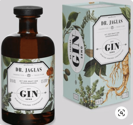
I have looked into gin bottles that are just on google, but now I think its best to look into the designs that already exist within the market showcasing the different brands the feature in the UK now. This will enable me to understand product marketing as well as a design for the product.

I typed into google, top gin designs and clicked on a. few websites and bottles to analyse through this blog post.

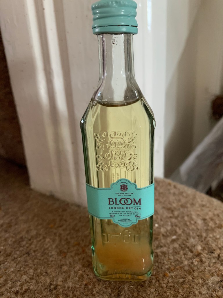
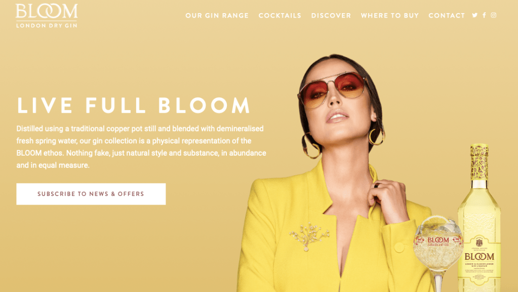
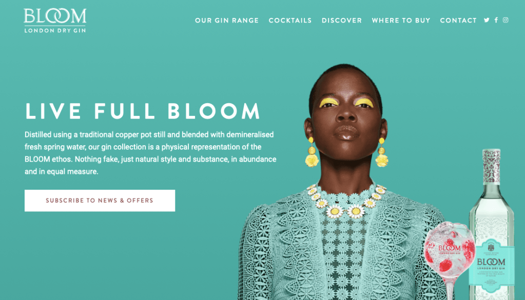
The first one I looked into was the brand bloom gin – which has an online website where they showcase their design and products through that. When you first go onto their website they showcase 4 alternative flavours that are displayed showcasing the different flavours. Each flavour show cases a model wearing the same colour as the gin and the entire design focuses around the certain flavour and colour of gin.

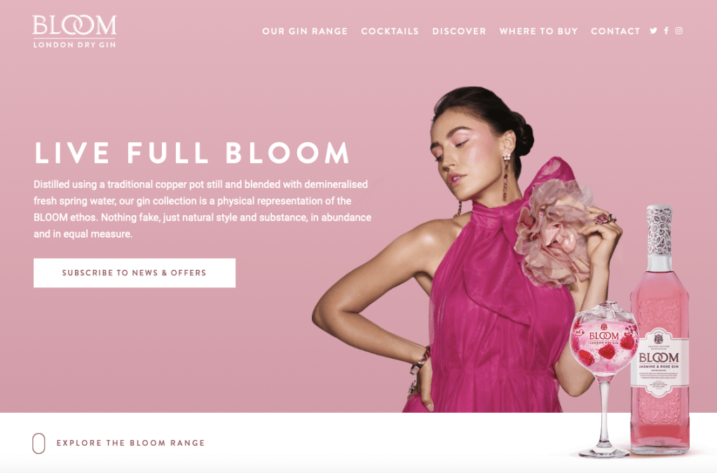
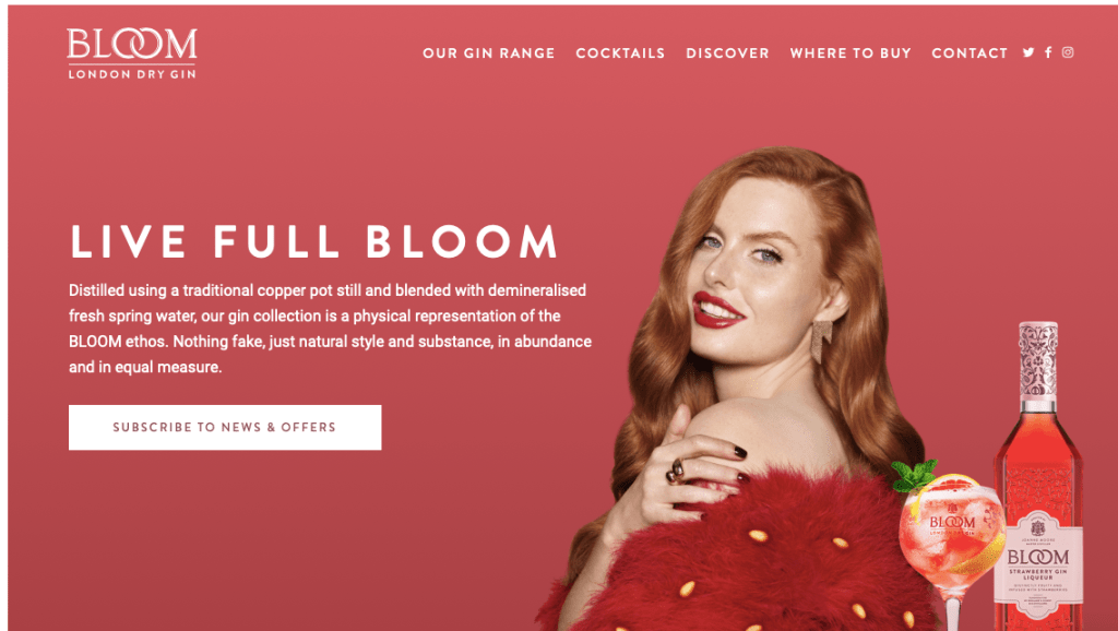
Now above is the advertising for this certain gin therefore – the bloom distilled gin original. When you then scroll down the website you enter into the ‘explore the range’ I found this so interesting because its almost like a website for new clothing products exploring the range.

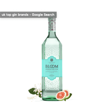
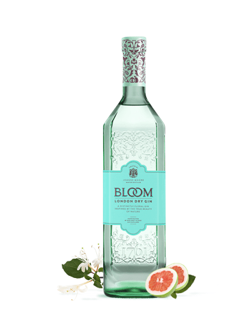
The gin I decided to analyse was the most iconic design and the original design for blossom. This design on the website was hovered over with an image that displayed the description of the gin and used as a form of advertising for the consumers. The description I almost what you would display on the label of a gin bottle, as it displays the name, description, the CL and the ingredients.

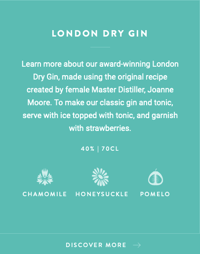
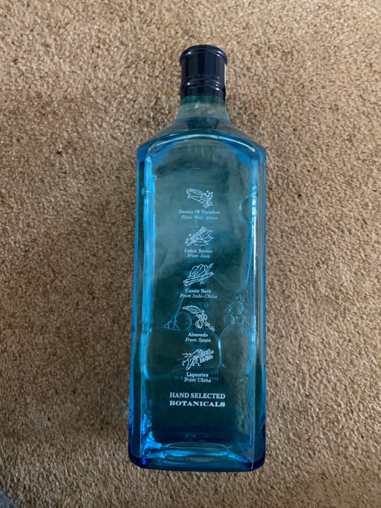
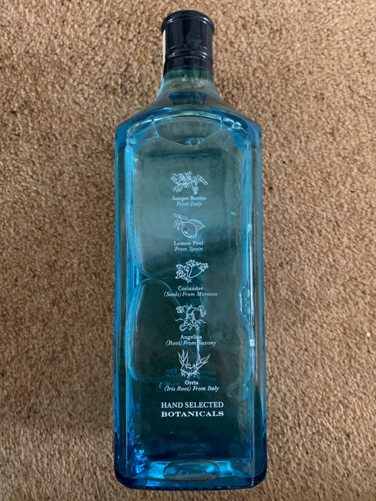
When the design is featured after the quick hover over image, you get a simple design of the bottle. This design works so well as it just focuses on the bottle, nothing else. The shape of the bottle is very sophisticated and displays a unique style to the dry distilled gin. The colour palette for this design is a turquoise which personally speaking fits in with the dry gin style, but also links with the bloom idea. The thing that stood out to me not just the logo and the bottle design (with the pattern) but the small details of the ingredients placed either side of the bottle. In the lower right corner you have dragon fruit and then in the back another ingredient which I am unsure off – however it works so well for the design advertising techniques. Adding the small ingredient almost allows the audience to taste the fruit to a hole new level.

When you then click on this certain gin – it takes you on a story. I find that most gin brands have a story behind them and portray a certain personality through their designs and Bloom showcase this on their designs and their website.

Their advertising continues through the branding, as it displays where you can buy the gin from and I think this is such a good advertising platform because it allows them to showcase where their audience can purchase their designs from. You never see this on adverts or on the bottles the fact they can showcase this on the website is a really good idea and perfect advertising platform.

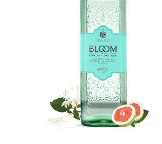
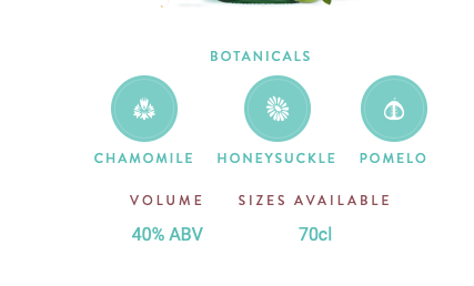
Above is the images displayed when scrolling down on the design – they showcase the bottle the way its shown at the beginning of the design. They showcase almost what it would look like on a poster. The image is clear, and the product is so appealing to the audience. They display the botanicals involve and the volume, and the sizes available throughout the product. The pictures of the bottle is so small I think it would work so much better if it was sightly larger as I find it hard to see some of the key points, or to even analyse the design. The entire design throughout is dedicated to link with the bottle, meaning the same colours and style will be used.

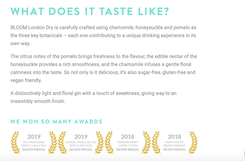
The best thing about this, is they describe what it taste like. When you want to try a new gin, you want to be able to know what it taste like without tasting it, if that makes sense. I think the design it self makes people almost taste it due to the ingredients displayed either side, and now they describe which draws the audience in even more.

The description is simple, effective and allows the reader to want to try it. I want to try it now I have read that. The entire Bloom brand portrays this elegant and sophistication through their design, it gives people a feel of spring and summer and the flowers blossoming. The design overall is dedicated towards elegance and flowers and thats what makes it work so well when advertising for the design and creating platforms.

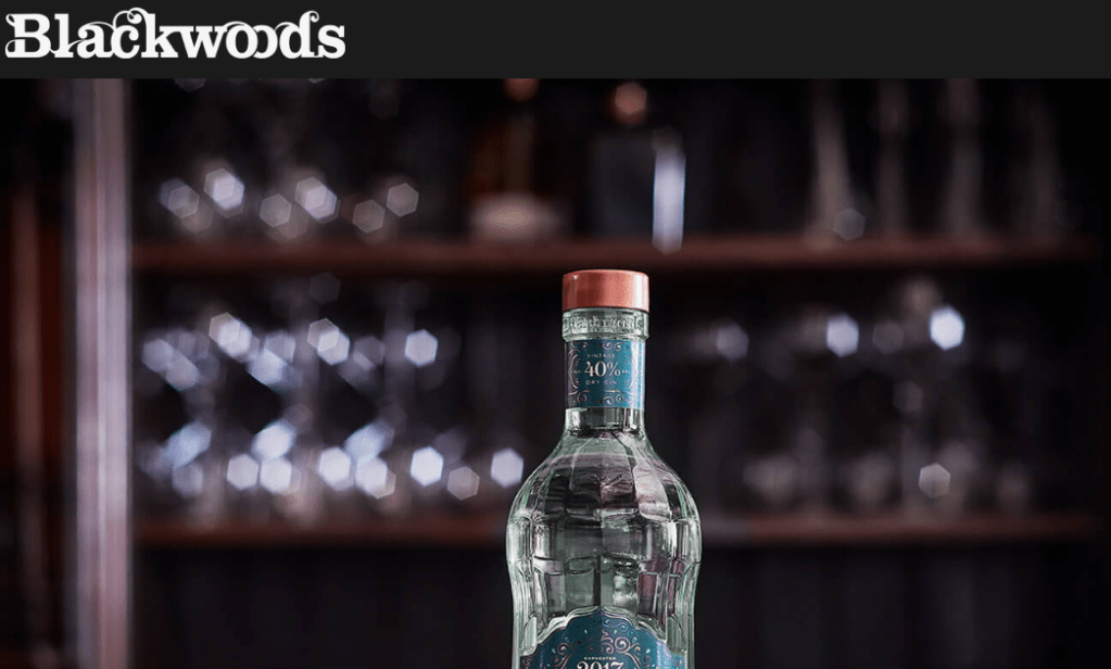
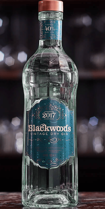
The next brand I decide to analyse due to their marketing techniques, website and product was Blackwoods Gin with botanicals from the Shetland Islands. Their website has that very pub feel to it, with a traditional sort of display. The type for the brand/product is very tradition, and old school and sets out the rest of the design for the bottle, logo and the website advertising platforms. When you first click on the website you see this image, no words, no random images, just a single bottle displayed within a a sub scenery which tells the story straight away about this gin.
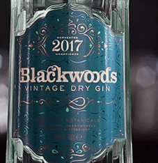
The bottle:

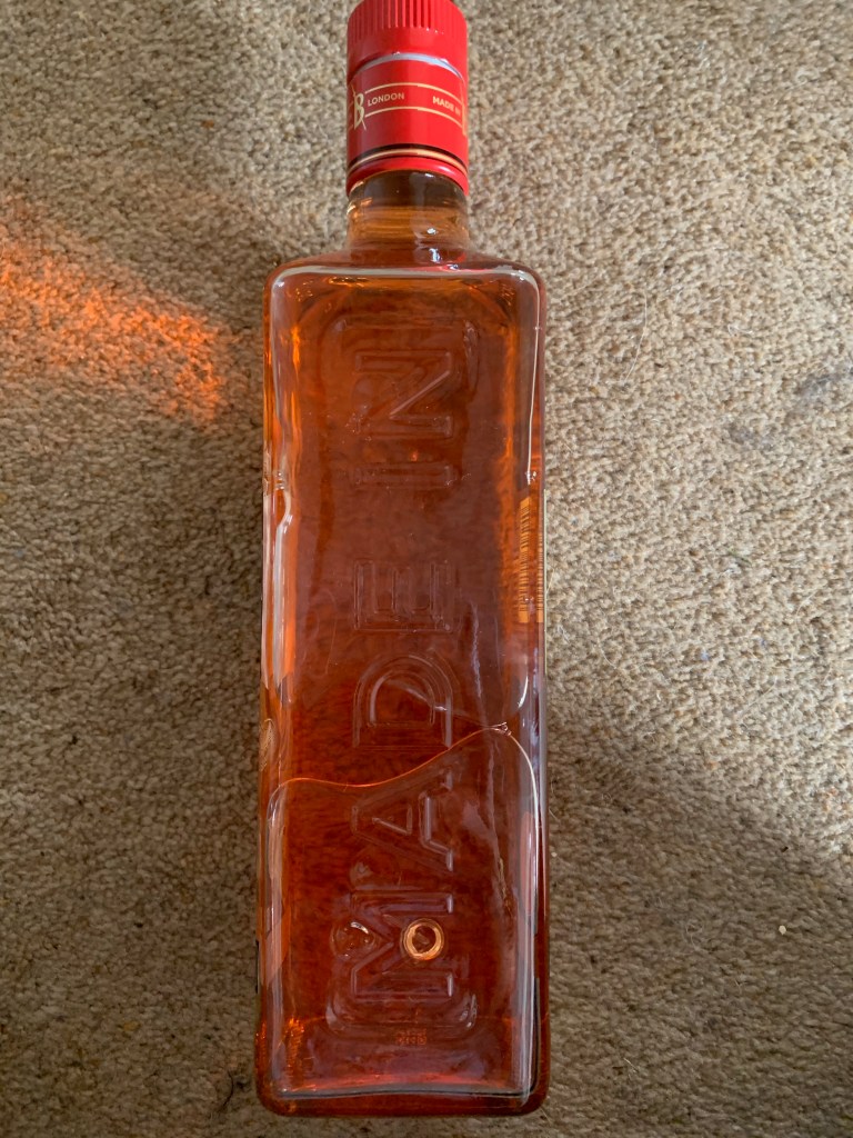
The bottle it self is so different in comparison to other designs I have seen – I personally think it looks so much like tonic water styles, its quite simple, small but has the elegant sort of style to the design. The bottle it self has a sort of pattern engraved within the design, and the top of the bottle features a label that links with the main label. The logo it self is very traditional like, with a teal background and a vintage type colour palette to relate to the description of vintage dry gin. The thing with vintage, is its old and unique and I think that this is displayed within this design throughout and thats its personality and story towards the bottle.

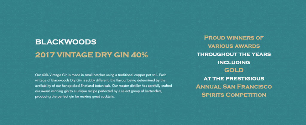
The design for this website is quite different to the previous design, when you scroll it then takes you into the next informative section. The colour palette is decided due to the colours used within certain bottles therefore in this case is this teal colour to link with the vintage dry gin design. They display key information, that they are proud winners and advertise their product as a hole. The information is clear, easy to read and gets. Straight to the point.

The last thing I wanted to analyse was this image below the related to the product. they have done it sightly different to other gins and displayed different ways in which you could use the gin and mix it with your favourite flavours. They showcase a more sophisticated design along side a more tradition every day design. Having these two designs, and showcasing how one could encounter this design allows the audience to experience what it could be like if you purchase this gin.

Researching the ‘Gin cupbord’

JDO - bomb project

My boyfriend mum is a lover of gin and over her years has collected a vast majority of gin, for this project I found that looking through her cupboard and photographing elements would be more beneficial than online imagery as to to me I was able to hold the bottle and a real feel of the product.

Now there is over 50 gins within this cupboard and I could be here for absolute days trying to explain it all. I decided to showcase every single one on this blog, however I would only annotate in detail the top 5 that inspired me through the design process. I took the top 5 to my iPad and competely analysed them throughout which really helped decided my design ideas.

All images:

All the images below are different angles of the gin bottles that I took, taking them from al different angels allowed me to understand each bottle individually. What is interesting about these gin bottles is that they all portray different stories and portray alternative personalities depending on the flavour of the gin.

Out of all the designs of gin there was one in particular I wanted to analyse and take further to understand how it looked and portrayed certain elements. I was going to take 5 gin bottle designs and analyse them, but personally I thought analysing one specific one would allow me to be certain of what to add in my gin bottle and the design.

The first one I analysed was the sip smith Lemon drizzle gin. This one stood out to me the most due to the shape and the colours used within the design. The shape of the bottle allows the designate work so well together. I analysed every single part of the bottle to understand all the elements that had to be part of the design.

Gin designs that interested me

JDO - bomb project

Research images: Gin in general

The first image is from Pinterest – by typing in gin bottles. The reason this stood out to me was the unique reflection of the pattern. I love the fact the pattern is design at the back of the bottle (inside) but because of the glass and the liquid it reflects through the entire bottle creating a story. The top Is wood like making it look clean and simple with a little label over it. The label is so simple but works well against the image. Gins have this elegant appearance to them, and this is a great example of that within this image below.

This image has an empty alt attribute; its file name is img_1006.jpg

I fell towards a lot of gin designs with patterns behind them. I think ti gives that really classy clean look to them. This one portrays a box (which I could potentially create) with also a bottle with the label on it. This one portrays a blue pattern background, with the flavours thats involved (ingredients) placed on the label which then links to the packaging. The label that sits on top of the pattern, is white with black writing, every little detail stands out due to it being white and bold text. The flowers overlap the design making it stand out and come together as a design rather than being a seperate label and separate pattern.

So when continuing research, majority of gin designs have a unique pattern about them. This one below stood out so much due to its unique pattern. Unlike the other designs it did not portray the ingredients used it was a simple yet effective mirrored pattern that followed through the entire bottle design. Dry gin doesn’t usually involve a lot of flavours and thats shown within the design. The pattern fills around the entire bottle and stands out, however the label sits nicely on the design not making it too overcrowded.

MY TOP DESIGN INSPIRATION:

Out of all the different sorts of inspiration I saw online this one stood out to me the most. I love the way the pattern is filled around the entire bottle. The pattern then links into the triangle making it all come together. Its designed so perfectly and stands out so much as a design. The pattern is bold colourful and beautiful then the label is sophisticated and a unique shape unlike the others.

  • Document
  • Block

No block selected.Open publish panel

  • Document

The first image is from Pinterest – by typing in gin bottles. The reason this stood out to me was the unique reflection of the pattern. I love the fact the pattern is design at the back of the bottle (inside) but because of the glass and the liquid it reflects through the entire bottle creating a story. The top Is wood like making it look clean and simple with a little label over it. The label is so simple but works well against the image. Gins have this elegant appearance to them, and this is a great example of that within this image below.

I fell towards a lot of gin designs with patterns behind them. I think ti gives that really classy clean look to them. This one portrays a box (which I could potentially create) with also a bottle with the label on it. This one portrays a blue pattern background, with the flavours thats involved (ingredients) placed on the label which then links to the packaging. The label that sits on top of the pattern, is white with black writing, every little detail stands out due to it being white and bold text. The flowers overlap the design making it stand out and come together as a design rather than being a seperate label and separate pattern.

So when continuing research, majority of gin designs have a unique pattern about them. This one below stood out so much due to its unique pattern. Unlike the other designs it did not portray the ingredients used it was a simple yet effective mirrored pattern that followed through the entire bottle design. Dry gin doesn’t usually involve a lot of flavours and thats shown within the design. The pattern fills around the entire bottle and stands out, however the label sits nicely on the design not making it too overcrowded.

MY TOP DESIGN INSPIRATION:

Out of all the different sorts of inspiration I saw online this one stood out to me the most. I love the way the pattern is filled around the entire bottle. The pattern then links into the triangle making it all come together. Its designed so perfectly and stands out so much as a design. The pattern is bold colourful and beautiful then the label is sophisticated and a unique shape unlike the others.

colour pallets and sketching bottle shape idea

JDO - bomb project

I did a lot of sketches before actually deciding the shape and colours of the design. I thought that sketching different shapes would allow me to sort of understand how the bottle could look at how the colours could play an impact within that design. I knew that I wanted quite a subtle theme within the colours meaning that palettes would be a lot better.

I did these sketches before researching as it was a way of making different ways of ideas flowing and understanding how gin bottles work.

The one below is a sketch of an oval glass bottle, the thing that sticks out for me with this sort of sketch it it enables me to play around with the logo shape – with this shape bottle it allows a lot of room for me to design and less restricted within the design, Its simple yet effective. Gin bottles come in different shape and forms depending on the purpose of the audience and the flavours. I do not think I will know the shape of the bottle until I have the design in place as then I could work around that.

Within this sketch, I used a water colour brush and did some colour drops off what I think could be involved within the design. Maybe a blue, to relate to the beach, because of flavours I would for greens and reds and pinks maybe even orange. I love the way this sort of shape allows reflection and thats why I am more drawn to it, as it allows the design to fit better, and due to it being smaller makes the logo be the focal point not the bottle.

Now I wanted to draw a square bottle to see how this could potentially look. I think this looks better in a sketch form as its more structured, however I personally do not think it allows the design to flow, I would have to make quite s strict design for it tofu nicely into this bttoel. The purpose of my brand and also the flavours is the idea of being free and care free, where as this bottle to me is quite structured and in line if that makes sense. I think it could work but like I said it depends on my design first and the route I want to take in that.

The story / mash up decision on words

JDO - bomb project

The story I want within my idea initally was the idea of a beach. Personally speaking, when it’s the colder months all I ever want is to be by the beach. I imagine sitting on the beach, with a lovely drink. I want to create a drink that makes people remember the beach, have a taste and smell of what its like to sit near the beach and the things that surround it.

I thought of a list of words that related to the sea – first of with the UK beaches linked with tropical holiday beach.

Words linked to beaches:

  • sea salt
  • seaweed
  • palm trees
  • coconuts
  • kiwi
  • sunshine
  • sea
  • watermelon
  • sand

When looking at all these words it was then my job to undertake ideas that I felt would fit in with the story I wanted to portray and how it would work. I asked Tim what he thought about my idea, and the words he would associate with the beach, and he suggested seaweed.

I then thought about mixing the idea of colder British sea sides with the tropical beaches together, and that’s when I came up with the gin flavour of salted sewed and watermelon. This is a mixture of different types of beaches. I also feel as some of gin needs a fruity flavour to level out the other elements within the drink.

This then led onto the idea of seaweed gin, however with an image below , displays gin sewed that already is out there. Therefore it was case of mixing another two sets of flavours to make it different.

When I think of seaweed, I think of salt, and sea. You can actually purchase salted seaweed from stores therefore making it an ingredient already. Therefore this was a flavour that I wanted to use for my product. Now thinking of gin, they always have a fruity flavour to make that sweeter flavour, I wanted another flavour to make it unique and have a better more appealing taste therefore thinking of fruits that could relate to the beach.

  • kiwi
  • coconut
  • watermelon
  • strawberries
  • mango
  • pineapple

For a while i went back and forth for different flavours they all could work, but I do drink gin and to me I put myself in that situation and what one I would like the most. I also thought about colours I could mix together, Kiwi is green making it all green label, coconut is white and brown and a bit boring, and the rest were bright colours. I knew it would either be between watermelon on strawberries as these were red and bright. To me watermelon is more beach as a lot of people iconicity eat this on the beach (including myself) when I go on holiday my mum always takes watermelon in a cool box when we go onto the beach, and thats why I decided on watermelon.

Mind maps / initial ideas

JDO - bomb project

These below are a bunch of initial sketches that I thought the idea my design could go too. I got the first initial idea from the mash up of pink salt. When I looked into pink salt there was a link for a logo that portray a shell on the background of the design. I then thought, ok why not create something that representated the beach.

The first idea here displays the idea of a shell, and being involved within the bottle design. I thought initially the bottle could be quite simple, have a shell in background maybe some palm trees. I am unsure on this shape as I think its not very unique its quite standard. I think the idea of more unique oval shape would fit more within this design. At first I thought of the link of the words could be done with fruit, maybe fruits that relate to sunsets, and beach – however I think this is already very popular with gin projects.

I then expanded a lot of my design ideas with the idea of colours and trees etc. However I still did not have the idea of the mash up. When looking at these images I thought they all looked a bit basic with the ideas, I do like the idea of having a palm tree within the design as it represents the idea of the beach theme, however does it link with the mash up I have currently thought off.

I then thought I would stop the drawing and focus more on the story from the story I would be able to create a mash up within the designs. I started a mind map with the middle subject of ‘beach gin’ this than led of to different ideas. I thought of ‘palm tree gin’ which then related to colours such as green, blue and white – linking with more coconut themes. I then thought maybe ‘sunset gin’ which involves colours such as red, orange and pink relating to fruits in this colour.

JDO – first meeting / brief

JDO - bomb project

25th February

JDO RAW:

We are feeling peckish

weird and wonderful drinks/ but relevant to what is around now

Something we haven’t seen before

getting two things and mashing them together

innovations , shaping the future

products / that would gain mashing ingredients together

unique characteristics and selling it in a new way

why is it good? why is it different? story of the product

Would I pick it up for yourself?

  • Tips from the studio:
  • Service it to us straight – a bit of a blurb to describe what you have done and why 200 words – sum it up and introduce your product.
  • Don’t burn out – develop on first idea if under pressure
  • Do not spend ages on sketches , pick one and go with / develop it
  • Shows your creative talent
  • Feel proud of it / effort
  • judgement criteria of your own before going ahead with it – go backwards
  • 4 bullet points to know what they want to see if you are achieving it
  • sketches send over

the delivery ]

6 a3 boards (JPEGS FOR DIGITIAL)

physical submissions accepted

mock ups are expected / are fine

written statement outlines design intent and rationale

video. animation and 3d render files optional

brand name, logo, brand product, and where it goes (e.g magazine advert, billboard)

instagram advert

advert for the idea?

submission @jdoraw.com

30th of the 3rd 2020

anything that doesn’t have a brand signature at the moment (BEACH GIN)

final evaluation – CC

creative conscience final designs and process

Evaluation and Reflection:

Please find below three sets of evaluation questions to consider at the end of your project and write up in your blog.

You should also check on these throughout the process of your project as this will help you to develop ideas and problem-solve issues before it is too late (ie: the end of the project!)

1) Visual Communication:

In what ways does the visual communication/message of the piece meet the needs of the brief?

I think my designs link to the brief as it was all about making a change and linking it to either the NHS or to a service. Within the creative conscience brief they always state different sections and different scenarios and I believe that from my knowledge from previous years I knew what to do to enable to meet the visual communication and the message within the brief. I decided to make awareness and the entire cc brief is about making a difference and designing for good and I believe my final achieves that.

In what ways does the visual communication/message of the piece fail to meet the needs of the brief?

I personally do not think my design failed to meet the needs of the brief as it informs, educates and actually goes inside a fire fighter station which is another reason by my design fits the needs of the brief.

What are the strengths of the visual communication? Why?

I think going to the station and actually taking the photographs of my uncle and actually get to experience the life of a fire fighter (to an extend) really allowed the design to have that personal effect and that made the visual communication stand out. I believe that the design educates, informs and entertains the audience and the photos really are the strengths of the visual communications.

What are the weaknesses of the visual communication? Why?

the main weakness for me was losing the A5 designs I actually worked so hard on producing these and my Mac updated and got rid of them all. this would of tied it with it being a school pack but now it turned into just being a magazine to hand out to kids. I feel like some changes could be made to the magazine and I would of done a lot of things different if you handed me the brief now. I have developed a lot in my magazine style therefore thats the reason I think I can pick out a lot of issues. however its clean and simple and really does achieve its goal.

In what ways could the piece be mis-read or mis-understood by the audience? Be specific about who the audience is.

I personally do not think it could be misread, however I wish I could do more pages just to explain fire fighter life a little more and this could be said as a misread aspect because I feel like there isn’t so much information in the magazine that there could be.

In what practical ways could the pieces be developed or improved?

like I just said I wish I had made more pages, and when I lost the a5 just completely update the magazine. there is paragraph issues that are really angering me even to this day but I couldn’t change due to timing, I feel like the one reason I am picking up on elements that could be altered is purely because I develop in months after creating this and I feel like I ave achieved a lot more and understand more in magazines than I did when I made this if that makes sense.

In what ways did you consider Designing Backwards or application of Systems Thinking to your project?

I think with this project and linking it to project X the outcomes are always dedicated to the finals as you want to knowhow your design for good in the outcome. I personally think that with this design it was all about system thinking and really understanding the topic before designing it. I think mu approach to the design was well thought out and I planned everything including the trip at the beginning to make sure I was concluding to the correct final outcome.

In what other ways have you considered the sustainability of your project process
and outcomes?

Due to my love of magazines, I think I always consider sustainability aspects now more than I ever did. I always tried to make the designs really stand out and use a lot of imagery, but sometimes with. magazines test printing helps – however for this project I test printed a lot of pages onto scrap old A4 paper before actually printing it and this would be to check spelling and lineament issues and if everything was in the correct place. And I do continue this a lot through my projects.

In what ways have you considered the ethical implications of your project process
and outcomes?


ethics within design always seem to now come naturally to me when a few years ago they didn’t, I had to consider fire fighters and not be patronising as I am not a fire fighter myself, I always wanted to showcase some facts about women fire fighters and really let kids know the different nationalities and the other gender being involved in this job..

In sustainability and ethical terms in what ways was your work in this project an
improvement or a backward step for you as a socially conscious designer?

I think I am turning more and more into a conscious designer, I always create projects to design for good and to make people aware of situations, events or people and thats how I think I will continue.

What targets can you make at this point for your work in the future as a socially
conscious designer?

I personally want to design to make a difference, and I think thats my goal for my future and career in graphic design. I do not want to design to add to issues, I want to design to make a change and thats how I think I am a conscious designer.

3) Reflection of own working practices:

How was my time keeping?

I think my time keeping could n been better, I wish I had made a plan to finish this along side my dissertation but I just got so caught up in that , I felt like I had no time for this. I think I could done a really good magazine if I just planned it a bit more – but I did try my best all things considering.

How was my analysis of the brief?

I always think my analysis of the brief are good, I always highlight I always make sure I am designing for the correct outcome and I do not every really think I don’t meed the needs of the brief. I think it was quite a simple brief, and linking to the CC brief it almost allows you to be quite unique with your outcomes and explore it on your own.

How was my research?

I think going to a. fire station, having a tour was the main part of this entire design process and really enabling the outcomes to the the bets they were. I personally think if I did not go and visit the fire station I would not of achieved the outcomes and I would off certainty not had any of the photographs. I think I did a lot of research and really involved my uncle into the idea and the LFB.

How did I draw conslucisons from my research:

After visiting the station, I was able to educate myself, and develop further research into different aspects of LFB. Without the research none of the design would not be possible. from having the photographs and other elements allowed em to draw conclusions as I was able to understand themes, colours and layouts for my designs and understand a main focal point for the magazine.

How did I use experimentation during the project? How can I make this more effective?

I think a clear example of experimentation through this project is actually designing to a5 designs then losing them and having to work from what I had and I think that show cases elements of experimentation to fit the main purpose of the design and alternating the main outcome. I also with magazines always experiment with different layout and designs and images before concluding, and I do the same with mock ups as I was not happy with the first mock up so I changed it to develop it further.

In what ways did I show that I had achieved the Learning Outcomes? How can I improve this next time?

I always look at the learning outcomes it’s the first thing I always look at therefore I knew I achieved them  and I think I will always do this – I don’t think I did that much for this project as I would of liked to but I know I would do for FMP and over all in the future. Due to doing the same as last year I already sort of knew the learning outcomes.

What parts of the project did I enjoy most? Why was this the case?

I think what I have learnt is visiting places your resining about and really getting into the design makes me enjoy it more because I have a reason to design for. I did find it a bit boring due to the style I went for but I did enjoy designing magazines as its my favourite thing to within graphic design.

What parts of the project did I enjoy least? Why was this the case?

I wish I picked better topic not that I have anything against the fire fighter service, but because we already did so much not the NHS I think I should of linked it to that in some way or another as I felt like I made more work for myself and then couldn’t keep up – and due to not having an interest being a fire fighter I couldn’t really connect to the research so much.

At what times did I work best? Why might this be the case? How can I ensure that I work well at al times?

on my own I worked my best, but I defiantly worked a lot harder at university due to the fact I was getting inspired by others and allowing ideas to flow a bit more.

What areas inspired me? Why was this the case? How could I follow these up?

my uncle inspired me. He has mental health and get through amazing jobs he does and the horrific things he visualises on a daily basis, the fact he puts that aside an helps others I just think its incredible, and I also think the fire service don’t get enough credit they are amazing, and learning about them and visiting the station made me really understand them more.

What areas were challenging or difficult?  Why was this the case?

I found researching for this hard, after the trip I thought I had it all, but then I felt like I had to research more and I just couldn’t get into it. I find it hard to research. topic im not interested in and this showed by having to add more time and I think personally I need to work on that because I won’t always get to pick the topics I design for.

How can I go about developing and improving the parts I found difficult?

not focus on the topic, focus on the design for good aspects and the outcome and I believe I could get through it. I also think do all my research at once do not leave it to the last minute.

Do I need to develop certain skills? Do I need these now? Or later?

always research first before designing. it helps.

Opinions from professionals on magazine design

APP - finals, APP - Research, APP everything

I wanted to allow the design to be amazing for the LFB – I wanted them to really connect with the magazine. I did not just want the audience to be pleased with this design I also wanted LFB and a fire fighter to give their opinion on the design.

I asked my uncle and I told him to be as honest as he could – here is his response:

” I though it was really good Katie and very professional. Lots of accurate info and well researched. “

Issues with A5 designs – moving forward

Creative conscience brief, creative conscience final designs and process

When it came to the end of the project I had a massive disaster with my project as I updated my Mac book I lost all the a5 designs meaning I could not create an extra load in time. As time went on it became harder and harder to re create it as I had other projects to do and focus on fmp along side all the issues the world is currently facing. I decided for this reason to scrap the a5 cards and this slightly diverted the message but not completely.

Message alternations

When I had to a5 designs the purpose was to create a school pack and this would be handed out to the kids, but the focus still hasn’t changed it’s a magazine for the fire fighters to give out want the end of their assembly’s and for schools across the globe, and any other source.