Magazine page 3

APP - finals, APP everything, Uncategorized

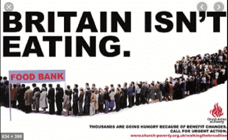
The first two pages have been short with information and did not want to go not a lot of detail within poverty. I did this so the reader would have to read on and want to continue to find out about UK poverty and ways in which they could help. Therefore the next page is “defining poverty” Again all the information is taken from full fact . com and this has been said in the type.

left hand page:

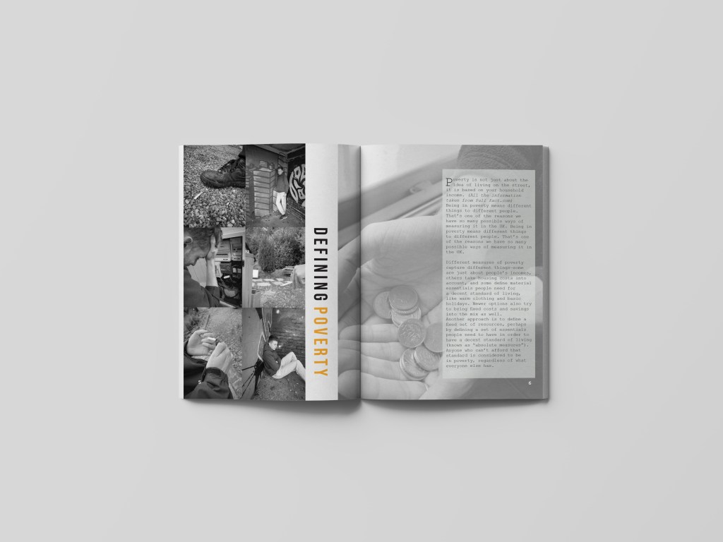
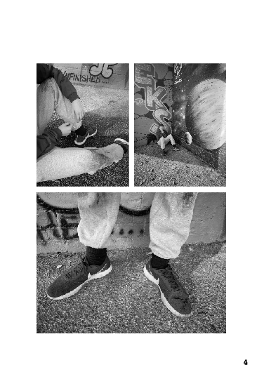
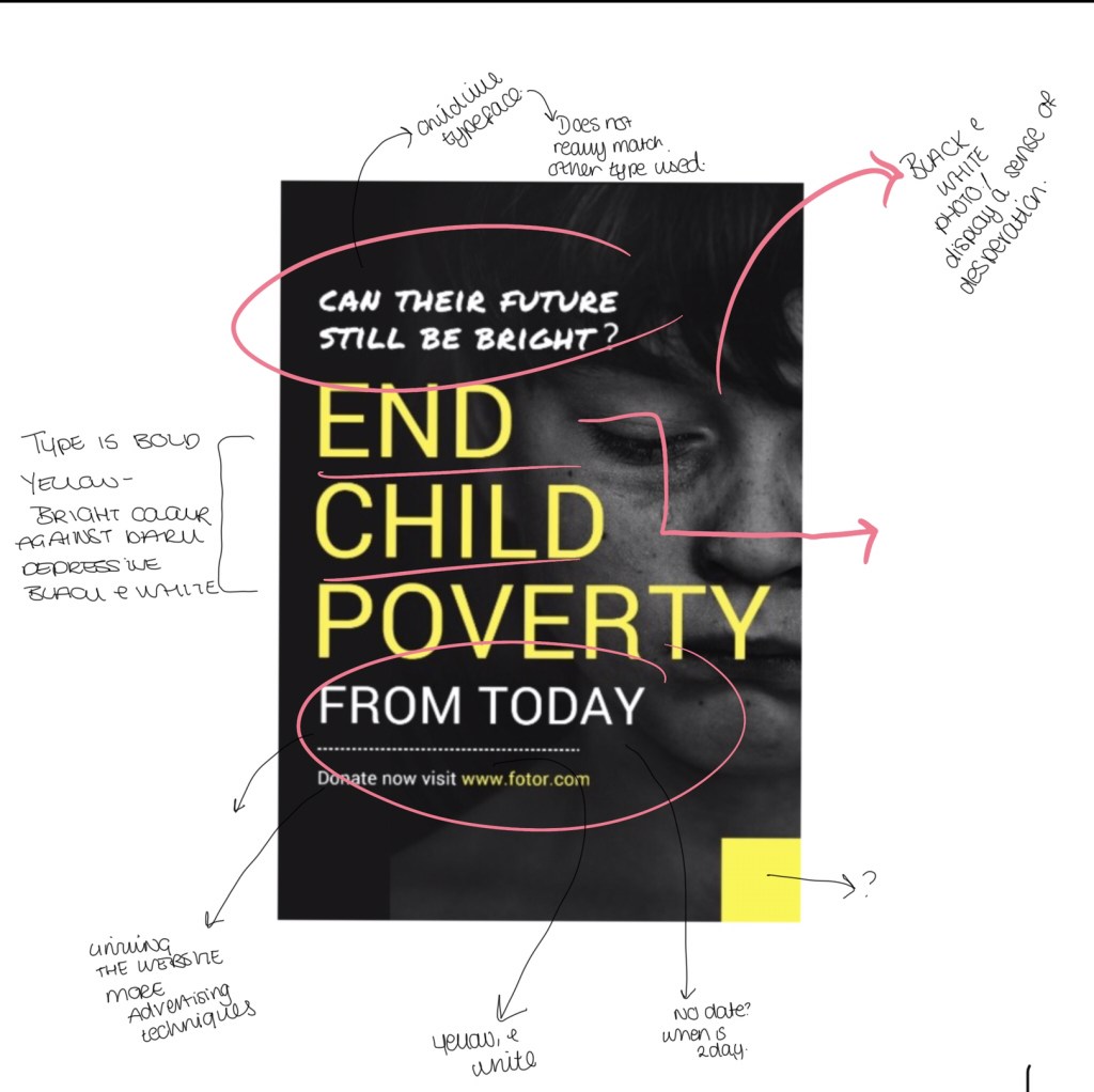
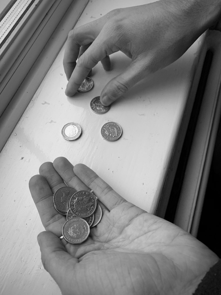
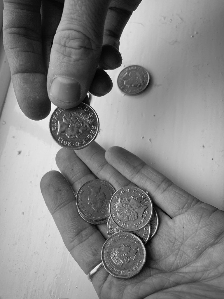
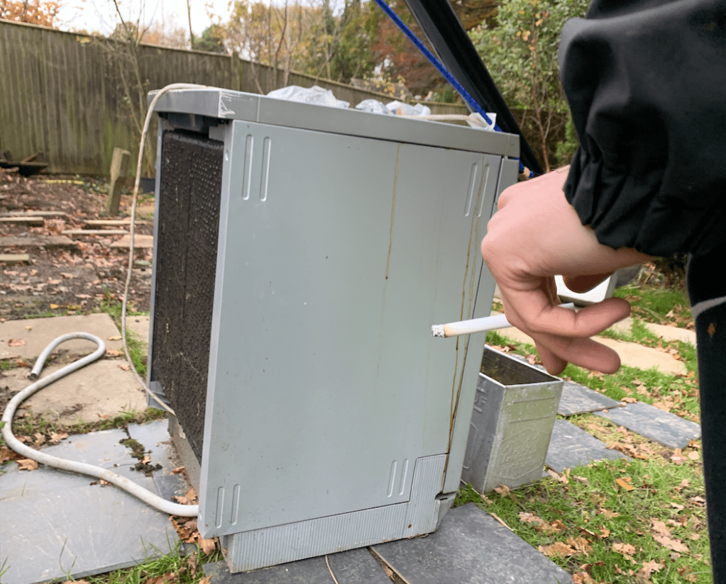
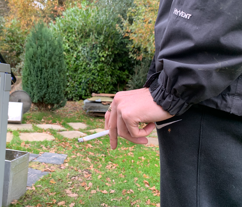
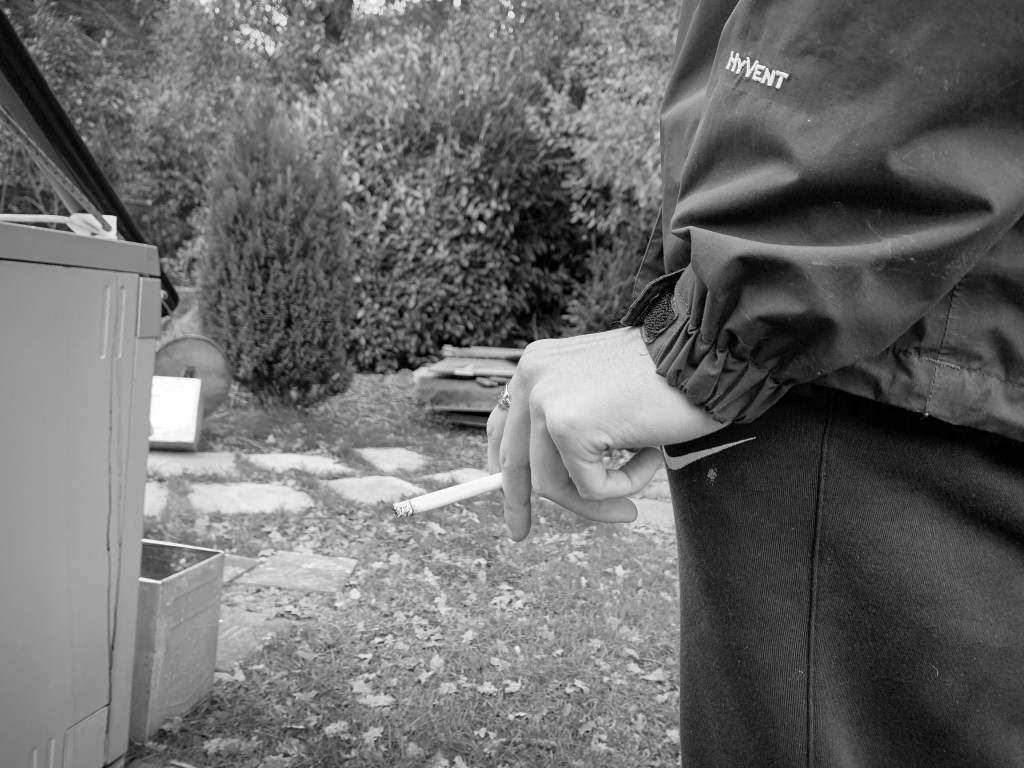
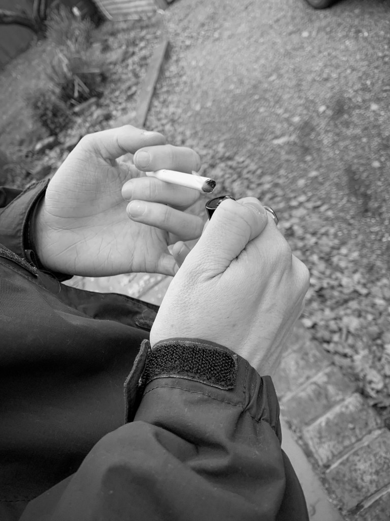
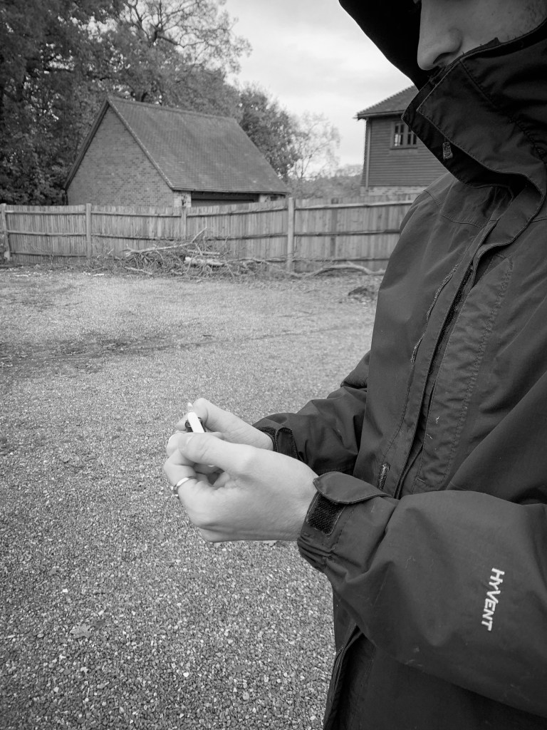
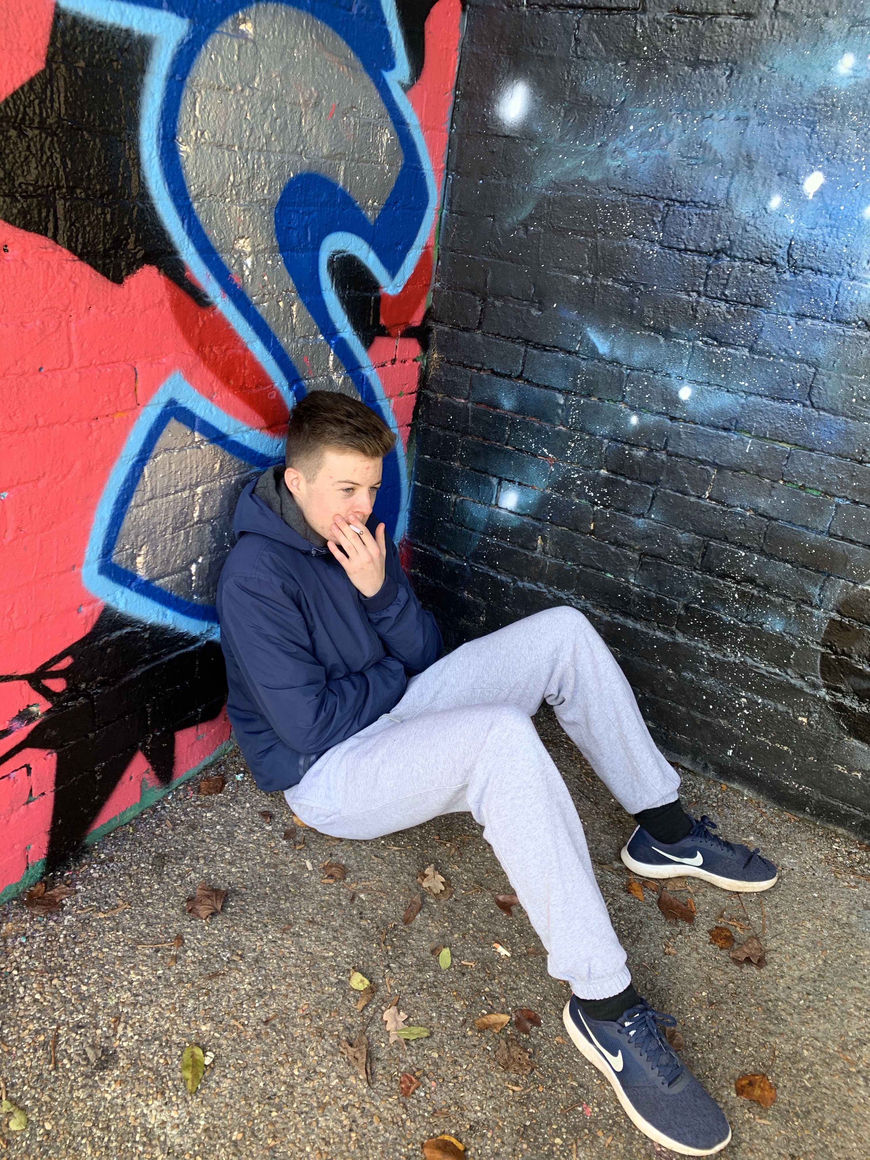
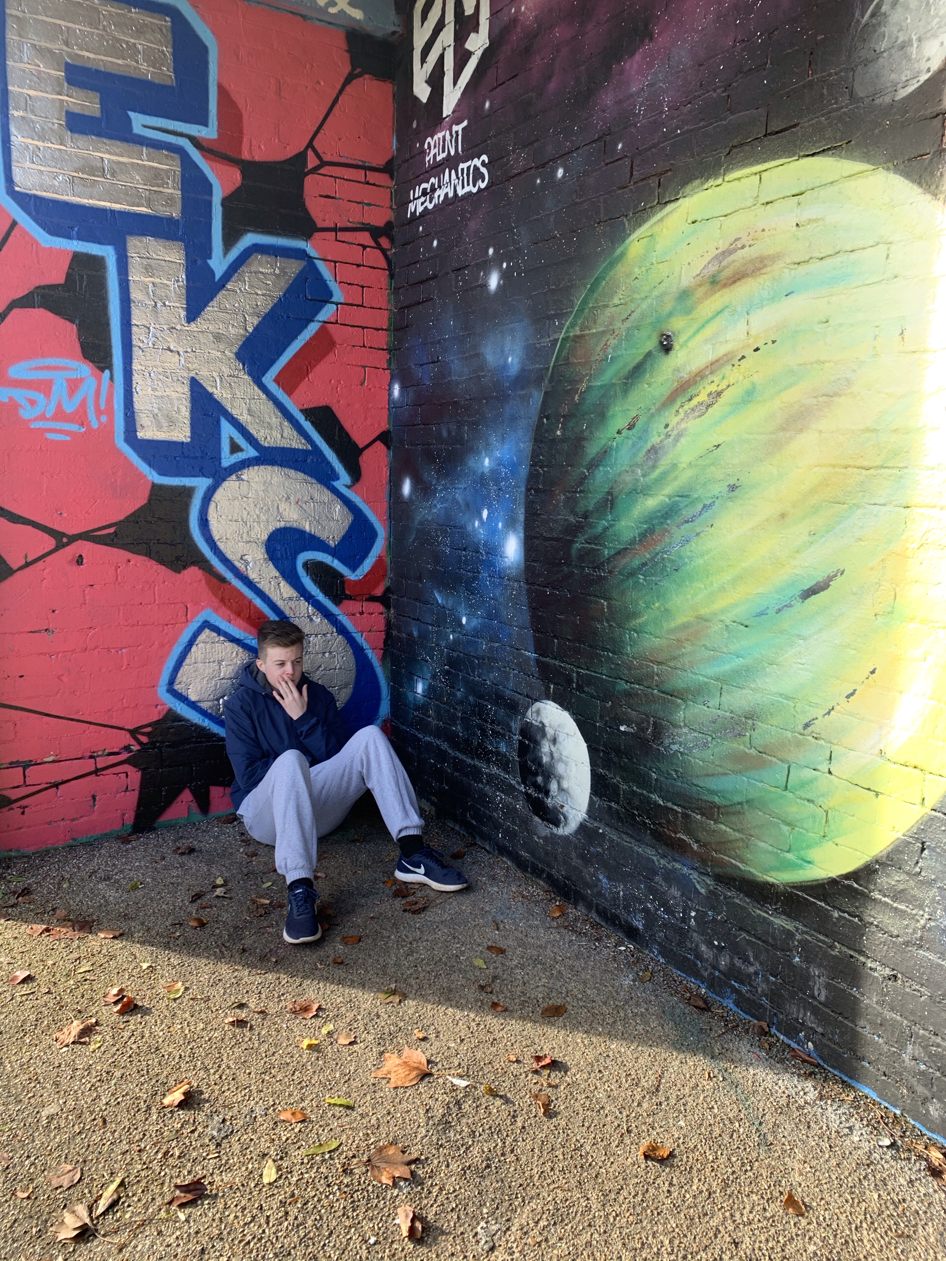
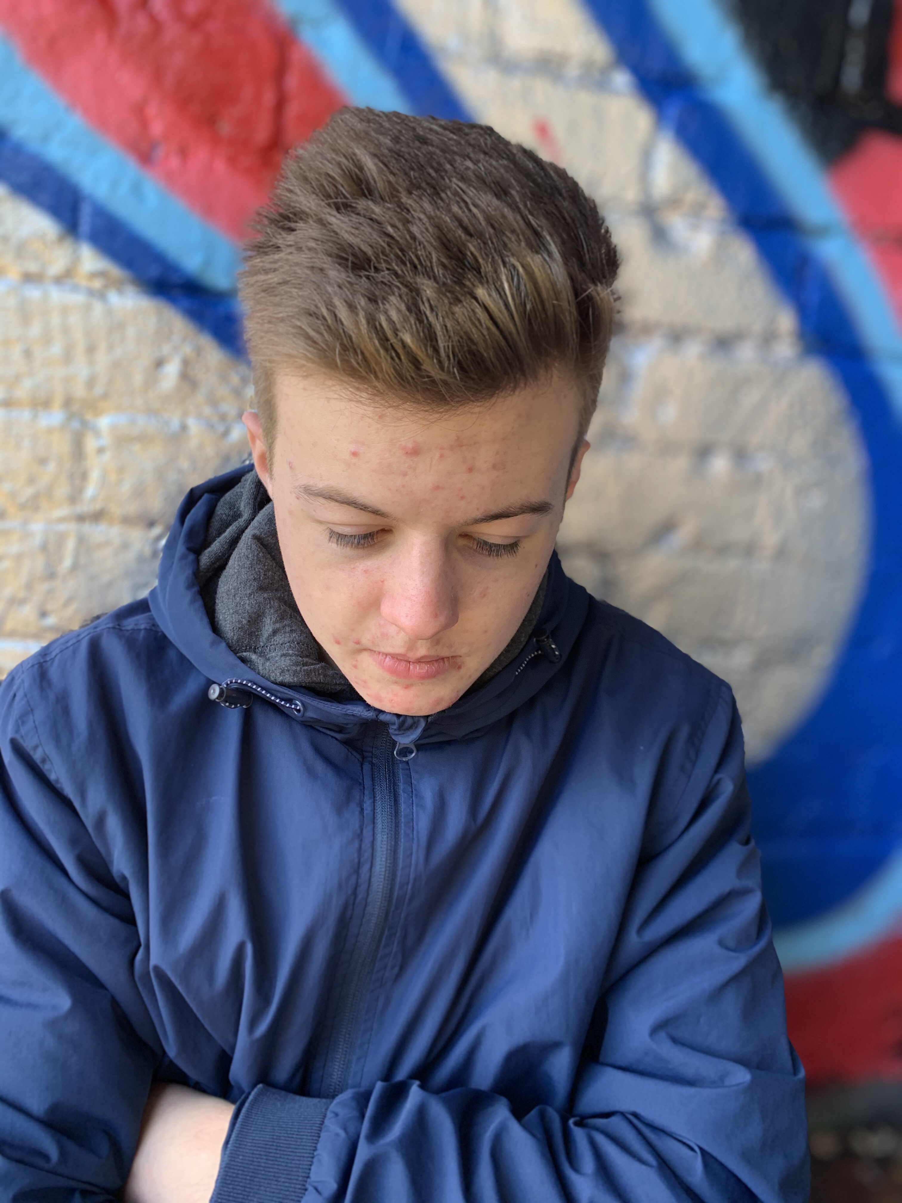
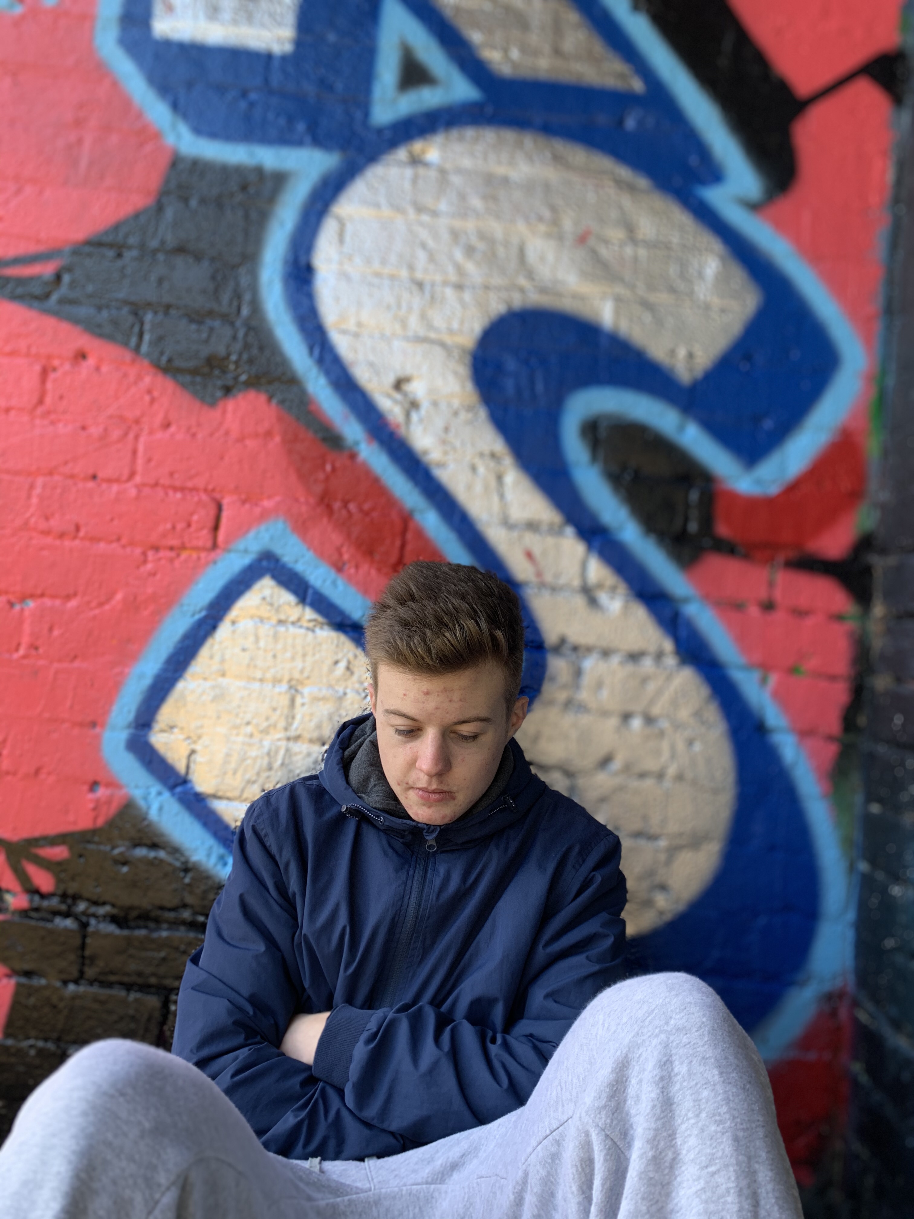
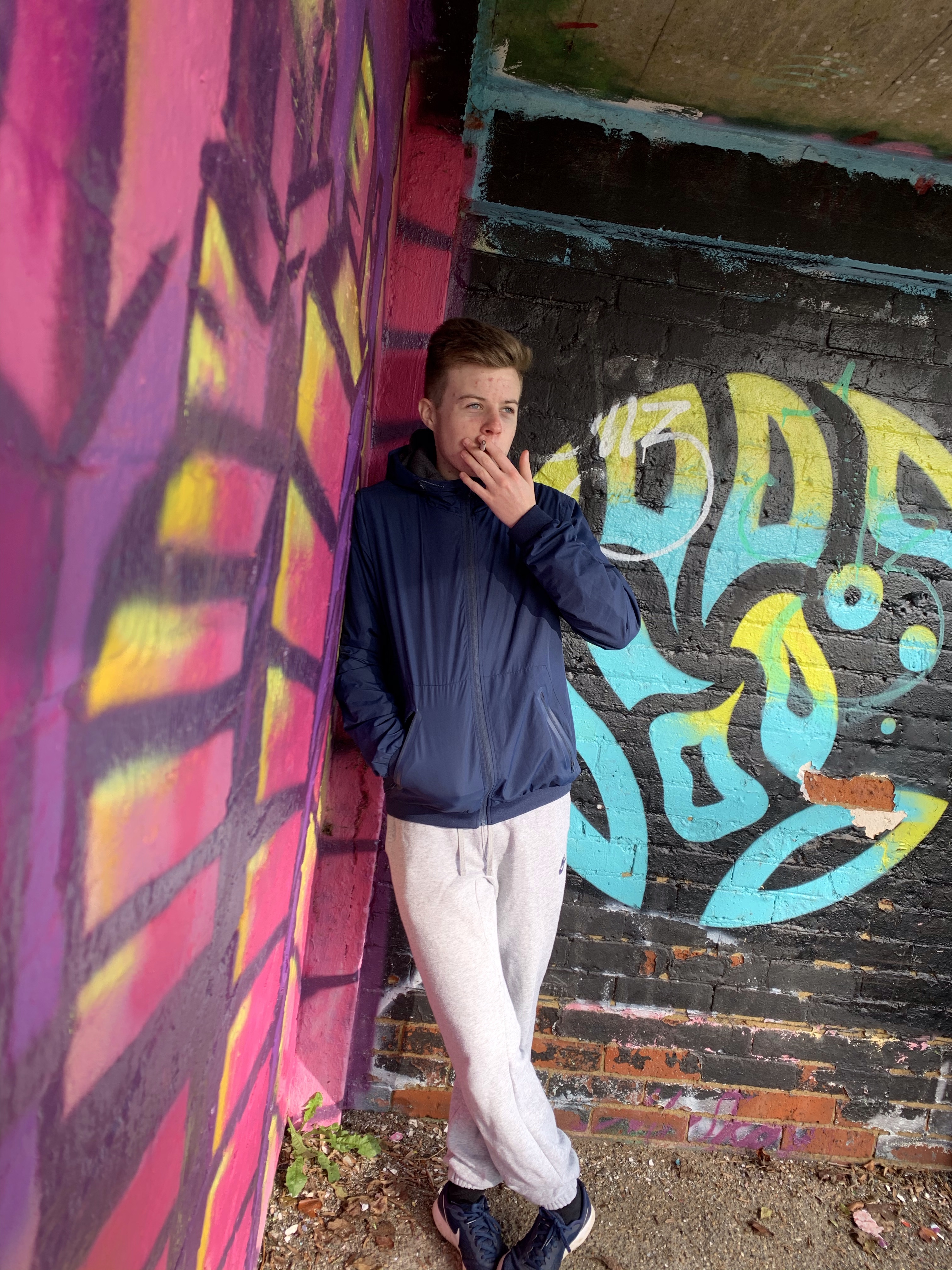
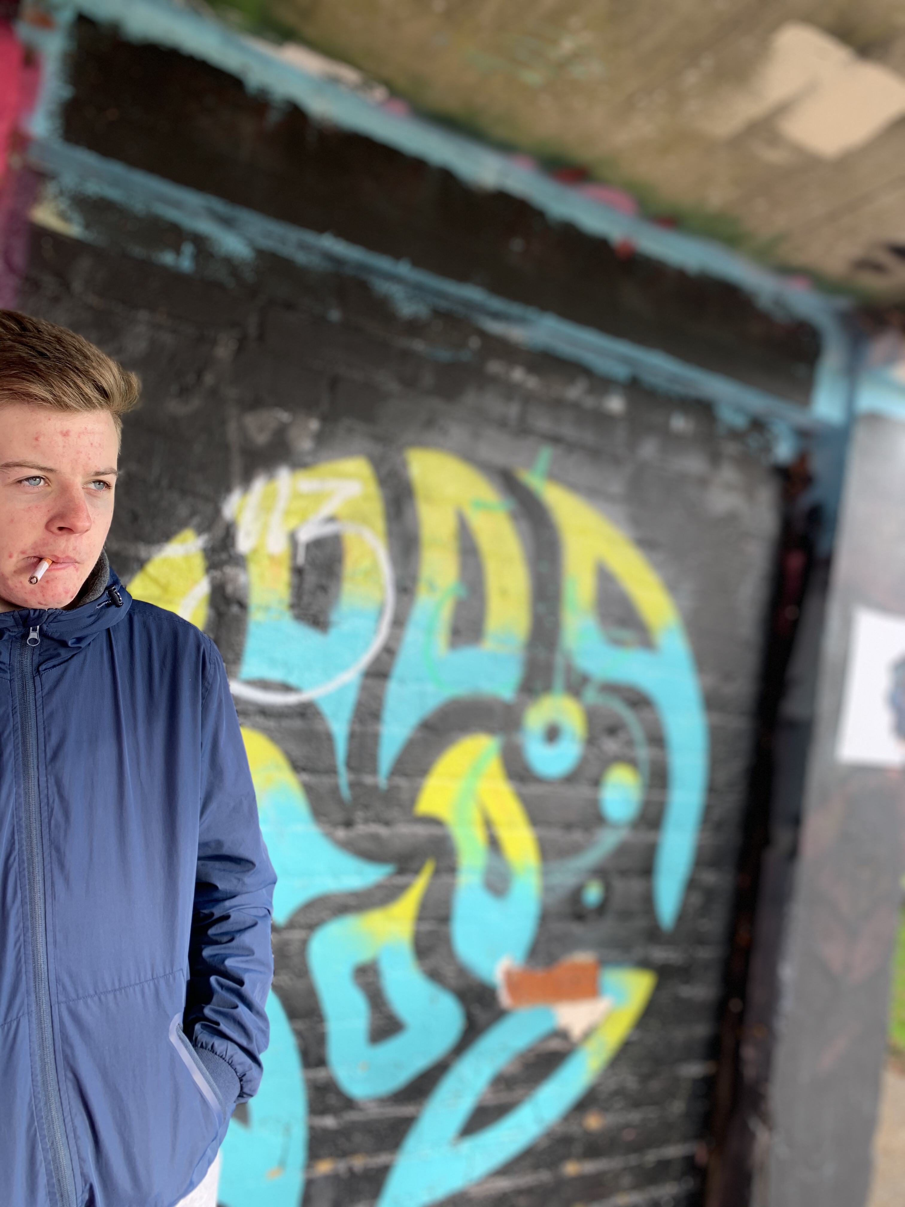
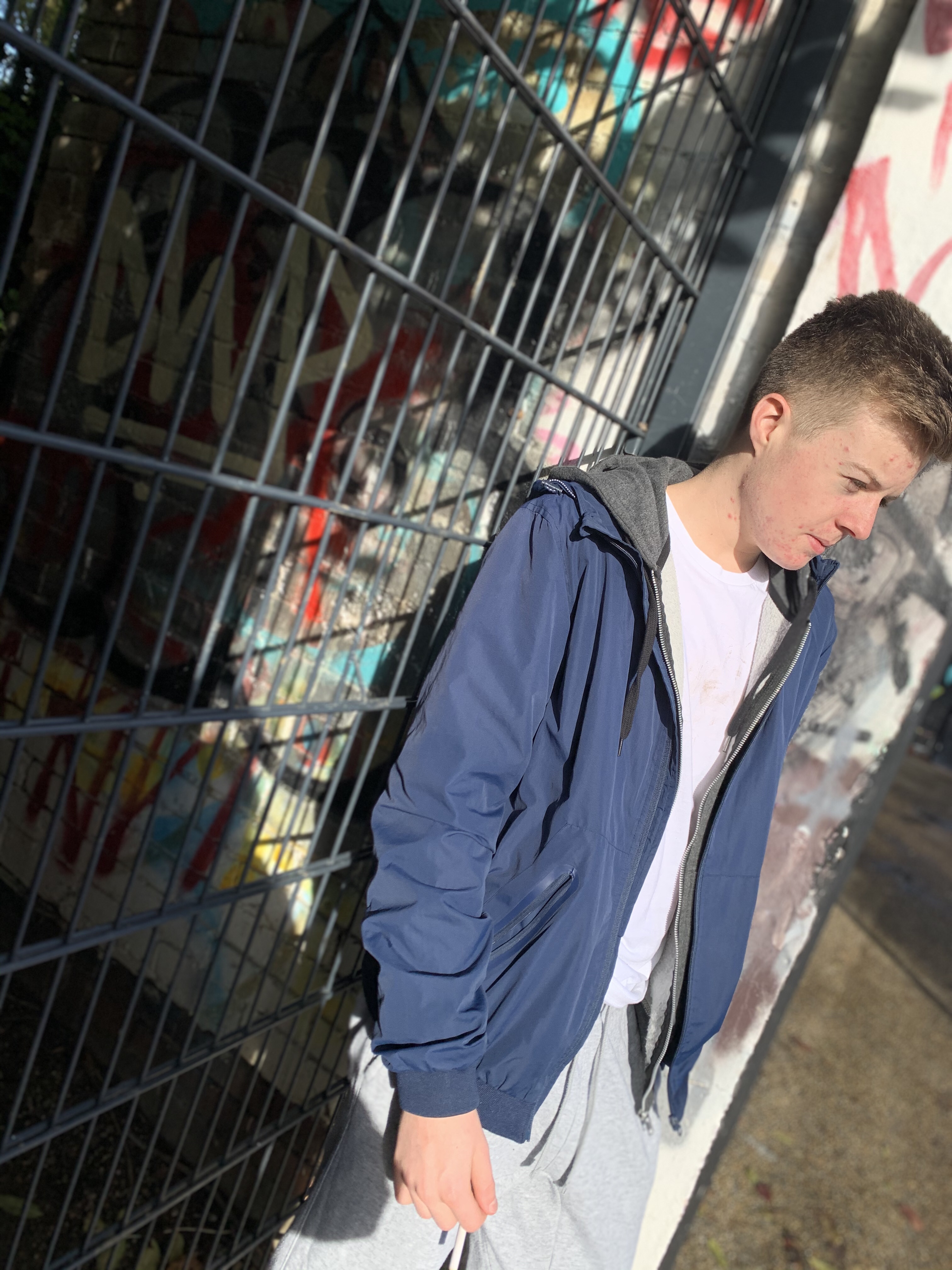
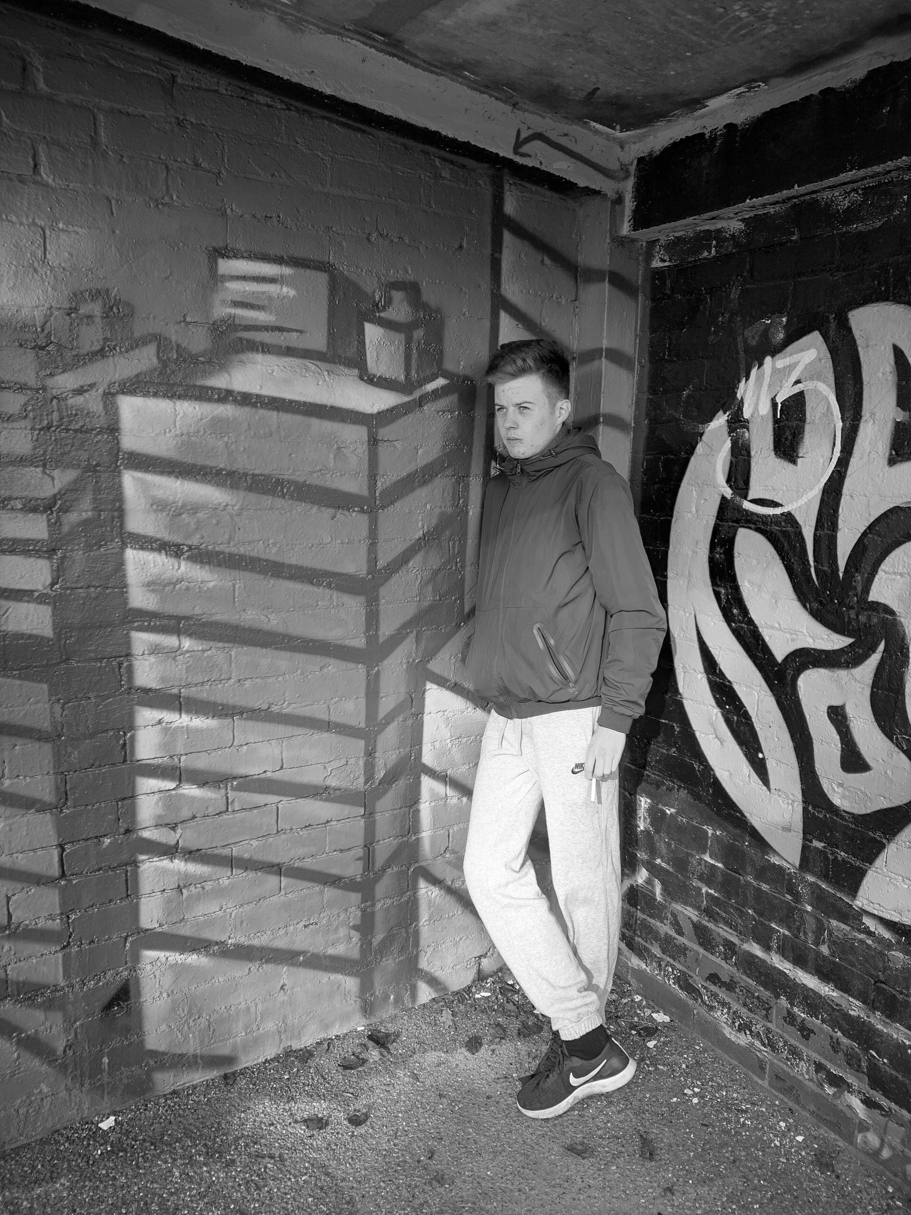
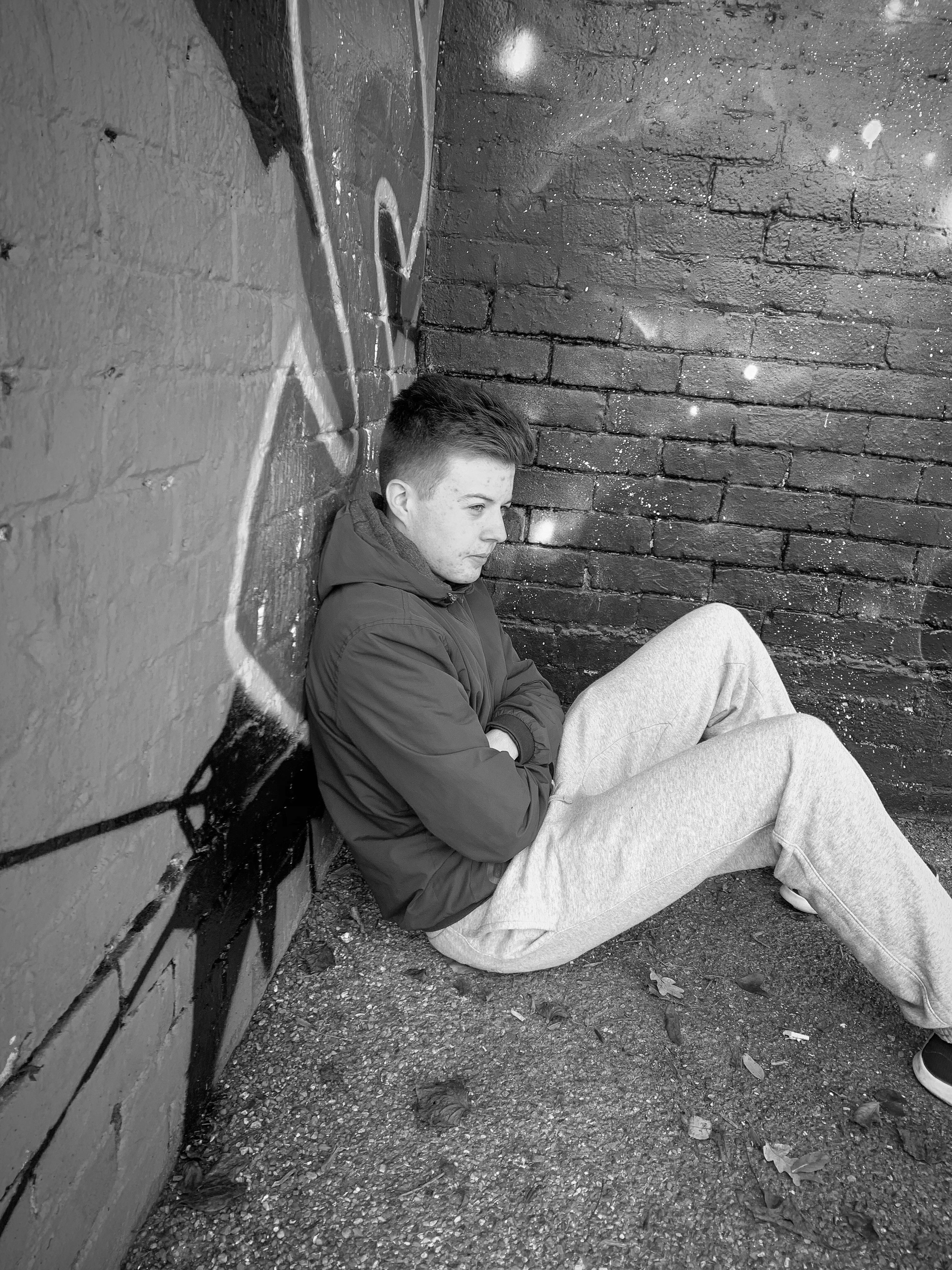
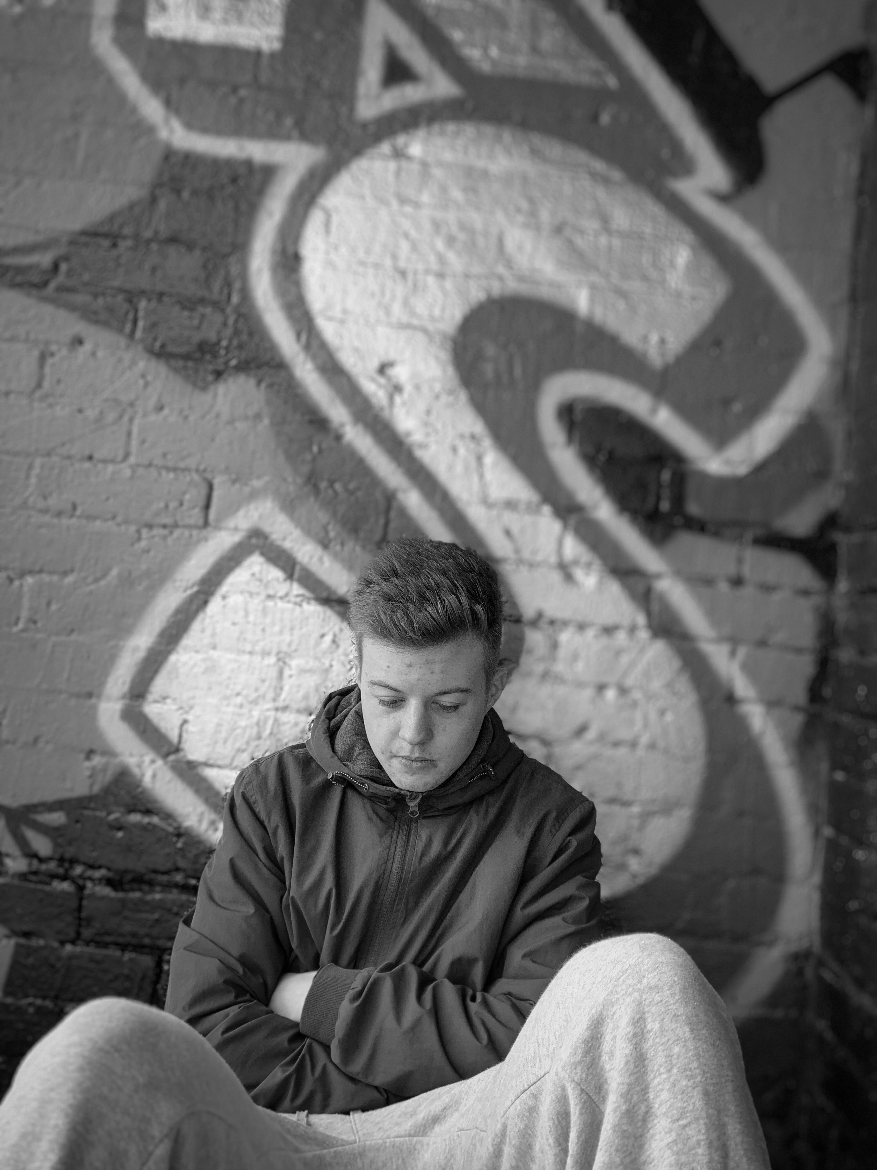
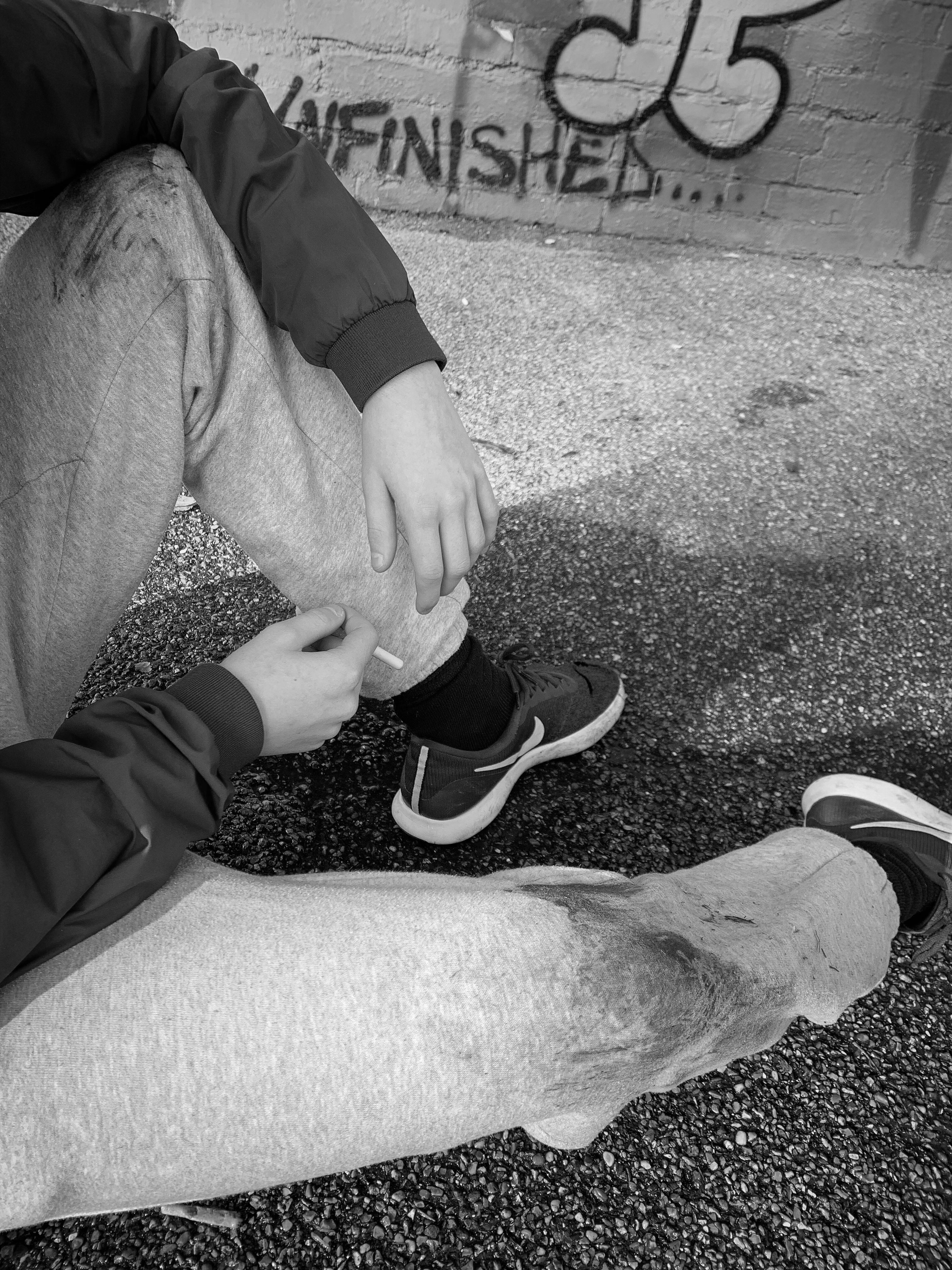
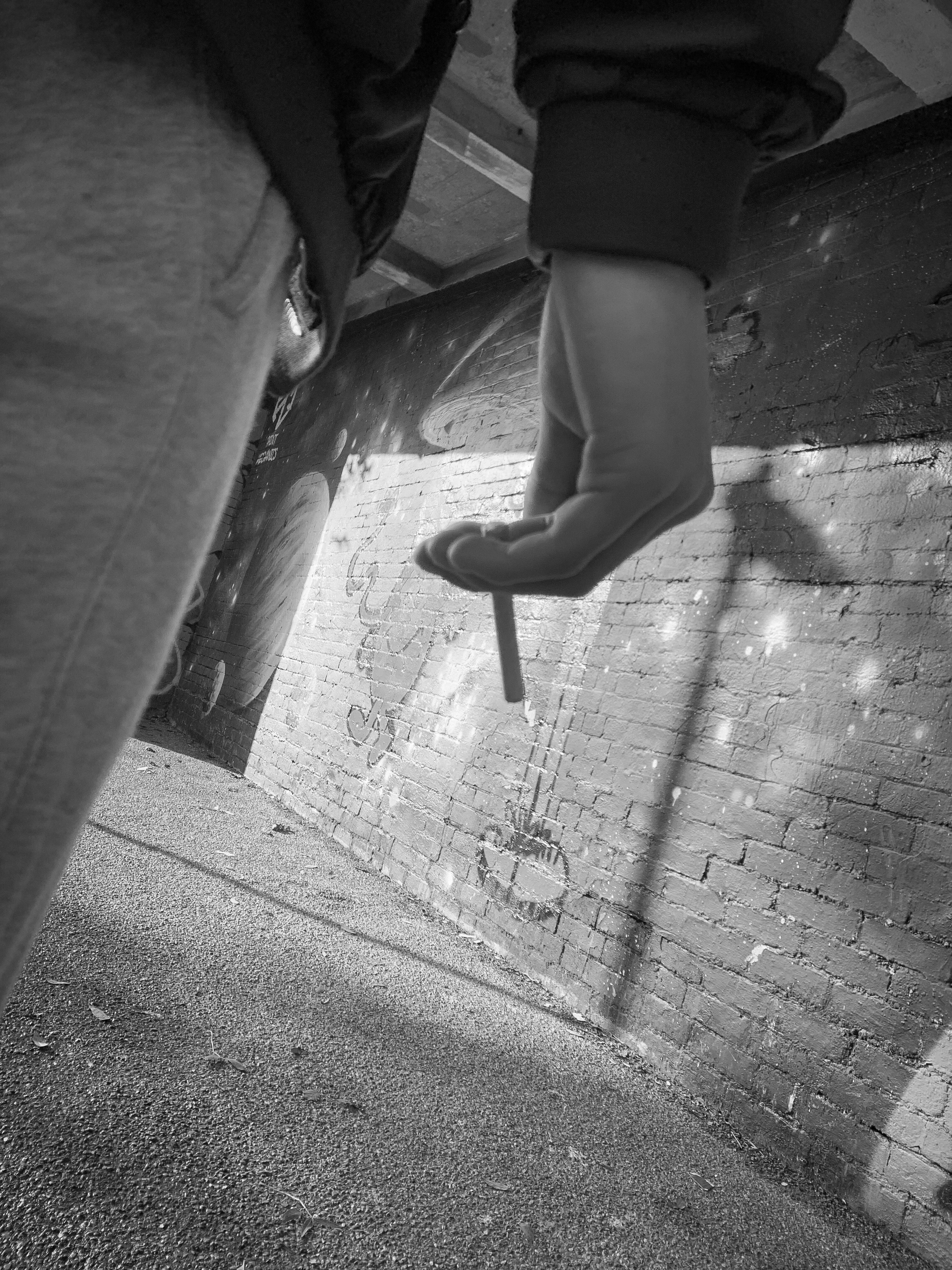
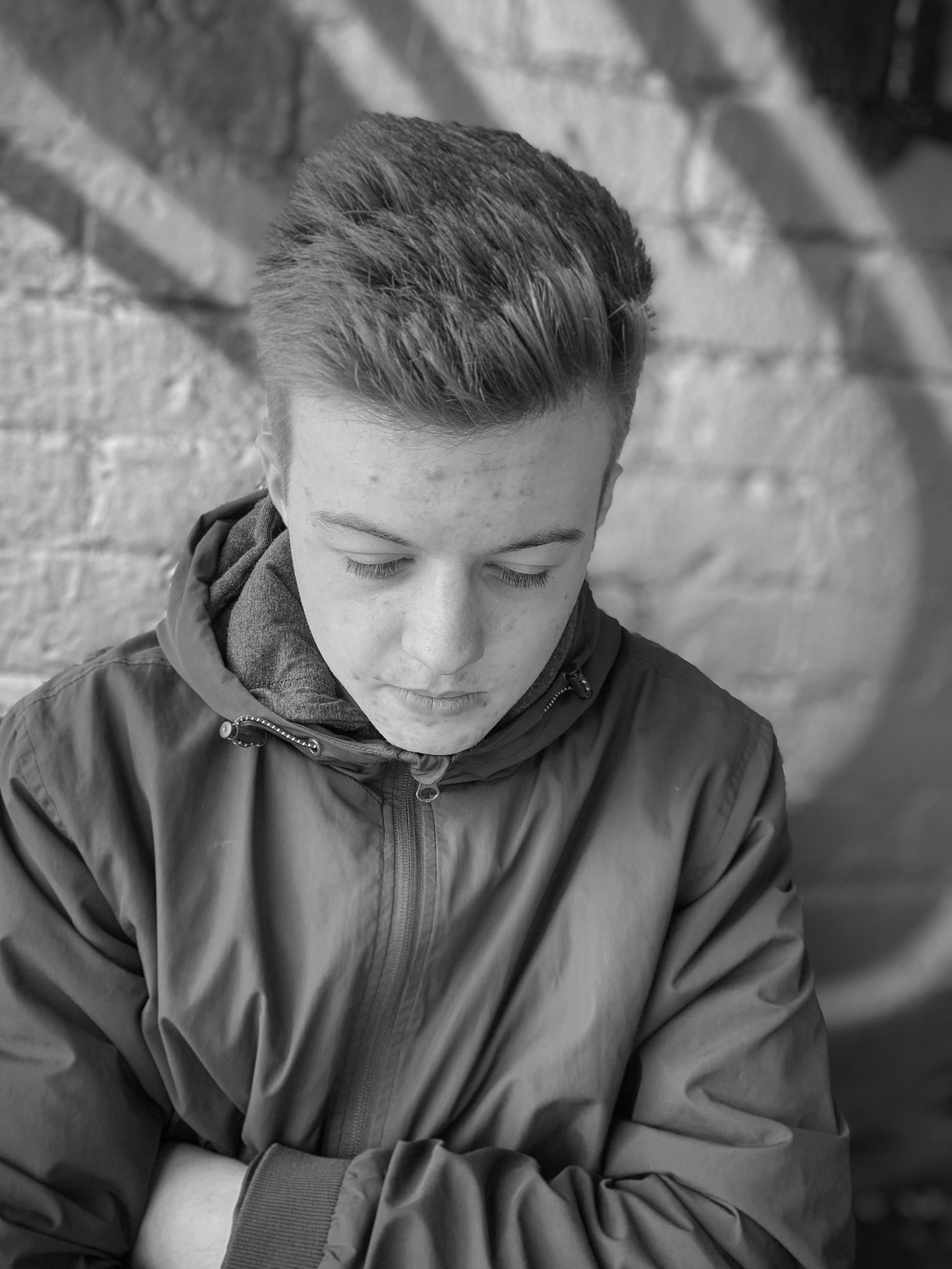
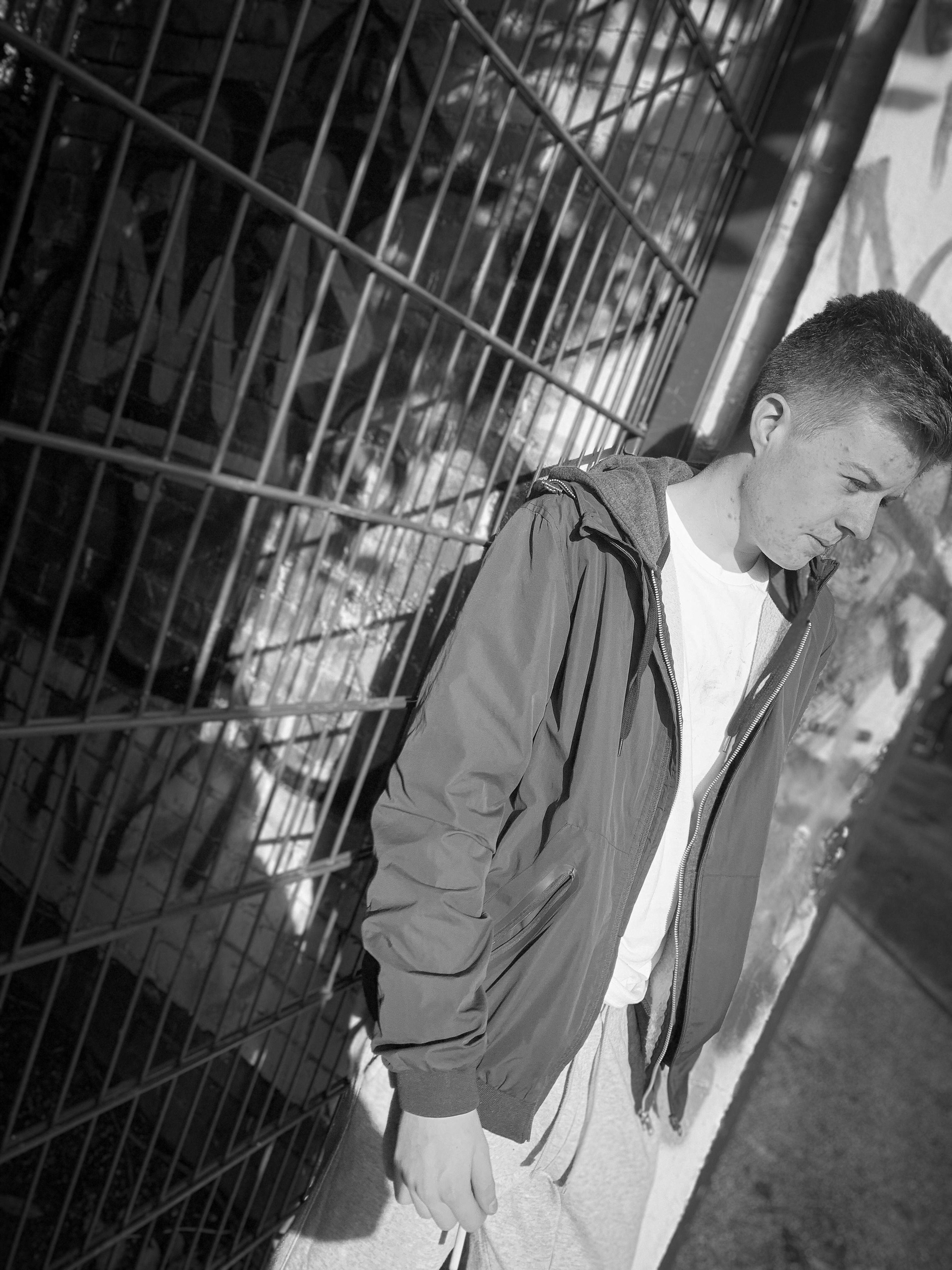
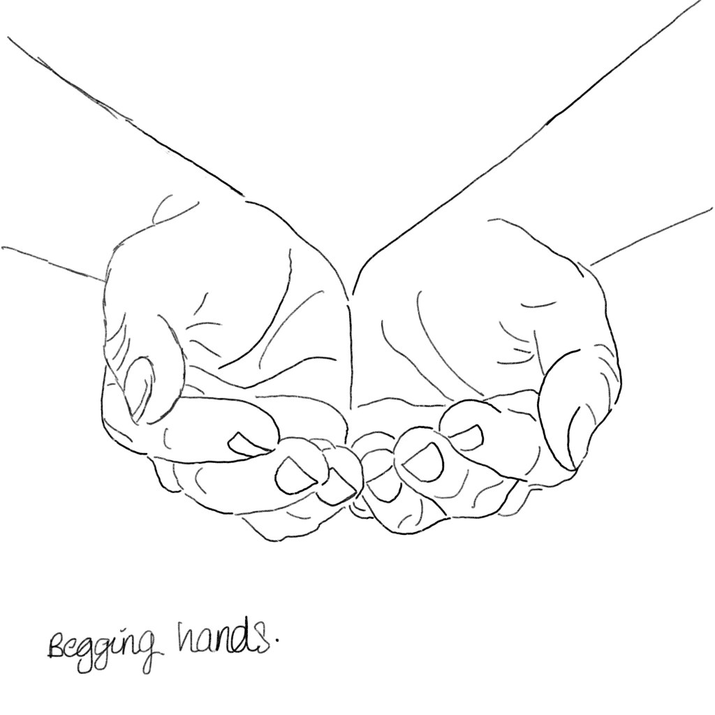
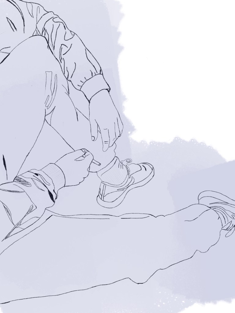
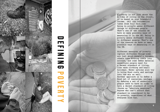
I wanted this page to be slightly different; meaning it would still have all the elements the other pages would have like the orange and black and white colour theme but the layout to be slightly different. This page is all about poverty and defining it therefore was a perfect platform to showcase all the elements that fall on the poverty line. On the left hand side I wanted to display a column of photographs that represented poverty within the UK and try my hardest to show case that well. I used the images that I felt represented the idea of struggling and desperation through photography… as you can see they are all black and white and the theme. At first I was going to make the entire left hand page a collage, but then felt as if it would become too over crowed in comparison to the other pages within the magazine already designed. Therefore, I stuck with the idea of collage but then moved the two columns right over to the left hand side so no gaps were shown, this then allowed me to have a bit of negative space left on the left hand page and follow through to the gutter to allow more images or text to be added. I am not sure if you can notice but when I screens hotted this to add It to my blog, I noticed a white gap that was between the two images which automatically made me change it. I did not change the design just made sure this white gap was gone (however I already did mock ups therefore had to change them also) this made me realise I NEED TO DOUBLE CHECK EVERYTHING!!!!!

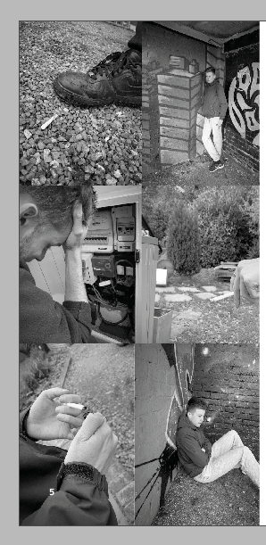
this is the updated one without that annoying white space between the two photographs at the bottom just to showcase that. I made them slightly thinner and this then made the white space disappear and no longer annoyed me.

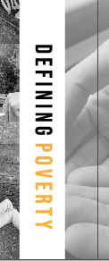
I then thought about making the title slightly different in comparison to the other designs. This page was different already due tot amount of images used so why nit make the type slightly different. I enjoy making posters and editorial visualise that are unique and different and that’s what Made me design this editorial spread like this. The aim was to make this page more about the photographs, therefore I did not want the type to over power that. by making two column collage it enabled me to create negative space between the left hand page and gutter and this then made a perfect space for the title. The type spaced BEBAS is that sort of typeface that can be read from any positioning therefore this made me want to alternative the positioning. With the negative space it worked so well and was readable still. I made the working defining in black and the world poverty in orange to follow the colour scheme that follows through the magazine. I was worried this would not be seen but it breaks of the images from one another creating negative space, and does not make it over crowded giving it that minimising effect.

I could of easily left white negative space over the gutter to the next page, but I felt as if this was then separating the two pages and not continuing the story. due to layout of text I thought it would be appropriate to put an image over the gutter next to the text following through to the next page. Within the image below, you can slightly see this image coming over the gutter and links the pages well together.

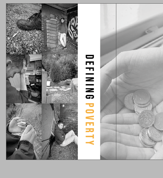
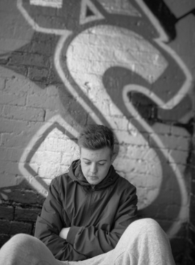
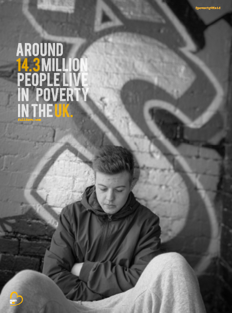
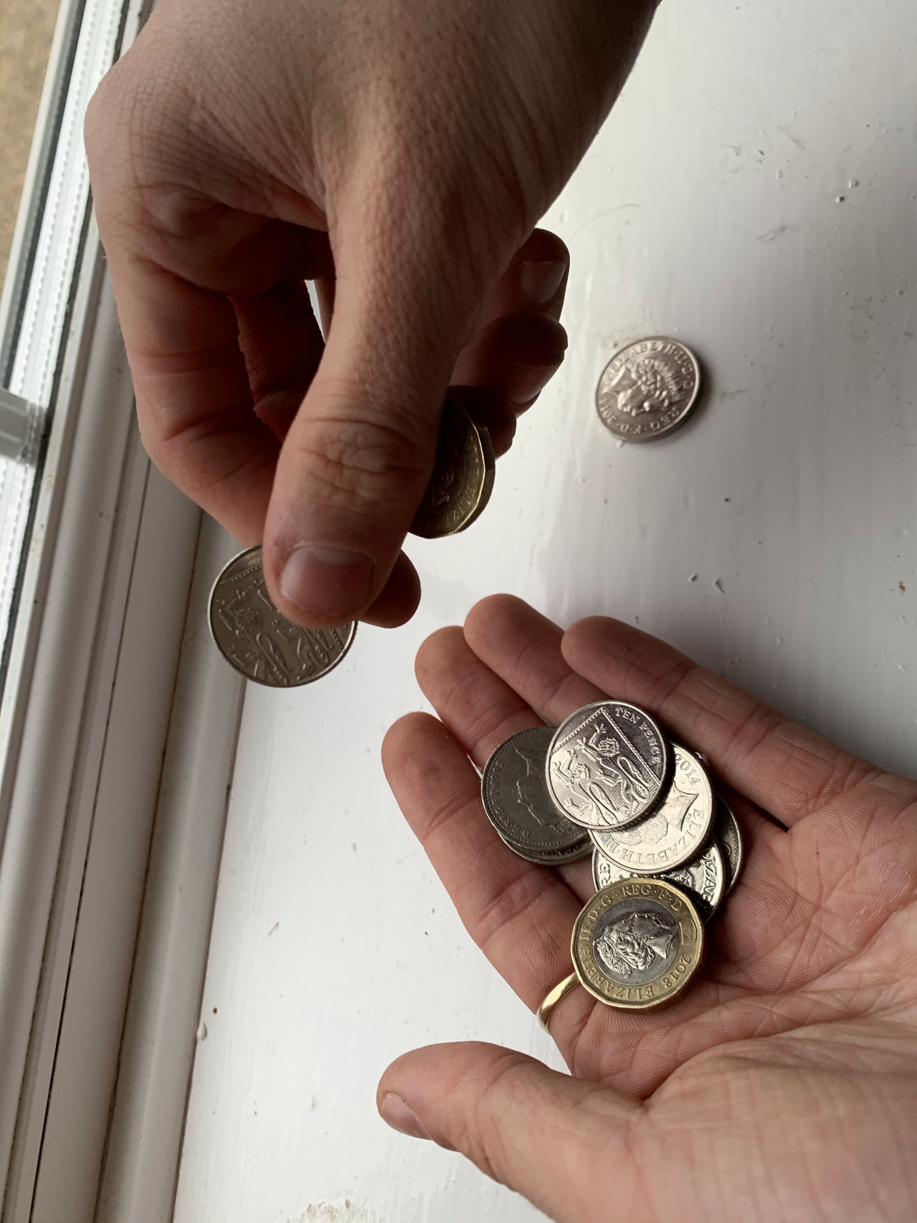
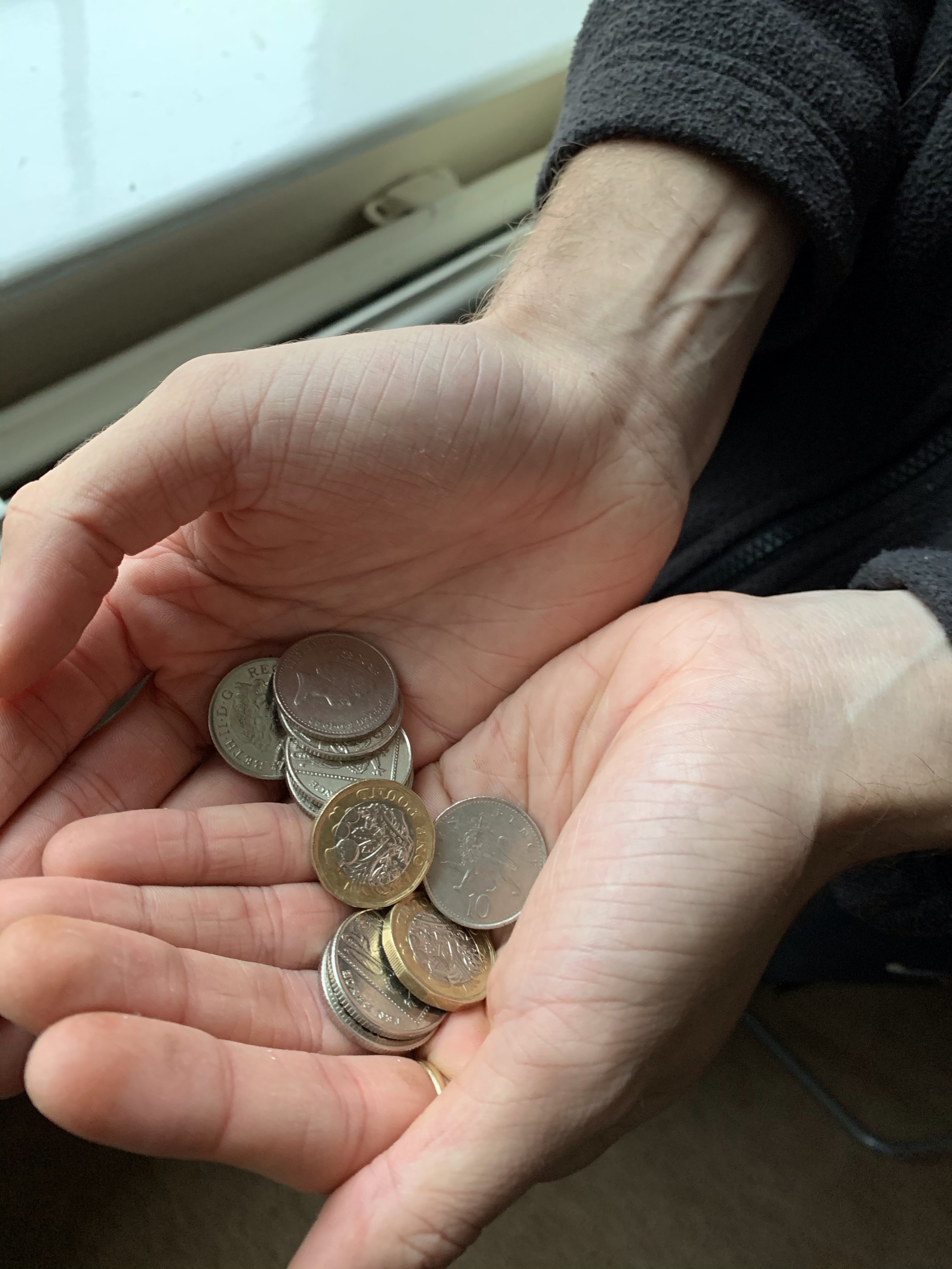
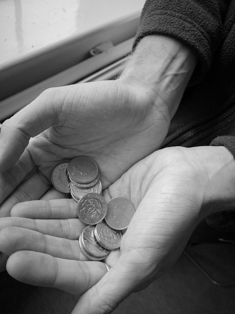
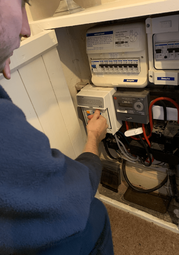
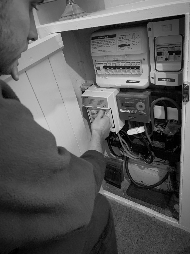
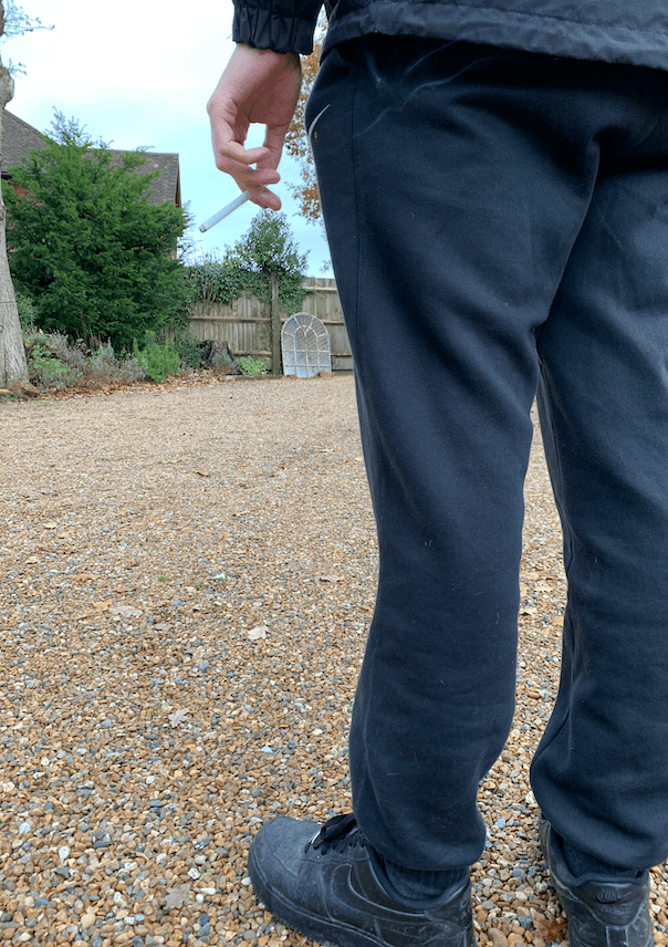
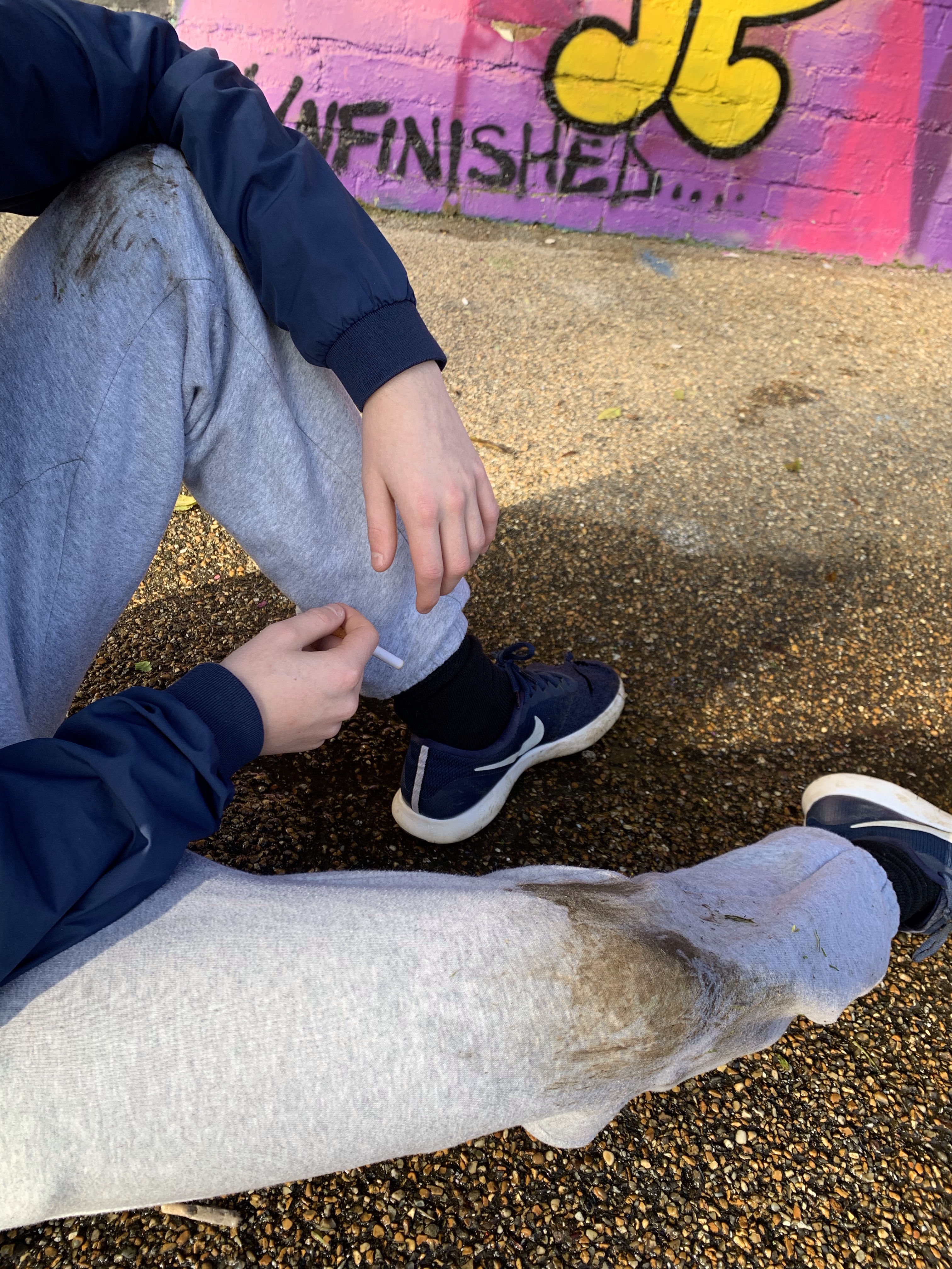
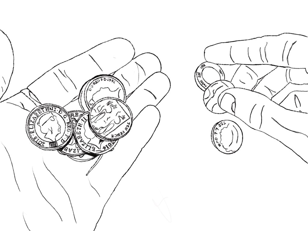
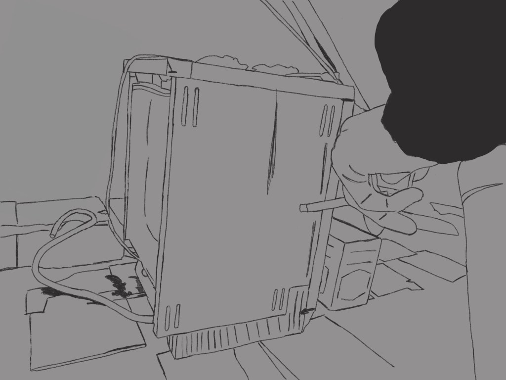
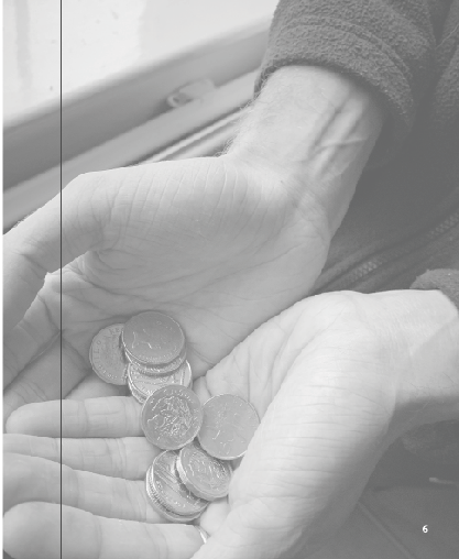
On the right hand side I wanted the entire page to be filled with an image and then the text to sit over the as this page was all about portraying life in poverty. Out of all the images I had taken one stood out to me the most, and that was the money holding, it represented the idea of living on what you have and not beyond your means therefore thought it was a perfect choice of larger scale image to fill the page. Because, I knew I was going to add type over this image I lowered the opacity to around 70 so the image could still be seen but did not contrast against the writing. I was worried that it would look weird lowered just because the other photos were not but I actually think it worked well and they told different stories but linked together through their meaning.

Adding type:

The type was an issue, but I got there in the end it just took a few stages to end up with it. I wanted all my information to be from the same website and source therefore again it was from full fact.com.

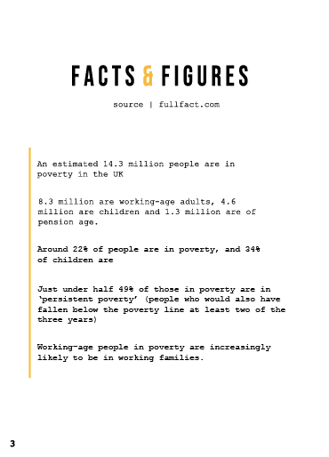
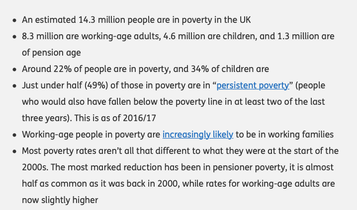
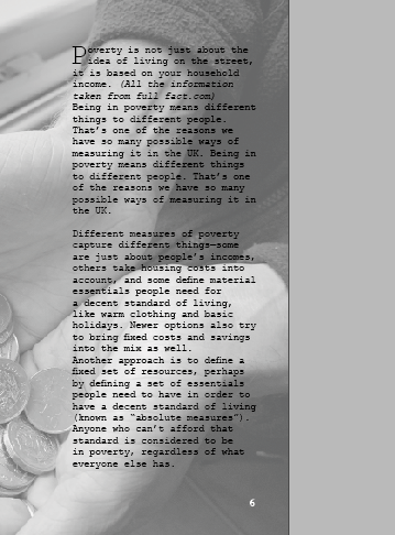
Poverty is not just about the idea of living on the street, it is based on your household income. (All the information taken from full fact.com)

Being in poverty means different things to different people. That’s one of the reasons we have so many possible ways of measuring it in the UK. Being in poverty means different things to different people. That’s one of the reasons we have so many possible ways of measuring it in the UK.

Different measures of poverty capture different things—some are just about people’s incomes, others take housing costs into account, and some define material essentials people need for a decent standard of living, like warm clothing and basic holidays. Newer options also try to bring fixed costs and savings into the mix as well.

Another approach is to define a fixed set of resources, perhaps by defining a set of essentials people need to have in order to have a decent standard of living (known as “absolute measures”). Anyone who can’t afford that standard is considered to be in poverty, regardless of what everyone else has.

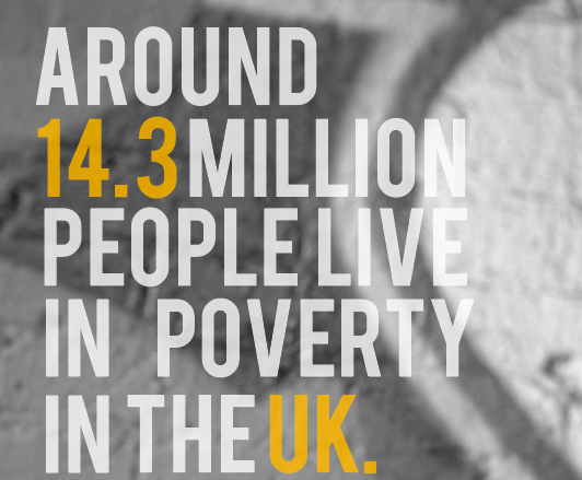
SOURCE FULLFACT.COM/POVERTYUK

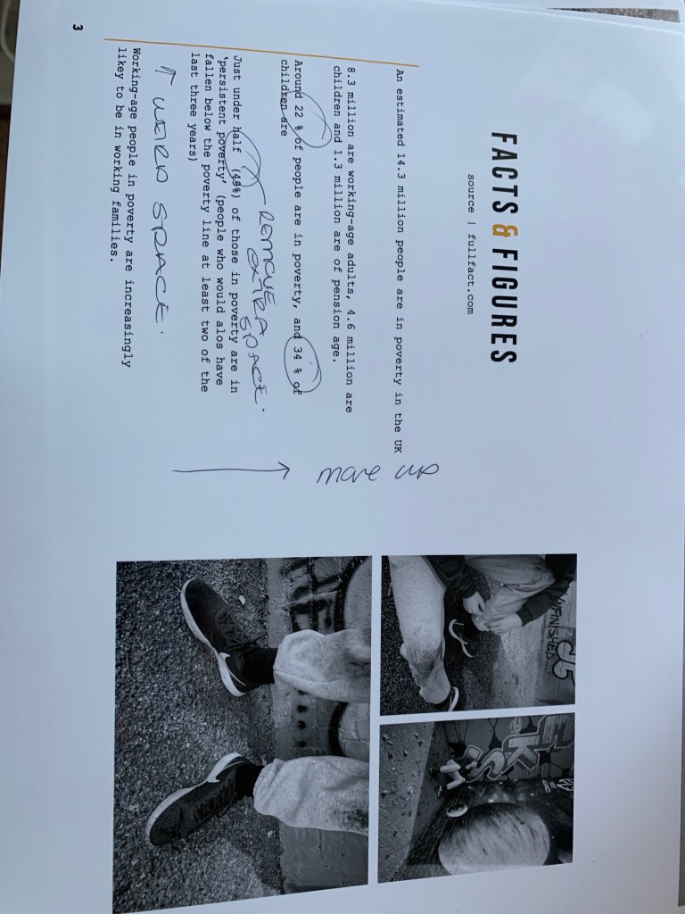
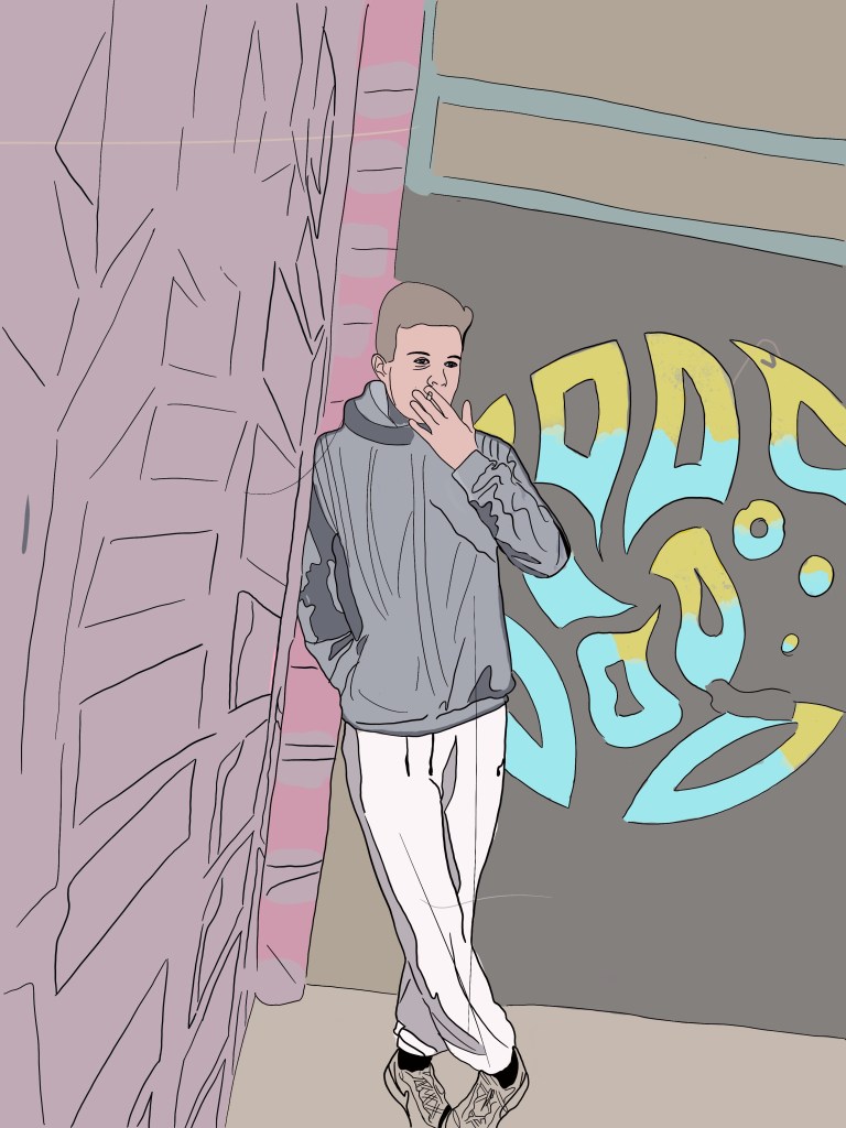
This was the first attempt of adding type to the page. I really wanted to use a drop cap due to research I had found and to me they make the text stand out so much more so the reader wants to find out more about what you are discussing. I made the type sit in courier and followed a column structure like magazine portray within their designs. However when we had the critique one of the comments was that this was hard to read in the mock up and the editorial design therefore I created a test print to see if that was the case.

test print

Below is an image on a4 the printed editorial layout on this page. I wanted to see if the writing was hard to read. and it was. I positioned this design in different places and stood away from it then close up to it and it was difficult to read on both aspects. I think it’s because the picture is black and white, and the type is so thin and small they contrast with one another. I showed this to my tutor and she suggested adding a block like some of my other pages and see bow that would look therefore I did just that and thought it worked 100000 times better for the reader to visualise and understand the writing.

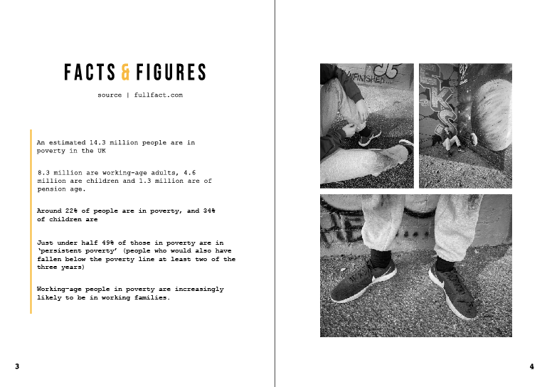
I decided to add a lower opacity white block behind the writing – and automatically this made the type stand out and become more easier for the audience to read. I could off easily made it a solid white but then yo would not see elements of the image as much and would clash with the rest of the design.

Final editorial design:

Below is an image if the final editorial design. I think this design works so well with the message I am trying to portray which is poverty in the UK. The photos on the left hand page are an indication of what life is like for the everyday person struggling with the small things some of us take for granted. I think the type in the middle separates the two images but weirdly connects them together well. The page indicates sensitivity to the topic and does not portray any stereotypical images that surround people in poverty. The image on the left also portray more than one person, as I wanted to ensure I was displaying what life is like through a variety of people not just one person, I also think not using the same image twice makes it stand out a lot and not a relative element going on in the design.
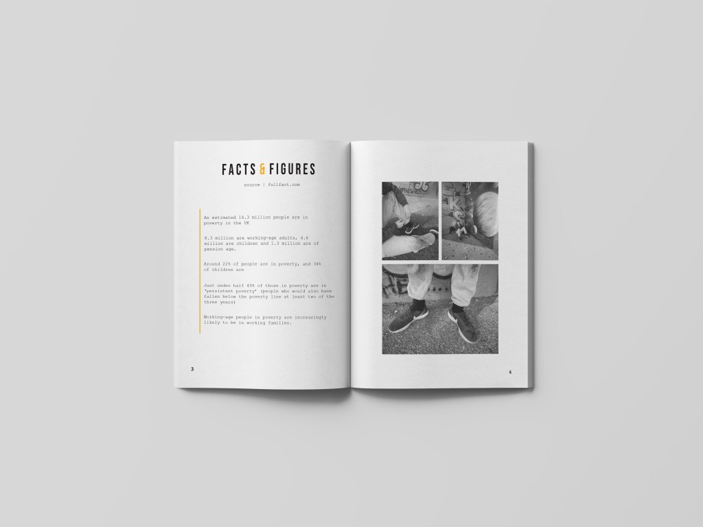
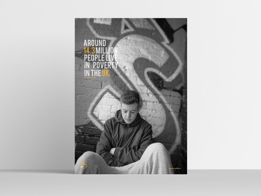
Mock up of design

Like all the pages I wanted to create a ,mock up for the audience to see what this would look like when featured in a magazine spread. When looking at this mock up you can see all the key elements well and they all tell a story in their own way but connect well with one another. There is a lot of imagery going on but its not too cramped to the readers eye. Having the image on the right be more lowered in opacity makes the page present more sensitivity towards the topic and not too in your face filled with images. The title works so well when featured in the spread, and this is due to the image on the right going over the gutter allowing the type to be seen well.

Open Magazine Mockup by Anthony Boyd Graphics

Magazine page 2

APP - finals, APP everything

The next page is displaying facts and figures within poverty in the UK. I wanted people to understand what it is actually like, therefore hitting them with facts and figures makes it more real and the facts are quite astonishing.

Again, the features are similar within the previous page. On the bottom of each page is the number, which in this case is 3 and 4 and is sat in the courier type face once again. The left hand page believe it not took the longest to create and this was due to the bullet point type feature within. However, firstly let’s discuss the title. I wanted the type to be short and sweet, and the title to be informative and eye catching. Therefore, decided to use the idea of spacing BEBAS again, (this to continue through the magazine design) but have the & sign in orange to make it stand out more. I did try it being black and the words being orange however it looked very tacky, where-as this design works effectively. Just like the posters I wanted to indicate where all the facts were from, so people knew they were true facts, therefore underneath the title sits the source that sits in the courier type face.

The issue I had with this design was the way in which I should lay out the type, within magazine I did not feel as if I should use bullet points because it made the design look unprofessional. It took a lot to make them change to the way they are now; but I noticed as soon as I added a guideline (the orange line going down the side) it made the design structure a lot better. I made sure the type didn’t go near the gutter as this was an issue when placing it into the mock up. I then made sure there was enough space between each sentence so It looked clean and even.

There are so many facts and figures that surround UK, poverty therefore I wanted to make sure I was portraying the correct ones and the post important ones for people to take action to help. All the facts have figures in them to relate to the title.

Sometimes with magazines about a certain topic, they over power the design with information therefore people skim the page and do not pick up key information. Therefore it was crucial for me to provide information that was easy for people to access and want to read. I wanted the design to show negative space and only portray the important facts clearly which I think they achieve well.

With the right hand page I was inspired by the image found on Pinterest. (bottom image) I loved the way they used collaged with the photography but made it so simple and not over crowded. Therefore wanted to use this within my design on the right hand page.

Comparing it the image before, you can see that it is slightly alternated in the way it’s displayed due to the photos I had to use. The top two photos represent the subject sitting down, and the focus on all these images are the clothing, indicating he is wearing the same shoes for a long time. I thought I have used a lot of imagery so far that’d displays emotion of the face, it was time to show case materials and other objects and surroundings that represented poverty. I think this design page is so clean and slick and show cases It in an effective way. The white lines that gap between each of the photo let them be individual photos but they come together well due to the layout and black and white theme.

test print

The test print was a great way to visualise any errors that occurred through my designs. When I printed this page I noticed a lot in comparison to when looking at it on screen. I am not sure if it is clear in the picture below however I noticed errors within the type when printing that I did not notice on screen, and analysed them on the printing page. There was a lot of odd spacing between percentage signs and number, and spacing between words. The space between each sentence was slightly off and the writing did not match the alignment of the second page. I then used this to re create the page and adjust the elements that needed adjusting and created it to fit in with the final mock up.


This is the final design before adding it into the mock up. I think it is clean, effective and really grabs the readers attention. I wanted the design to follow through from the first page, and it does so well. it has the same cleanest about it, the same us elf black and white photos and the same colour scheme. I was worried how I would lay out certain photos and I think this simple layout makes the photos stand out well and you are able to locate and identify each photo and realise the story they are trying to tell. The audience, can easily read the writing and get an understanding of the facts and figures that surround poverty in the UK, and I think this is due to the fact its not a over whelming page fill of information and imagery it still incises the reader to continue onto the next page.

mock up

Below this is the mock up of two the pages would look when in magazine. For some reason the facts and figures a lot higher and however when you look at the spread above thats what it looks like its just added in unusually through the mock up. I think the design, portrays the sense of sensitivity around the topic, it does not bombard you and portrays the information clearly to the audience. I personally think the negative space allows the photos to take charge within the design and allows the page to tell a story.

Open Magazine Mockup by Anthony Boyd Graphics

POSTER DESIGN 1

APP everything

The first poster I designed was a. trial and error to establish whether or not it would work as a design concept.

Before designing anything I looked at full fact . com and this is where I accumulated the majority of the facts that are portrayed in the designs, so people knew where the facts came from to make them more true. The first photo I used was this one below as I thought it represented emotion of poverty well and the life that surrounds it. This photo represents sadness and life on a daily basis. What I think makes this photo stand out and work well is the graffiti in the background and the emotion displayed on the face/

The final took a lot of adjusting before the completing it to the standards that I would be happy with. I wanted to have the logo within the poster and this then would set the colour scheme that I would use through the designs.

Finding the right place for the logo was actually a lot harder than you would thing. At first I tried it in the top two corners and it appeared way too big. Below are some examples of what it looked like and to me it was taking over the poster photography and was way too bold for the eye. I then thought I want people to read the text then the image then realise the company therefore I thought it was easier to just to put the logo nearer the bottom.

I then decided to add the logo in the bottom left hand corner because you could easily navigate it and still represented the company well. Due to the fact that the picture is black and white it makes the logo stand out so much more and develops a colour scheme through the rest of the design. I think the logo works well with the BEBAS type through the poster design; the key thing with logo design … is that as long as the design works small and large it can work well with the design which in this case I think the logo works big and small as its able to read.

The purpose of the posters was to make awareness of poverty in the UK. Therefore having facts and statistics would enable people to understand poverty more. Before we had the first crit my designs did not have any indication of where the facts were gathered from. Therefore one of my developments to insure I had somewhere on the poster of where I got these facts from, otherwise it’s the so what factor? and the audience may not believe the facts I am portraying.

I took all the information from full fact . com therefore wanted to display this somewhere in the poster design. Below is the information I used for the posters. I wanted the type to be short, sweet and straight to the point to make awareness.

I decided to stick with the BEBAS type face to show the link between the logo and the poster design otherwise would be way too much type going on. This is first thing you would notice along side the photography therefore it was key to make this bold and set the entire theme for the poster.

I used the fact ‘around 14.3 million people live in poverty in the UK’ I wanted to use a fact that went straight to point of the million of people who suffer within poverty and how it effects people that are right under our noses.

I played around with the type for a long time to ensure it was the best layout possible for the design. I wanted to make the type feature colours that was in the logo as this then became the theme through the designs. The idea was to highlight the words in orange so these stood out more against the background image. At first I thought the type was way too bold and almost clashed against the image; therefore I lowered the opacity to 78 and this made it visible still to the eye. I wanted the 14.3 and the UK to be in orange – this then makes the audience focus on the facts and want to read more and understand more in ways to help. It is only a small feature but the full stop makes it seem quite blunt and too the point, I think it makes it quite a snappy point; if it did not have a full stop I feel as if the audience would feel as if the information may continue.

As said previously In my first feed back I got told to add somewhere within the design about where I gathered the information from to make it a reliable source. I gathered all my information from full fact. com therefore this was linked within the poster. Within my magazine design I wanted to use courier type face therefore to show a connection between everything I thought I would use these for the smaller information provided on the poster. Therefore below the type, I added this in the courier type face \ I did not put the entire URL as it would look awful and less professional… therefore I just put the general website therefore people could locate other factors for themselves.I decided to make it in this case sit in orange as there was a mixture of white and orange in the text and felt like this stood out more in the orange in this case.

I then decided to actually create an instagram page dedicated towards poverty UK aid to make people aware of the upcoming issues the UK faces today. Therefore, due to the era we are in the main form of interaction seems to be instagram, However I would create a magazine as time progresses.

In the top right hand corner, I decided to add the instagram – I was going to add the website etc however I wanted a quick way people could view what we do and then direct them to websites etc. I then decided to put it in exactly same time as the full fact one so these two aspects acted as information that was key.

Final poster design:

Below is the image of my final first poster. I think it portrays the message well. The emotion for this image is portrayed through the colour of black and white. It’s the idea of being alone and feeling so isolated within the life of poverty. The type is simple yet effective, and sets the colour theme for the rest of the design. Poverty is something quit delicate and something that is a sensitive topic to some people; therefore I think this image portrays’ poverty well and makes a good advertising campaign. Every element within this design will feature on all the magazine. The use of golden spiral through this design allows the perceptive of each element appear to the eye.

Mock up of poster:

Meaning behind photos taken / do they work?

APP - Research, APP everything

After collecting all the photos I thought I would make sure they portray the message wanted once editing them.

Photography tells a story and once adding black and white the photographs taken the story became more personal and real. When show casing the word to people, they said the photos portrayed poverty well due to the angels used within the photography and the subject used within. I made sure each photo told its own story, therefore hardly any text would need to be used.

When designing for a subject that is so sensitive like poverty, portraying imagery that is not stereotypical is so key. When I research, there was so many stereo typical imagery and it almost made people resent these ‘sort of people’ when in actual fact thats not what everyone in poverty is portrayed like in real life. I think the imagery portrays normal working day people struggling and this is reached out to the audience well.

Poster Research

APP - Research, APP everything

I thought I would look into exciting posters out there surrounding the idea of poverty within the UK to get inspiration but also create something slightly different.

What I noticed when typing this into google was that the majority of poverty posters are in an infographics format. When typing it into google I could not find much; therefore I compared the two different styles that are out there.

This one displays a more simple graphics design. They have used the idea of portraying just type over the poster. Then used a hashtag to make people aware and actually take a stand. The only thing that I dislike about this is the colour choice, if you weren’t to read this and happened to just be scrolling pass it I would off thought it had something to do with period poverty, due to the pinks used. I think they should used a more collective choice colour. This design displays that you can have such a simple design aspect and get the message across, however I think having a photographs enables people who aren’t in poverty understand it more where as this design is just speaking to you directly. How can we solve poverty then?

The majority of the designs are about child poverty not much about family poverty. This is an example of these infographics displaying child poverty. They are very simple, they do give the correct information and they portray what it is like however it might be too simple. it does only focus on child poverty, I personally do not think infographics portray poverty well, I think you should display what it is like to design for the good.

This is the only poster that I thought was slightly advertise due to the photos used and the way it represents UK struggling with it. I chose this because it was displaying what it is like to be in poverty, and the type really catches the readers attention making you want to make a difference. It is an awful design due to the layout but having type that catches the eye and images that portray what it is like is what poverty advertisement should be like.

I could not find a lot on google, therefore began to look into companies and their idea of advertising as I then had the idea of creating an entire new company. The first poster I advertised in this blog post was by JRF who are a comapny who want to change UK poverty.

I then found some on google that I thought would be great to analyse with the iPad to pick out key things that could inspire me in my designs. There was design that sin pried me so much and stood out in comparison to the other designs. This poster below is about child poverty but the way in which its designed is what inspired me so much. The way in which they have used a black and white photo of a child that portrays emotion, and this is black and white creating a deeper meaning stands out more and portrays a story of life in poverty. They then use a bright colour of hope which is the yellow, and this makes the writing not only stand out and catch the eye against the black and white but also allows the page to have hope and happiness through a negative design and meaning. They then have a child like type and this makes it more personal and connects with their audience in portraying poverty.

The final poster I looked at was this one below. This to me showcases that poverty can be designed and portrayed sometimes without any imager. They have managed to add the words poverty and over highlighted within one word which makes it powerful to the reader. This displays that simple is key sometimes on senstivie topics.

Photography | house hold photography

APP - Research, APP everything, Uncategorized

when we got home after the first crit I wanted to take more photos to portray poverty within homes. Therefore I used jack as an extra model and gathered some mor photography symbolising home poverty.

From experience, in our home we have a change pot you use it for bread and the basic essentials, however sometimes this is actually what people only have to provide them with the basic needs.

The first photo I took was this one below. This displays someone looking for lose change. I did not want to look like begging so he isn’t sat on the street, he is trying to collect lose change for bread and milk (as an example)

I wanted to photograph someone holding the money but not begging for money, to indicate people living on lose change. Therefor explains the next photograph. Within this photograph the subject displays him holding some loose change, and this spreads over both his hands. this indicates looking for loose change for essentials, and not begging or really asking for help.

I then like the other photographs decided to make these images turn into black and white as this then portrayed a continuous meaning through the designs. I used the same PS app on my iPad to make the black and white theme so I knew there would be consistent through the deigns. At this point I was unaware of what photos I would use but to me they all portrayed life of poverty in the house gold and portrayed emotion through the colour choice and subject choice.

I then decided to take photos of gas and electric. From personal experiences this was something that happened a lot at home, and gas and hot water was an issue. I remember coming home when little from my nan and grandads and we would have to wear our coats until the boiler would heat up providing us with heating. This is something you do not think about when suggesting poverty therefore I thought this would be beneficial for my design as its all about making awareness. In the living room there was a gas box and jack was sitting near it I turnt my head after taking the first set of photos and thought “this could be a perfect way to capture life in poverty to people”

The first image displayed at the top shows the subject fixing elements of the metre. I wanted it to look like he was trying to fix a problem with it. Therefore I think this showcases that well.

I then thought that the first photo did not show the emotion that comes along things like this not working. Some of us take gas and electric and heating for advantage and do not actually think about the cost and the issues that some people face. The top image displays a problem with the metre and the subject trying to fix it, then the bottom one is almost displaying the after effect it has on the subject because it cannot be fixed. I made jack put his hand on his head as this indicated a sense of struggle and desperation. I wanted to portray through my photography the sense of alone and the need of help and this was going to be continued through all the photographs I would off taken.

Again, it was time to make these images black and white. When I made them black and white it enhanced the emotion of struggle and desperation. You could still see al the elements but the black and white made it more depressing and created a atmosphere around the design.

Out of the two, the bottom one had the biggest affect with adding black and white personally speaking. You could feel the emotion pouring off the rage, indicating desperation and being tired of living like this. With the subject leaning on the floor, with his hand to his head, with his head down made this photo tell a story without any words needed to be presented and that was the aim of all my photographs together.

I then decided to take a few outside, to be featured in the magazine and show a link between the posters. (this is when I took the photograph of jacks eye used in one of the main posters) All these images below were taken in the garden, and the camera was angled a certain way to make sure you caught the right elements that portrayed poverty in the UK.

Few of the non edited photographs:

Below are just a few that I took to give you an understanding of the type of atmosphere I was going for within these designs. When I took the first set of pictures there was one of my brother with a fake cigarette and it was angels up so you could just see the cigarette and the background was blurred creating depth of field. I then wanted to continue this through some of the designs and use this as sort of an act of boredom displayed. the cigarette symbolises boredom, and wasting money on the not so important things in life. I shot different photographs in different scenarios to display this, I made sure it looked rough in the background. I wanted to create more photos that displayed objects and materials instead of emotion in faces of what life was like, and these would then feature within the magazine aspect of the campaign.

Some black and white edits

Again, the cigarette was part of the photograph and some of these are from the non edited images above. I shot it from alternative angles, and I wanted to showcase that not everyone in poverty looks like they are and this stereotypical aspect has too stop. This boy has a coat and has a ring on, but his home income makes him sit on the poverty line, And I hope these photos all showcase this some how or another.

Where would these photos feature?

I wanted all these photos to feature within the magazine. I did not want to use them for posters just because personally did not think they were as powerful with emotions compared to the poster designs. I wanted photos that indicated poverty in house hold and I think these photos achieve that well.

Photography taken

APP - Research, APP everything

I took my own photography for this project as I wanted it to become personal and a certain message through my designs. My brother does acting therefore using him for a model seem appropriate for this as he likes the camera. I did use jack on a few also after the experiment of the first set of photography.

When researching different photography either global or uk the street paid a big impact – in the uk the main purpose in the background was the graffiti and this is what inspired me for the photography I took at first.

Within an area near my house there is a graffiti wall and is where the photography took place. All these photos are un edited therefore they are bright and bold at the moment. The graffiti wall is huge so we took photos in different aspects and angels to portray alternative images

I tried to make my brother look as ‘rough’ as possible he had a fake cigarette which we used in this is… we made him wear old clothes and covered in mud to portray the stereotypical idea that covers poverty. Below are a variety of images with this background – some feature Danny sitting on the floor, others standing up to portray a variety of lights which create alternative meanings etc.

Photos:

Sitting on the floor | smoking | looking sad

All these photos represent poverty in alternative aspects. I got photos of his face up close, with the background blurred to show some depth of fields which are similar to the photographs I had researched. I photographed, shoes that had holes in, muddy clothing. The purpose of these photographs was to show the stereotypical like of poverty, and these photos represent that, it’s not about being on street asking for money it’s about finding things to do and go on about your day despite the issues you face. These photos to me work so well for poster ideas as they show emotion throughout the persons face.

I wanted these photographs to look depressing as the photographs originally taken were way to bright to portray life through UK poverty. I used an app of my iPad and just made each photo that I was going to use in black and white. Automatically making the photo black and white gave the photos a meaning and through the photos it portrayed an emotion of being in poverty. I think that because the photos had elements of sunshine it made the photos stand out more when adding the black and white and gave them more depth.

Ideas and sketches

APP - Research, APP everything

I always sketch some of my ideas before creating stuff just to get an understanding of the sort of images I wanted to take and how I could portray certain things within my design. I did some of these sketches before taking photos and some after but just to show the process of the inspiration before completely anything further.

Below are all the sketches I have accumilated over the course of these designs. I recently purchased an image and found a new way fo sketching a developing ideas. I have always enjoyed sketching on either illustrator or photoshop not always by free hand just because it never links with my finals. I found a new way of rotoscoping to make it easier for me to develop ideas. I found when is sketched from my photos it developed ideas further of layout etc. This allowed me to create more portfolio work than just photography.

There are photos here based on imagery taken and some from my head.

Creating personas

APP - Research, APP everything

For this project I thought I would I create personas to enable me to understand what sort of characters and audience I would portraying my work towards.

Using an app online I decided to create two personas based on the subjects displayed within my designs to tell them more of a story to the audience. The first persona is Jack Freeman. (random name)

Below sits the image of the persona dedicated to subject one. The name is completely made up and the story but its an example of the types of poverty issues that are around there and what it means to fall into the poverty line. Within this person, the goals display that he wants to get out of poverty and feeling like he cannot afford things. The frustrations for a teenager with parents living on the poverty line are wanting to wear the next new thing in when in some cases this is not possible for the parent, and this is displayed within this discussion. Within the Bio, it gives you a run down of what its like for this boy Jack, living with a single mum and what its like for their family.

Danny harper

The next persona was based on the image of Jack, but did not want to give him his real name so gave him my brothers name with a fake last name. However from my experiences, I added this into this persona, so it became more personal, and my side of the story could come out more. The fact with all these people, is how their family in poverty affects them and their daily life, these two are about how it effects the younger people and below is a final one of a mum and dad and how thats effected them being on the poverty line.

My audience

APP - Research, APP everything

Not only have I created personas to help me understand audience I wanted to create a blog post explaining it.

Poverty is all around us, and some of us have never even experienced it therefore wanted to show case it not only for those who have been through it but also those who have no idea what it’s like. I want this campaign to be for everyone no mater who you are, to understand life through poverty in the UK. The things you take for granted some people cannot even afford and every now and rhino you should remember that. Also this campaign is for families who need support when they have no one to turn to and hopefully poverty uk aid can be that extra support they need.