Photography inspiration & black vs colour photography

APP everything, Uncategorized

I decided to go towards photography within my designs to enable my message to come through … therefore I wanted to make sure I was analysing photo that was already out there to understand the techniques used within poverty photography.

Already looking at poverty photography the majority of the photos are portraying the most stereotypical idea of poverty. Poverty is known for the less fortunate countries however it happens right here in the (UK) and that’s where my idea sparked from. I wanted to analyse the stereotypical photography to get na understanding on the techniques used within the photographs and then narrow it downforce global poverty to (UK) poverty photographs.

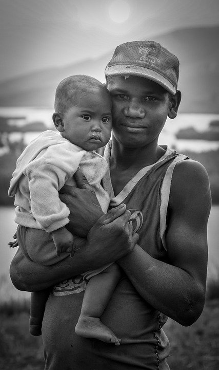
This photograph display poverty using depth of field. The focus of the design is on the two people portrayed – they display poverty by the young boy (who seems quite young) holding a baby – the baby has snot running down their nose indicating the lack of facilities – the baby also has no shoes on indicating poverty and lack of materials. the young boy is half smiling, wearing a hat that is falling apart and a top that seems to be years old as its starting to fall apart. I think what makes the audience connect with this photo is the way in which the older boy is smiling despite the conditions they live in. In the background you can slightly see in the blur the muddy area , indicating a less fortunate town. I think its quite a stereotypical image but it does portray poverty the characters due to their clothes and appearances.

Taken from google


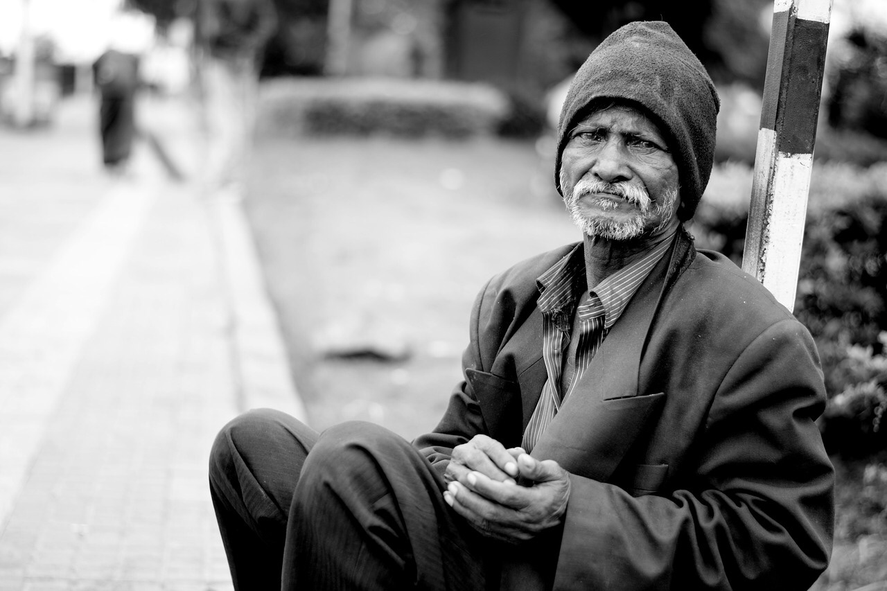
I chose this image to portray the idea of different generations through poverty, and portray the fact that poverty happens through whatever age, and can effect anyone. This photo below displays an elderly man his posture is the main focal point of him being in poverty. his clothes are not muddy but send to be slightly large for him, with a dusty hat. His hands are shaped sort of like when someone is begging for money,. The man is sitting on the edge of the pavement indicating no home or lack our place to stay. Again it sousing depth of field as mentioned and sits in. A lack and white format..,this I’d icates slight depression within 5e photograph and tells more of a story.

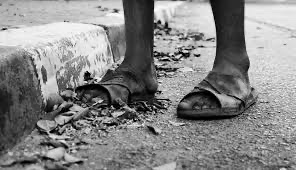
I chose this one because unlike the others it does not focus just on the persons face and appearance. this photo indicates no person but their feet. They are walking along the road (that’s quite messy and not clean) the fact that they are no trainers that they are sandals indicate it’s a hot country, maybe like Africa.. one of his feet is hanging out the shoe making it difficult to keep his foot in place. This shows you can portray poverty in other ways not just the face or person.

photographs (UK)

i then decide to focus just on photography poverty based in the uk as these photos do come across slightly different in comparison to the other designs. Some of them are in black and white and others are not therefore I thought I would analyse both and compare them. There actually is not a lot that represent Britain and it’s poverty very well.

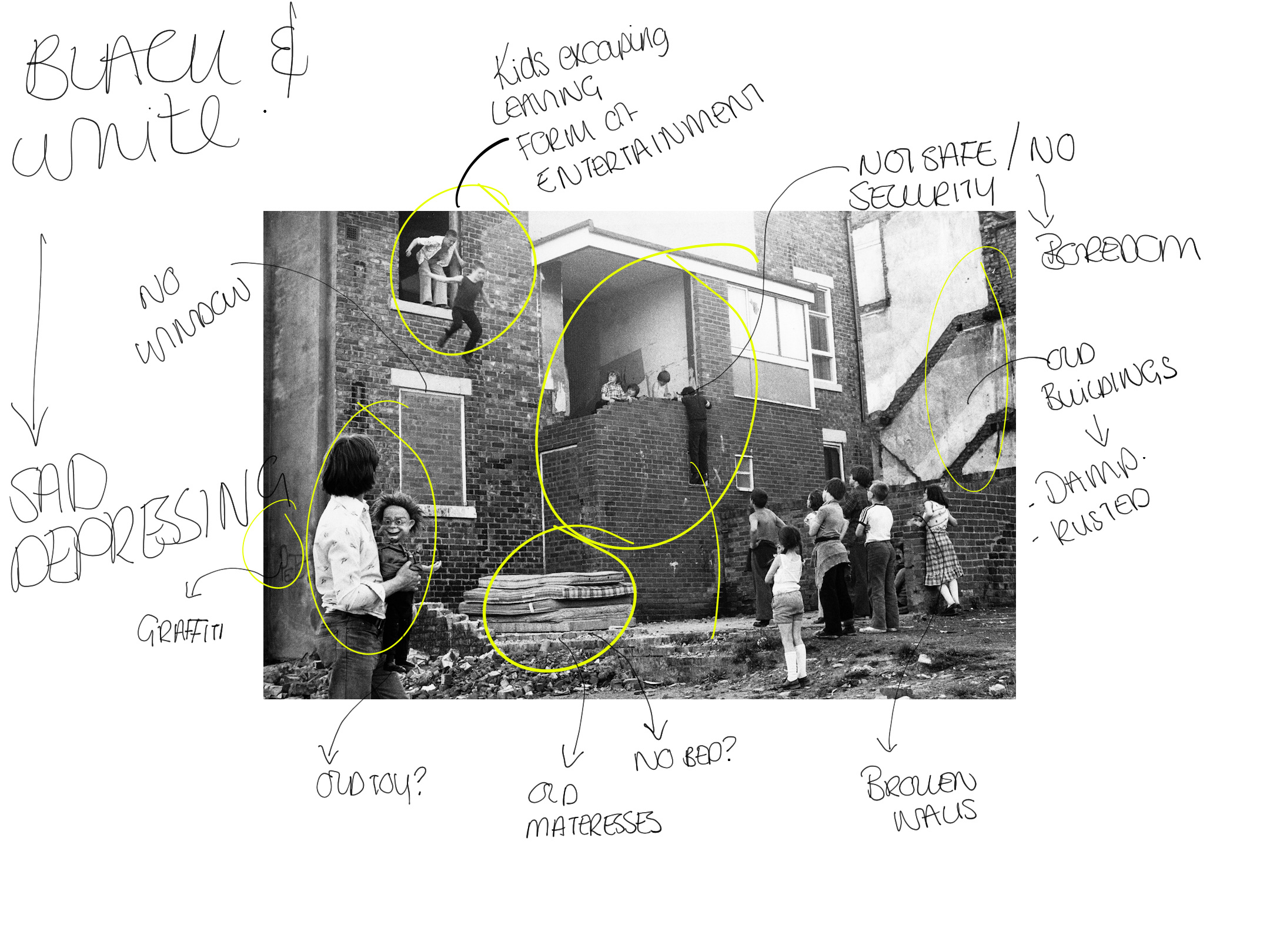
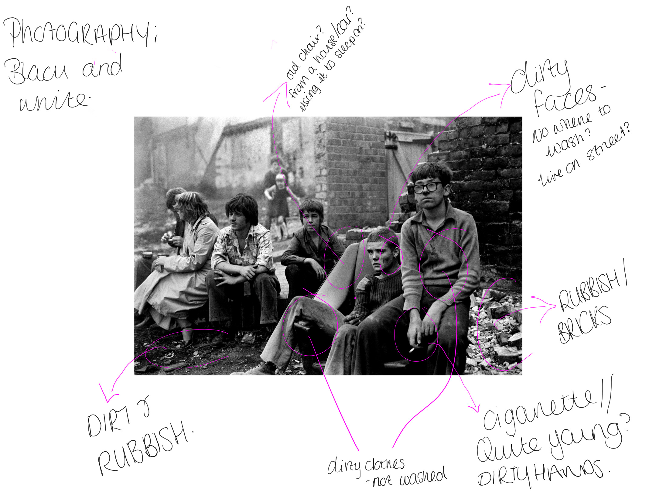
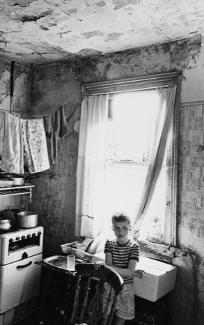
Now when typing into google poverty uk photography I noticed a common ground. These images below are all based in the UK when typing into google. They are all black and white. They all display house hold poverty. They could off easily displayed these photos in non black and white but it would not have the same meaning behind the design. Adding the black and white portrays the idea of alone, isolated and struggling like there is a black cloud always above you. Each one touches you, makes you feel compassion towards people and make you want to help them, they are all normal families and kids and thats what makes these photos so powerful.

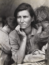
I then thought about understanding the effects black and white photography have on the eye. When looking into poverty there was something that stood out to me and that was migrant mother. I am currently writing about this in my dissertation and thought it would fit in so nicely here.

The photograph popularly known as “Migrant Mother” has become an icon of the Great Depression. The compelling image of a mother and her children is actually one of a series of photographs that Dorothea Lange made in February or March of 1936 in Nipomo, California. She captured this horrific time, and making it black and white made it more powerful and told more of a story than if it was in non black and white. You can feel the sadness of the mother, the surrounding being horrific and you feel that from this image, and thats what I think should be portrayed when displaying a sensitive topic such as this.

Effects of black and white imagery:

Black-and-white photographs comprise only highlights, shadows, and the shades of gray between. In contrast, each hue in a color photograph adds an element to the image, which can distract viewers from the subject. … As a result, black-and-white is more likely than color to create an abstract visual.

From researching into black and white photography, I thought it would be interesting to see what people say. on one website someone said they they get distracted when the photo is not black and white meaning their focus goes all over the place where as if its just black and white you focus on the one subject the camera has tried to portray. Which explains why a lot of poverty and depressing photography is black and white so people

colour vs black and white

How the pallets affects how we see and feel?

https://photography.tutsplus.com/articles/color-vs-black-and-white-photography-how-palette-affects-what-we-see-and-feel–cms-28747

I then found this article above that was so interesting and felt it was appropriate to discuss here.

Black-and-White Photography

Has Reductive Simplicity

There’s a reason so many students learn to photograph (and draw, for that matter) in black-and-white first: a monochromatic palette is simpler, with fewer elements.

  • Black-and-white photographs comprise only highlights, shadows, and the shades of gray between. In contrast, each hue in a color photograph adds an element to the image, which can distract viewers from the subject. By reducing an image’s elements with black-and-white, there’s less for photographers—and viewers—to contend with.
  • Composition can be seen more readily in a black-and-white image because structure and spatial relationships take precedence. A silhouette, for example, can be particularly powerful in a black-and-white image if it’s clearly separated from other shapes in the composition.
  • Similarly, shapes, lines, textures, and contrast within a black-and-white image are prominent. As a result, black-and-white is more likely than color to create an abstract visual.
  • The more complete the tonal range, the more dynamic the image. Black-and-white photographs with a deep black, a pure white, and lots of varying grays in between can engage the eyes and draw viewers in

“Black and white is abstract; color is not. Looking at a black-and-white photograph, you are already looking at a strange world.” —Joel Sternfeld

colour:

  • Colour plays a huge part in the story the photograph tells. So if color somehow detracts from the main point or subject of an image, the image has lost power. Ideally, the main subject is in a prominent hue while unimportant elements are in a less dominant hue.
  • The complexity that color invokes needs to somehow be resolved in an image. To make an image that coalesces, all of the colors need to establish some sort of relationship with each other.
  • One way to achieve color harmony is to photograph complementary colors. In the traditional color model of red, yellow, and blue, complementary colors are opposite each other on the color wheel: red and green, yellow and purple, and blue and orange. Pairing them can create a very satisfying visual experience.

Researching more into this made me realise, ow much black and white can effect the emotion through designs and defiantly something to use for ht future of designing for good.

existing poverty photography

APP - Research, APP everything

I thought I would look into some existing adverts that are already out there for poverty but for global issues and analyse them. I do want my designs to be slightly different but also follow the format that comes along with poverty photography and advertising . Before looking into adverts I thought I would look into some some sort of photography used and then this could lead into advertising posters.

Photography // poverty global photography

Tish’s images capture a raw picture of the struggles faced by the youth at the time. She would often photograph her family, friends and neighbours – people she spent time with every day, and whose struggles she shared. Capturing candid shots of youngsters on the streets, playing cards, building dens and fire, or causing mischief came naturally, because the subjects trusted her.

https://www.bjp-online.com/2018/05/deprivation-and-community-in-thatcherite-britain-with-tish-murthas-youth-unemployment/https://www.bjp-online.com/2018/05/deprivation-and-community-in-thatcherite-britain-with-tish-murthas-youth-unemployment/

The first photo was this one below. I decided to annotate not before writing notes in my blog about it to make me have more of an understanding of the photography / story being told through the photo.

Annotation of image

Notes from annotation

At the top there are two boys jumping off the window. This shows the idea of the kids having fun despite not having a lot. Boys behind boys. Everyone is watching them and egging them on. On the other hand it could show the idea of them escaping but they have happy faces on so to me it displays them having fun and symbolising you cans have fun despite what you have.

Need to this… a kid is hanging from. This shows how unsafe this area is. However if you look closely he is standing on a window to reach up to his friends to chat. The kids just look like they are hanging out in this urban area.

Below this sits a bunch of old mattresses without any sign of a bed. This indicates that there is no bed around here, do these children sleep on these? It also suggest a bit of a “dump” as they look quite dirty and not well looked after.

There is loads more annotation to this and this is displayed in the photo the last thing I want to mention is the colour. I think for poverty the idea of black and white really makes it stand out and makes it more depressing and shows the sad side to poverty and this is definitely something I would use within my designs as it makes it so powerful and tells a story.

https://flashbak.com/powerful-photos-of-glasgow-slums-1969-72-54283/

Poverty in the UK / PERSONAL STORIES

APP - Research, APP everything

Typed into google ‘poverty in the uk

Despite being a developed country, those who are living at the lower end of the income distribution in the United Kingdom have a relatively low standard of living.

Poverty affects millions of people in the UK. Poverty means not being able to heat your home, pay your rent, or buy the essentials for your children. It means waking up every day facing insecurity, uncertainty, and impossible decisions about money.

Key words

  • Not being able to heat your home
  • Pay your rent
  • Buy the essentials for your chikdren
  • Facing insecurity
  • Uncertainty
  • Impossible decisions about money

What causes poverty in the Uk?

  • Wage inequality. … 
  • Job insecurity and part-time work. … 
  • Unemployment. … 
  • Economic inactivity Related to unemployment is economic inactivity. … 
  • Old age People over 65 have traditionally been more at risk of relative poverty, as pension incomes are significantly less than average incomes.

Knowing the poverty in. the UK and how it has increased over the years, I decided to look into a few case studies that indicate house hold poverty. The most ‘typical’ idea of being in poverty comes in 5 forms… (information taken from https://www.poverty.ac.uk/living-poverty/personal-experiences)

  • single parents on benefits
  • the young unemployed
  • low-paid workers supporting a family
  • adults who are disabled
  • single pensioners.

Single parent poverty:

Being a single parent is hard enough, then being on the poverty line makes it 10 x harder. The first case study I looked into was a single parent named Jenny 39. Here is her story.

Jennie is 39 and unemployed. She lives with her three sons, all of whom have disabilities, in Redbridge, outer London. The family has lived in temporary accommodation for the last 12 years.

Jennie worked as a hairdresser when she left school and then switched to part-time work when she started a family. Her middle son, Mark, 13, contracted meningitis when a baby and Jennie left work to care for him. He is visually impaired and has Perthe’s disease, as a result of which he cannot walk long distances. Jordan, 16, has attention deficit hyperactivity disorder (ADHD) and Michael, 11, is also visually impaired with no peripheral vision.

When Jennie separated from her husband in 1999, the family moved to a women’s refuge, all four sharing one room for ten months. Since then the family has always lived in temporary accommodation, seven different homes in total. Jennie suffers from insomnia and stress.

For most of the children’s lives, the family has been poor. When filmed in late 2011, the family lived on £243 a week, excluding housing benefit but including jobseeker’s allowance, child benefit and child tax credit.

Single parent background: POVERTY

Single parent poverty

Single parent families are one of the groups most vulnerable to poverty. The 1999 PSE survey found that single parents were well over twice as likely as all households to live in poverty, with two out of three single parents living in poverty (see Poverty and Social Exclusion in Britain, Joseph Rowntree Foundation, 2000).

Single parents, working and non-working, are among the heaviest losers from the Coalition government’s tax and benefits changes. While some of those in work will gain from the raising of the tax threshold, most benefits for families are being frozen, cut or withdrawn. Jennie has been affected by the three-year freezing of child benefit rates from April 2011, and by changes in how inflation is allowed for in the jobseeker’s allowance, with annual adjustments being calculated using the Consumer Price Index instead of the faster rising Retail Price Index. Other families will be affected by:

  • a reduction in the childcare element of working tax credit from April 2011
  • the capping of housing benefit for existing claimants from April 2012
  • the replacement of the social fund, and the localising and lowering of council tax benefit from 2013.

The Institute for Fiscal Studies, in a report commissioned by the Fawcett Society, estimates that lone mothers can expect to lose 8.5 per cent of their annual income by 2015 as a result of the government’s changes. This is three times the percentage amount the average childless couple will lose (see further details on the IFS website).

The poverty trap

Single parents with few qualifications and skills, and often with limited hours available for work, can often find the type of work they can get is so badly paid that they are little better off in employment than on benefits. Although successive governments have tried to tackle this problem and have put pressure on single parents to find work, the relative pay of unskilled, part-time jobs has fallen over the last 30 years, making it increasingly difficult for many single parents to find work that will lift them out of poverty. They remain caught in the poverty trap.

Homelessness

Homelessness is on the rise. Between 2010 and 2011, the number of families accepted as homeless by local authorities rose by 14 per cent, while recorded rough sleeping was nearly a fifth higher in Autumn 2011 compared with a year earlier (see Homelessness figures surge by 14 per cent).

The young unemployed:

My biggest fear is leaving university and being unemployed as it has risen over the last decade for young people. A case study I found was from a 19 year old jobseeker named Marc, Marc is 19 and lives in Redcar in north-east England, a town where there are twelve times as many people claiming job seeker’s allowance as there are job vacancies. Despite having passed a number of GCSEs and A-levels and having applied for hundreds of jobs over the last two years, Marc is still unemployed.

Youth unemployment

There are over one million young people under 25 who are without work – the highest figure since records began in 1992. Just over one in five young people are now unemployed, nearly three times the average rate. Long-term joblessness, especially among the young, brings a high human cost, often leading to a lifetime of intermittent and insecure low-paid work. There are currently 857,000 young people who have been out of work for over a year.

Jobseeker’s allowance

Since 1980, the value of this benefit has fallen by a half relative to average earnings. 

Under the government’s new benefit rules, jobseeker’s allowance, along with a number of other benefits, will be annually adjusted for inflation in line with the Consumer Price Index (CPI) rather than, as at present, the Retail Price Index (RPI). The CPI rises more slowly than the RPI, effectively cutting the level of these benefits.

The government has run into controversy over moves to make young people work without pay or lose job seeker’s allowance (see Government revises its work scheme).

A low -paid worker

In the UK I feel as if this is the most common factor of poverty. Parents can work long hard hours but still not earn enough to support their family.

Renée is 40 and works long hours for low pay to try to provide for her four children, aged 3 to 14, and her 80-year-old mother. The three generations of the family share a damp and overcrowded three-bedroom council flat in Hackney, in inner London.

Background

Working families and the benefit changes

Nearly all working families on low incomes, both single parents and couples, will be affected by the government’s tax and benefit changes. While some will gain from the rise in the personal tax allowance, losses will arise from benefit changes, most significantly:

  • a three-year freezing of child benefit
  • adjusting for inflation using the Consumer Price Index rather than the Retail Price Index
  • the faster withdrawal rate in tax credit as incomes rise
  • a reduction in the levels of the childcare component of working tax credit
  • making couples with children work at least 24 hours a week between them instead of the current 16 hours a week minimum
  • the capping of housing benefit for private tenants.

Universal Credit, which is due to replace tax credits and most benefits from 2013, will hit poorer working mothers the hardest, according to a report by the charity Save the Children (see Welfare reforms could push 250,000 children deeper into poverty).

The poverty line

APP - Research, APP everything

When researching the phrase that stood out to me the most was the use of the words ‘the poverty line’ which is how they measure poverty. You can tell if you are in poverty or if anyone else by understanding the poverty line.

Data based on incomes published in 2016 by Department for Work and Pensions (DWP) show that, after housing costs have been taken into consideration, the number of people living in the UK in relative poverty to be 13.44m (21% of the population).

The poverty threshold, poverty limit or poverty line is the minimum level of income deemed adequate in a particular country. Determining the poverty line is usually done by finding the total cost of all the essential resources that an average human adult consumes in one year.

https://cpag.org.uk/child-poverty/measuring-poverty

Each year, the Government publishes a survey of income poverty in the UK called Households Below Average income (HBAI). This survey sets the poverty line in the UK at 60 per cent of the median UK household income. In other words, if a household’s income is less than 60 per cent of this average, HBAI considers them to be living in poverty. This is the definition of relative poverty, whereas absolute poverty is where a household’s income is less than 60 per cent of the median as it stood in 2011.

One in five households in the UK have an income below the poverty line, after their housing costs are taken into account. 30 per cent of children live in households below the poverty line (after housing costs). This is almost double the poverty rate (16 per cent) for pensioners.

Calculating poverty after housing costs give a more accurate measure of how much families have to live on. 

In the 1970s and 1980s, income inequality in the UK widened rapidly and the gap has remained wide since. Nearly all the increases in our national income have gone to people in the upper half of our income distribution, leaving the top fifth between five and six times better off than the bottom fifth.

A P P proposal

APP - Research, APP everything

A.p.p proposal 

POVERTY IN THE UK

Client/purpose 

The purpose of my APP is to promote UK poverty, Whenever someone says poverty they think of poor countries such as Africa. Britain is a rich country, however no one understands the poverty that is right under their nose. A new company ‘change’ has started to show the sorts of household poverty that are surrounded in the UK, examples within this company will display, child poverty, household income poverty, adult poverty, they want to make awareness of the poverty within the UK through an advertising campaign includings posters and double page spreads to one day be featured in a magazine.

Audience

The audience for this campaign is anyone who wants to understand about poverty. I want it to be aimed at the local Brits who do not understand what it’s like to have nothing and understand that there is poverty right under their noses and they can contribute to help and make it stop.

Message 

The purpose of this campaign is to make awareness of local poverty, I want to spread awareness of British families who struggle on a daily basis with simple essentials that some of us take for advantage- this then resulting to them to be in poverty. I want to make people aware that it’s not just the poorer countries that deal with this. There are so many different aspects of poverty that not many people are aware of and this is what I want to display in the advertising campaign.

APP introduction / breaking apart the brief

APP - Research, APP everything

This was the start of the APP introdcution

Brief summary

The APP is worth 15 credits – and this is what we have to do.

Student brief:

Preamble

This module is designed to encourage and enable students to use graphic design and the ‘client’ to expand and develop their professional style and to produce bodies of work for public scrutiny and evaluation. The module will enable students to synthesise theoretical, conceptual and technical skills gained during the programme to manage projects in a variety of areas of design practice and produce appropriate practical solutions.

The brief is designed in such a way as to allow open interpretation within the given theme and allow flexibility within chosen pathways. To ensure clear direction and intent from the outset of the course, you will need to determine and agree with teaching staff, your chosen pathway, i.e., typography, illustration, etc. 

Assessment Task

The ‘weight’ of the dissertation that you have chosen will determine how many of the themes you will have to cover. The following indicates how many themes you are to choose:

Title Credit

*Pathway Option A

Dissertation 45 (7000-8000 words)

Advanced Professional Practice 30 (2 themes)

Major Project 45

Pathway Option B

Dissertation 30 (5000-6000 words)

Advanced Professional Practice 45 (3 themes)

Major Project 45

*please note: Although it is entirely your decision which option you take, Option A will require you to work with an overlap with your fmp. How will you manage this? 

Use the any of the following as catalysts for a project theme from which you will formulate a project brief of your own making:

  • Proverbs
  • Artificial Intelligence (AI)
  • What if?
  • Cult of personality
  • Appetite


Research

Your research is likely to be highly personal, unique and largely dependent upon your chosen area of specialism and your area of focus within the given theme. However, you will produce a series of research journals, the content of which will document your creative journey, your processes, your thoughts, and your discoveries and must clearly demonstrate a developing understanding of your field of specialism. Also, your journals must indicate that you have considered the theme(s) appropriately and that you demonstrated that you have developed both your analytical and practical skills in relation to your chosen field of specialism in the undertaking of this project.

Stating the obvious, your journals need to be written up regularly, not late into, or at the end of the project. This is to help ensure and evidence consistency and continuity of thinking. Regular reflective practice is expected. Reflective practice is the ongoing process of looking back on your actions, practice, working methods, etc., then assessing and recording how well these actions worked, how they will shape what you will do next and what you have learned in the performing of these actions.

The content of these journals is entirely at your discretion, so long as they contain the aforementioned points and fully address the learning outcomes. Don’t dismiss any ideas in the early stages of this project, however daft they might seem. Include notes, passing thoughts, observations, photographs, doodles, articles, drawings, diagrams, snippets of conversation, etc.

Note: Internet findings, highlighted or otherwise will be ignored by assessors as they are not considered to be meaningful research unless you have made a sound and adequate response to the article/item. Also, be careful when sourcing information from the internet. For example, Wikipedia is not an entirely reliable source of information, as anyone can contribute to and edit the information on these pages at will. Therefore, you will need to make sure that information you find is true and that it comes from a reliable source. You must record the url (web address) of all of the web pages that you refer to in your journals. Staff will work closely with you regularly to discuss your work in progress and direction via the content of your journals.

Work for Submission
 

In terms of size, medium and materials, how the final piece will manifest will be at your discretion. However, substantial research journals with content adequate to honours degree level work will be expected.

Another important aspect of this module to bare in mind, is that staff and examiners will be expecting to see your work as fully developed as possible, so that it is fit for purpose. For example, if you are producing illustrations for a book, it is not enough to paint the pictures, you will need to have transferred the images into a spread or publication containing styled text, so that they actually illustrate the text, rather than remain as pieces of ‘fine’ art.

BREAKING DOWN BRIEF