Now this design is slightly different in comparison to the other designs due to the layout of the design. I wanted to create a poster that could potentially be on a billboard and sometimes this would more likely be landscape therefore I created a design that was slightly different and had alternative images and mock ups to present that.
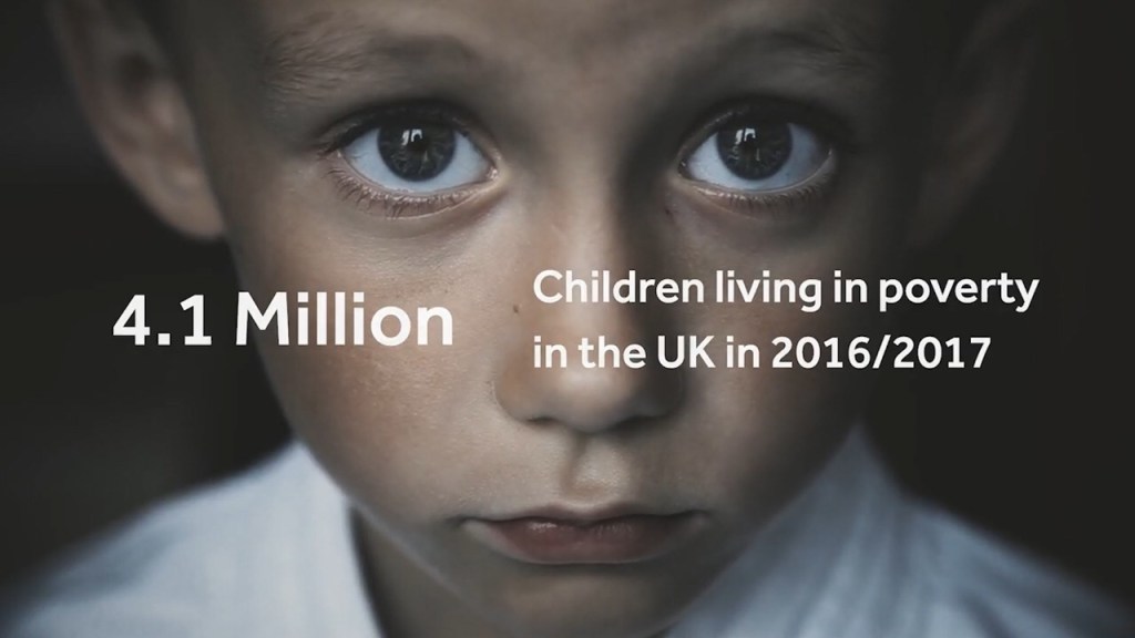
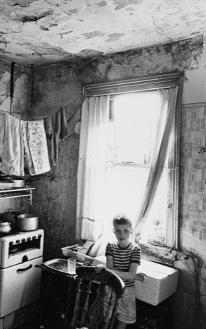
When we had our first critique, I got the feed back to photograph at home poverty more… therefore when I got home that day, I decided to photograph jack in our garden. When taking the photos we took one that really inspired me. When I was originally researching I found a photograph that inspired me through the taking, therefore you can slightly see the link between the research I gathered and my photograph/poster.
Inspiration photo:
This photo is about children poverty, but what made the emotion come through was the look in his eyes. The purpose of these designs are to portray emotion through poverty… and portray to people what it’s like to be in poverty.The eyes tell a story, of sadness and hope but still show life within the eyes. this is what inspired the final photography for this design.
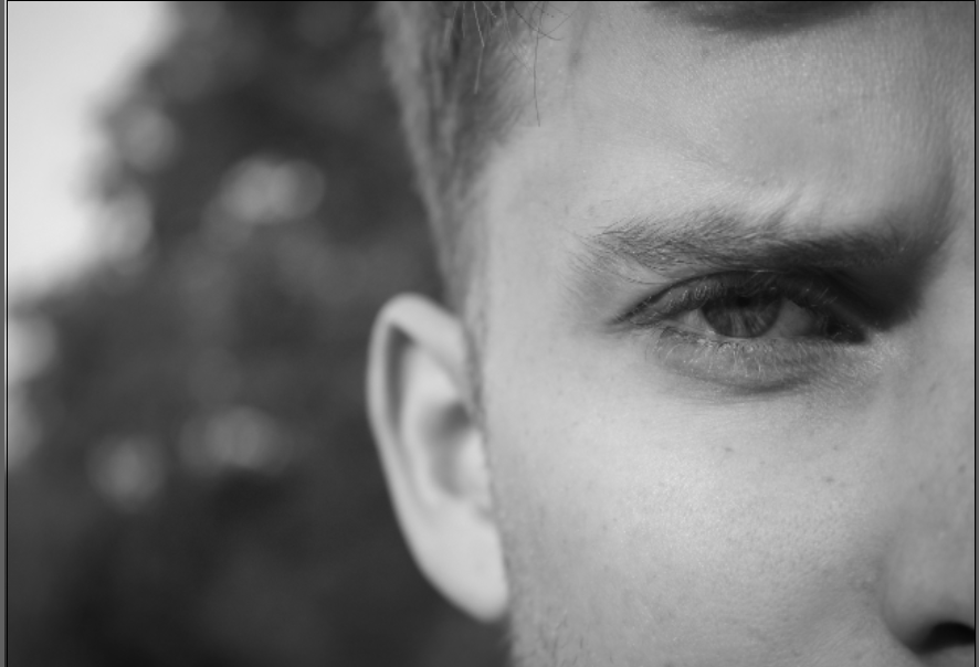
My campaign is displaying poverty within adults, and families, therefore wanted to use someone who was an adult. I decided to use one eye, and have him skinning to display emotion. With a lot of the photography within poverty, they use depth of field to display the emotion and this image portrays that.
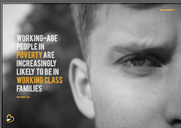
The same layout features within this poster but is almost completed on a larger scale. When we completed the first critique without even noticing the wording was completely wrong and did not make any sense therefore this was something that had to be changed. I used facts from full fact.com therefore all the facts link together and come from the same website.
” WORKING-AGE PEOPLE IN POVERTY ARE INCREASINGLY LIKELY TO BE IN WORKING CLASS FAMILIES “
Within this sentence that’s featured in the poster there is not a numerical number to highlight and focus on therefore, within this sentence I chose words that stuck out the most to highlight the issues in the world. In this case would be POVERTY and WORKING – CLASSS. I highlighted these words to ensure to the audience that poverty affects the working class the most.
Just like the other designs I wanted the logo to be placed in the bottom left hand corner, and the @PovertyUK instagram account located in the same right hand corner.
I Thought the type would sit perfectly on the left hand side due to the empty space the sat aside the image and I believe it does. With the type with all the posters it follows the same layout purpose, meaning that the words on each line are around 2 to 4 and this then creates a block in which the type sits in.
The final poster:
Below is the final poster for my landscape design. It portrays a deeper meaning of emotion in comparison to the other posters and I think this is because the look in his eye. This photo does not show surroundings he is living in but the way in which his life is effecting him. Within his eye you get a sense of struggle, without even seeing the rest of his face because of the eye brows and how they are frowning indicates anger and fed up. I think this photo captures peoples attention because the focus is in the eye; the emotion comes from his face. Unlike the other ones where I have displayed a subject and his surroundings this one focuses on one thing. The black and white made a huge difference to the effect of this poster, and turned the mood from vibrant and positive to depressing and in need of help.
I did not want to use one person to model the entire work because it effects thousands and singling one person did not seem right. I wanted to showcase a multiply of people and the different ways in which it could be affected.
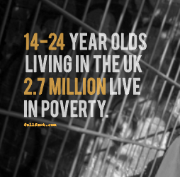
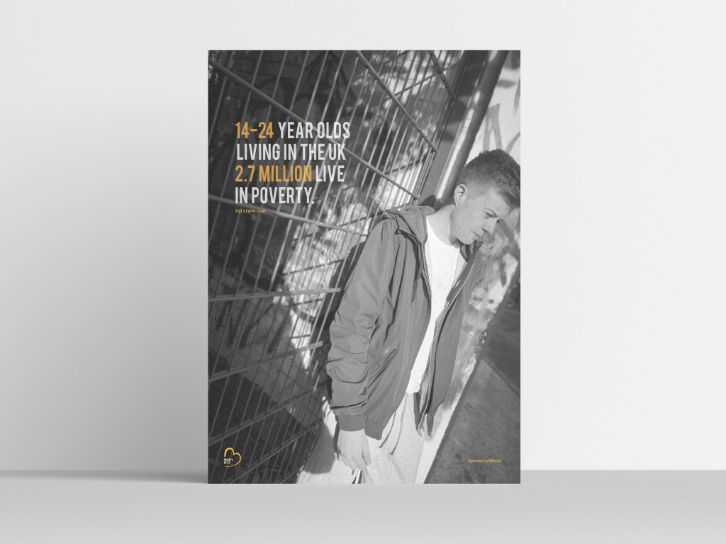
The design elements within the magazine are similar therefore not much needs to be discussed. The key elements that need to be continuous through the design are the logo and the link to the instagram page, and the full fact . com. This poster indicates life through the ages of 14-24 therefore I wanted to use a photograph that indicated younger people and how it would be for them. I decided to use the exact same layout as the design before hand by this using the bebas type, and the colour scheme. Again, the key information which in this case is 14-24 and 2.7 million, these sit in the colour orange as they are the key information, and again sit in the opacity of 78%.
Again, the link of the website where all the information is collected from sits in orange in the courier type facd underneath the type. In the right hand corner again sits the @povertyUKaid in the corner.
The image;
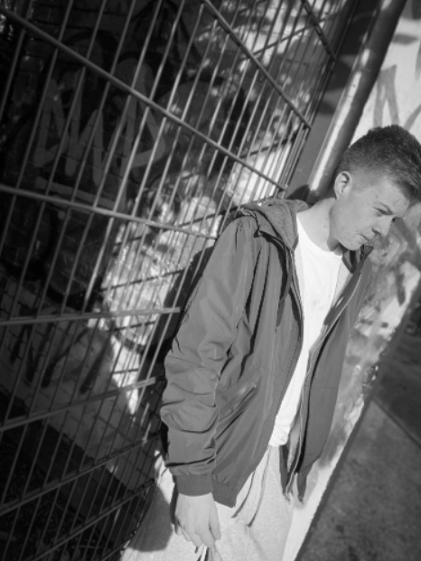
The image within this poster features my brother leaning up against a gate. What I think makes this photo work so well is the angel of the photography, you can see Danny’s emotion and the background he is surrounded in. Again, making this photo black and white allows the photo to portray emotion through the design; the original photograph displays sunlight and even with the black and white you can see the sunshine, and this reflects on the subject and the background well.
Final image:
This is the final poster design for the second poster. As you can see this is exactly the same as the previous poster meaning it has the same position of type, same colours, and the indication of the instagram and where I gathered the information from, sits below the type.
The key thing for this design was to make sure the logo and the type and all the elements were in the exact same place as the previous design. To do this, I had to copy and paste it from the previous design and align It in the exact same place. It was key to ensure there was enough space between the top of type and the width as the previous page, and the @povertyUKaid and the logo sat in the same place.
This photo is exactly the same as previous and portrays the same message. The image explores the emotion through different ways such as the colour, the posture of the subject. I think what makes this photo excel more than the other is due to the light that is portrayed through the photo. I think displaying the subject in different angels allow the sensitivity of the subject come alive more. Overall this image portrays poverty well, links with the type and advertises the life of poverty through a 14 to 24 person. These posters act as a taster to the magazine, and then explore more into what poverty is exactly like.
For my design I wanted to create an entire new brand to help poverty within the UK and create a platform where w make awareness of the current issues and allow the public to help other families in need. I wanted to show case live through photography and advertising techniques and create something different in comparison to other companies. Therefore I created poverty uk aid.
Creating the logo:
I wanted to create a brand, a logo and a platform which enable me to help others who struggle through the lives of poverty in the UK. I wrote down a bunch of words that I felt represented poverty well and this then enabled me to research ideas and connect for the logo design.
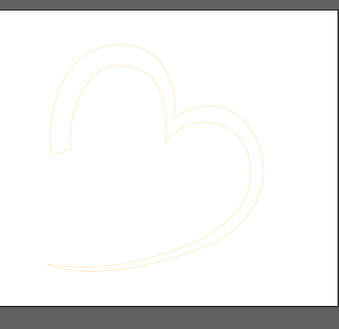
The word that stuck with me the most was the word COMPASSION. I then searched this within Pinterest and thought of the best way in which I could display this within a logo form. I found this image.
I actually did drew it myself on my iPad but have unfortunately miss placed this sketch, however it was just the heart shape that inspired me not the wording. I then started playing around with colours; I found a connection with the colour red and orange. I then looked into alternative reasons behind colours, the purpose behind my design is to present the depressing side of poverty in the UK, Therefore I wanted a colour to contridic that that expressed hope and positivity.
definition of the colour orange:
Orange combines the energy of red and the happiness of yellow. It is associated with joy, sunshine, and the tropics. Orange represents enthusiasm, fascination, happiness, creativity, determination, attraction, success, encouragement, and stimulation. … In heraldry, orange is symbolic of strength and endurance.
This then inspired me to create a black and white, with orange theme within the designs and the logo.
The process was so easy as I already had a simple idea in my head. A logo is meant to be simple and effective therefore complicating it would mess with the original meaning of a logo. I simply vetoed around the inspired image of the heart.
I then filled in the heart in this bright orange that stood out for me. The type I think works best is BEBAS it is simple, bold and effective. Therefore this was inspired for the type. At first I was not going to leave the gap between the heart but then I thought this would be a good place for the title to sit.
I made the ‘poverty UK” grey and then the word “aid” match the orange heart. At first I tried the entire writing orange and that is came across way too much orange and portrayed too much of a positive appearance. Then I tried black and that became too dark, then I lowered the opacity and then thought to show a connection between the type and the logo so they did not become separate from one another.
Final logo:
This then became poverty aid UK’s final logo. I think it works so well and portrays the idea of compassion and poverty all in a simple logo. The colours worked well with one another and acted as a starting point for the colour choices within my design.
when we got home after the first crit I wanted to take more photos to portray poverty within homes. Therefore I used jack as an extra model and gathered some mor photography symbolising home poverty.
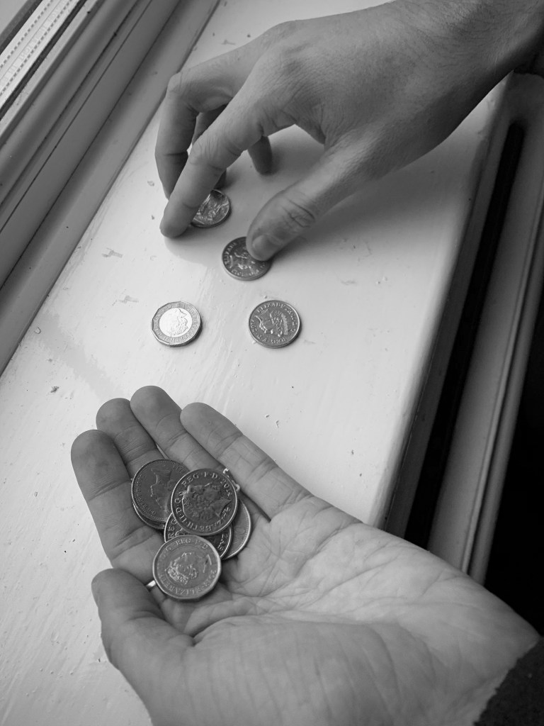
From experience, in our home we have a change pot you use it for bread and the basic essentials, however sometimes this is actually what people only have to provide them with the basic needs.
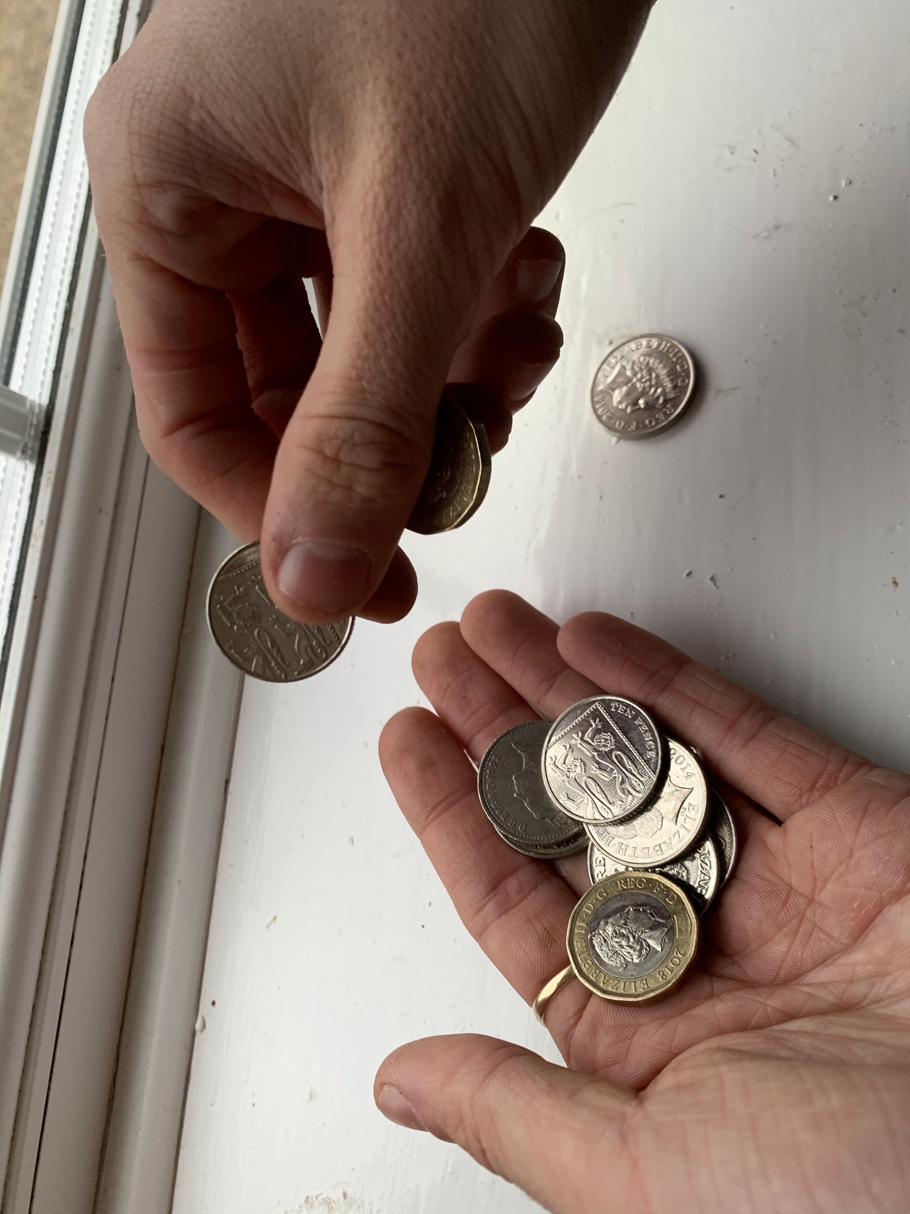
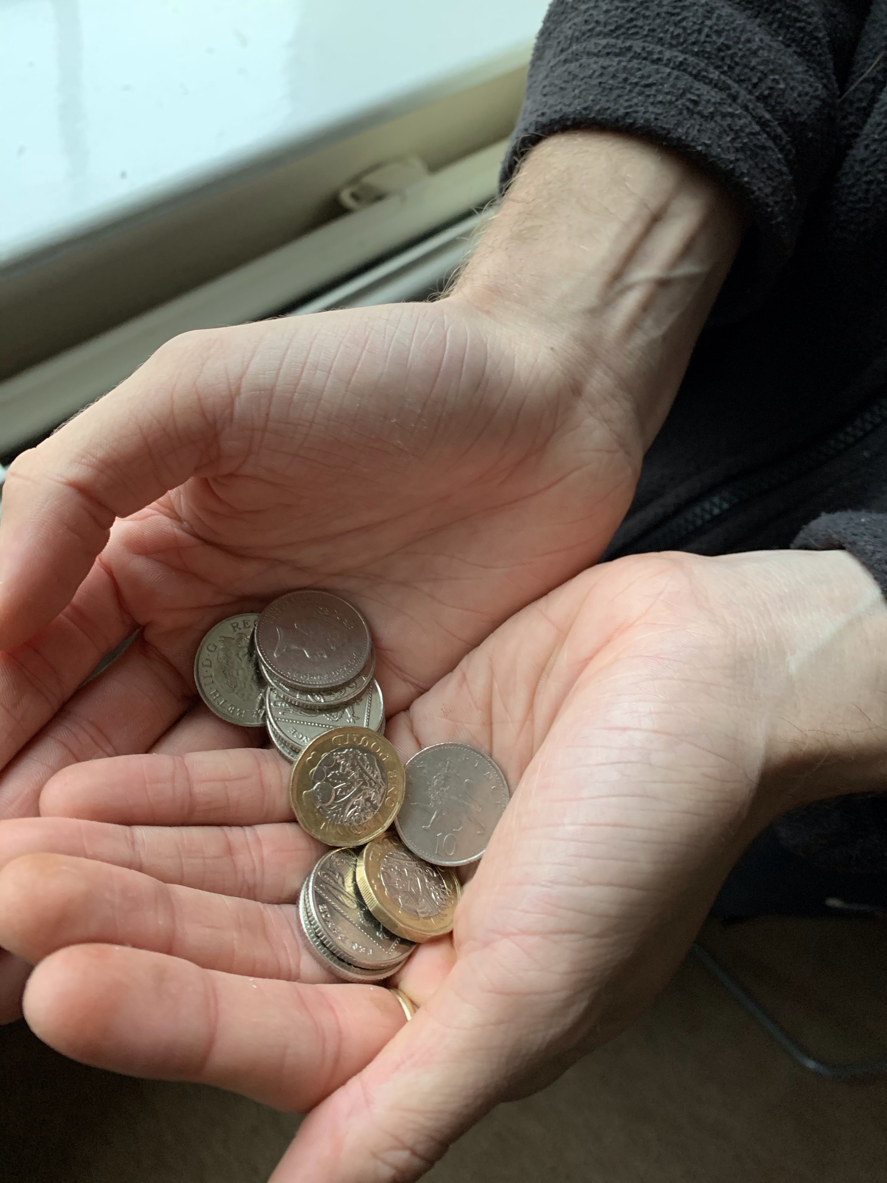
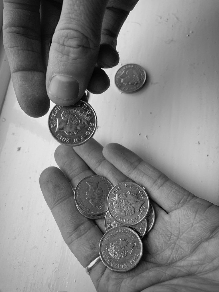
The first photo I took was this one below. This displays someone looking for lose change. I did not want to look like begging so he isn’t sat on the street, he is trying to collect lose change for bread and milk (as an example)
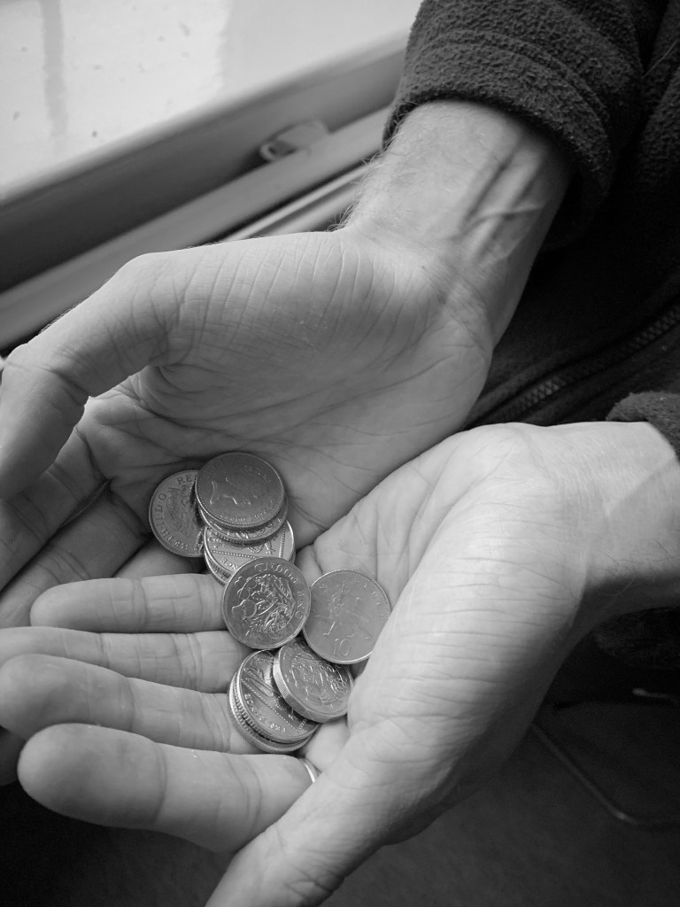
I wanted to photograph someone holding the money but not begging for money, to indicate people living on lose change. Therefor explains the next photograph. Within this photograph the subject displays him holding some loose change, and this spreads over both his hands. this indicates looking for loose change for essentials, and not begging or really asking for help.
I then like the other photographs decided to make these images turn into black and white as this then portrayed a continuous meaning through the designs. I used the same PS app on my iPad to make the black and white theme so I knew there would be consistent through the deigns. At this point I was unaware of what photos I would use but to me they all portrayed life of poverty in the house gold and portrayed emotion through the colour choice and subject choice.
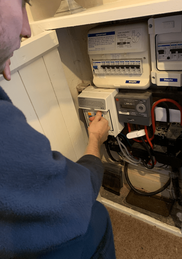
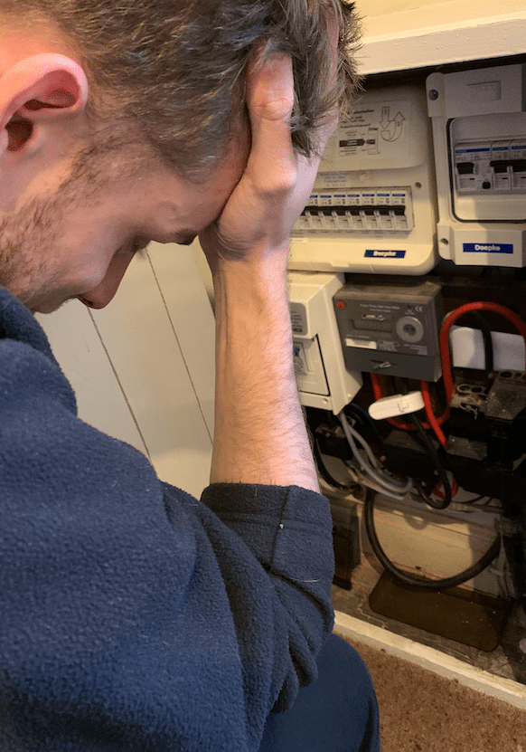
I then decided to take photos of gas and electric. From personal experiences this was something that happened a lot at home, and gas and hot water was an issue. I remember coming home when little from my nan and grandads and we would have to wear our coats until the boiler would heat up providing us with heating. This is something you do not think about when suggesting poverty therefore I thought this would be beneficial for my design as its all about making awareness. In the living room there was a gas box and jack was sitting near it I turnt my head after taking the first set of photos and thought “this could be a perfect way to capture life in poverty to people”
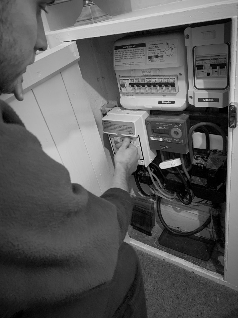
The first image displayed at the top shows the subject fixing elements of the metre. I wanted it to look like he was trying to fix a problem with it. Therefore I think this showcases that well.
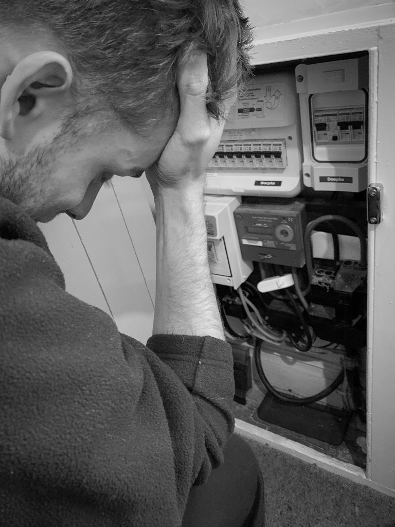
I then thought that the first photo did not show the emotion that comes along things like this not working. Some of us take gas and electric and heating for advantage and do not actually think about the cost and the issues that some people face. The top image displays a problem with the metre and the subject trying to fix it, then the bottom one is almost displaying the after effect it has on the subject because it cannot be fixed. I made jack put his hand on his head as this indicated a sense of struggle and desperation. I wanted to portray through my photography the sense of alone and the need of help and this was going to be continued through all the photographs I would off taken.
Again, it was time to make these images black and white. When I made them black and white it enhanced the emotion of struggle and desperation. You could still see al the elements but the black and white made it more depressing and created a atmosphere around the design.
Out of the two, the bottom one had the biggest affect with adding black and white personally speaking. You could feel the emotion pouring off the rage, indicating desperation and being tired of living like this. With the subject leaning on the floor, with his hand to his head, with his head down made this photo tell a story without any words needed to be presented and that was the aim of all my photographs together.
I then decided to take a few outside, to be featured in the magazine and show a link between the posters. (this is when I took the photograph of jacks eye used in one of the main posters) All these images below were taken in the garden, and the camera was angled a certain way to make sure you caught the right elements that portrayed poverty in the UK.
Few of the non edited photographs:
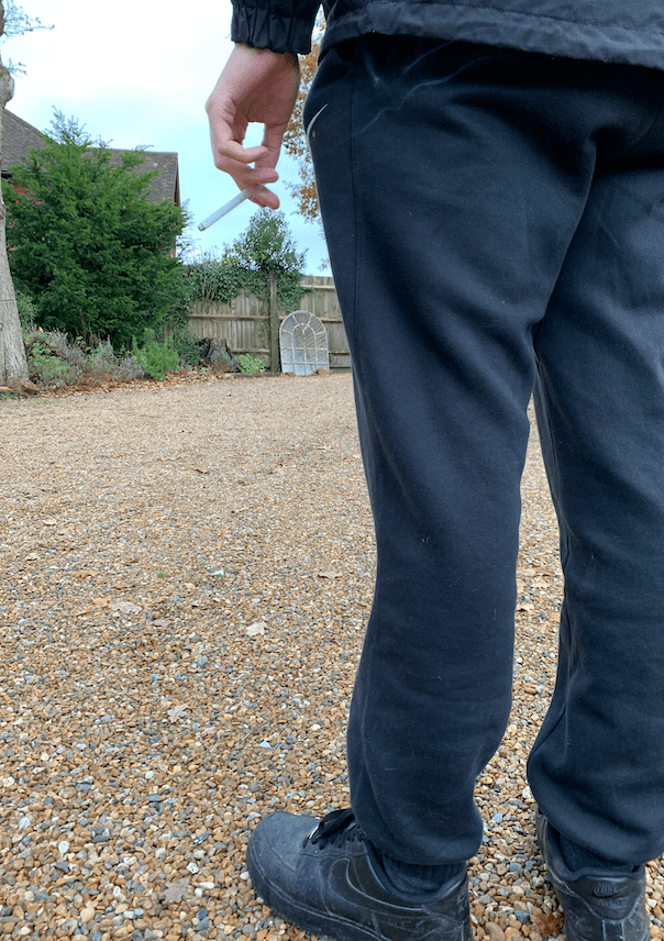
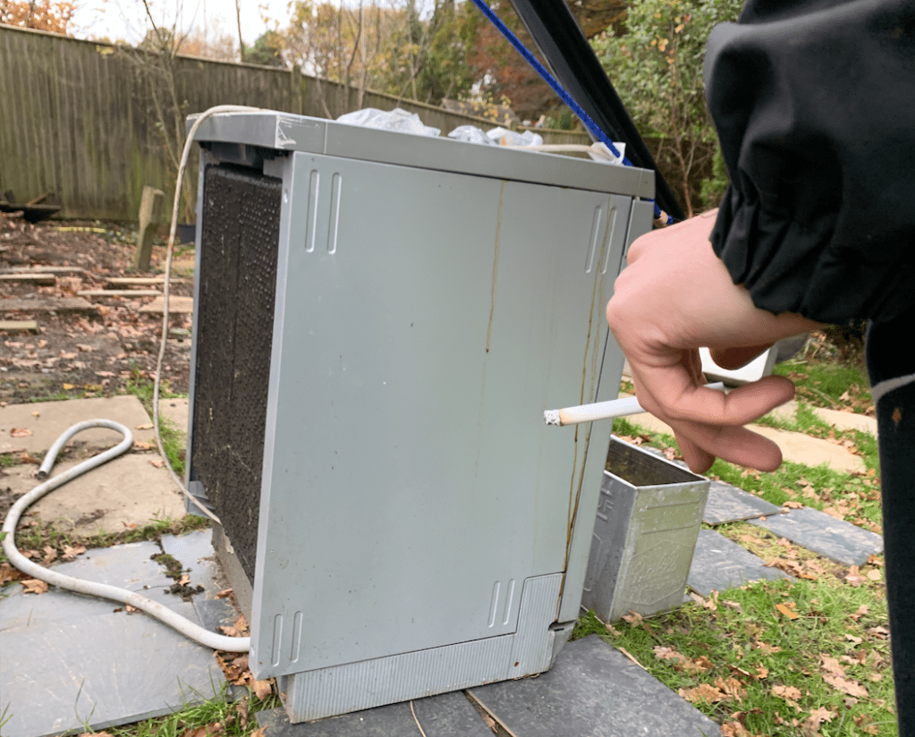
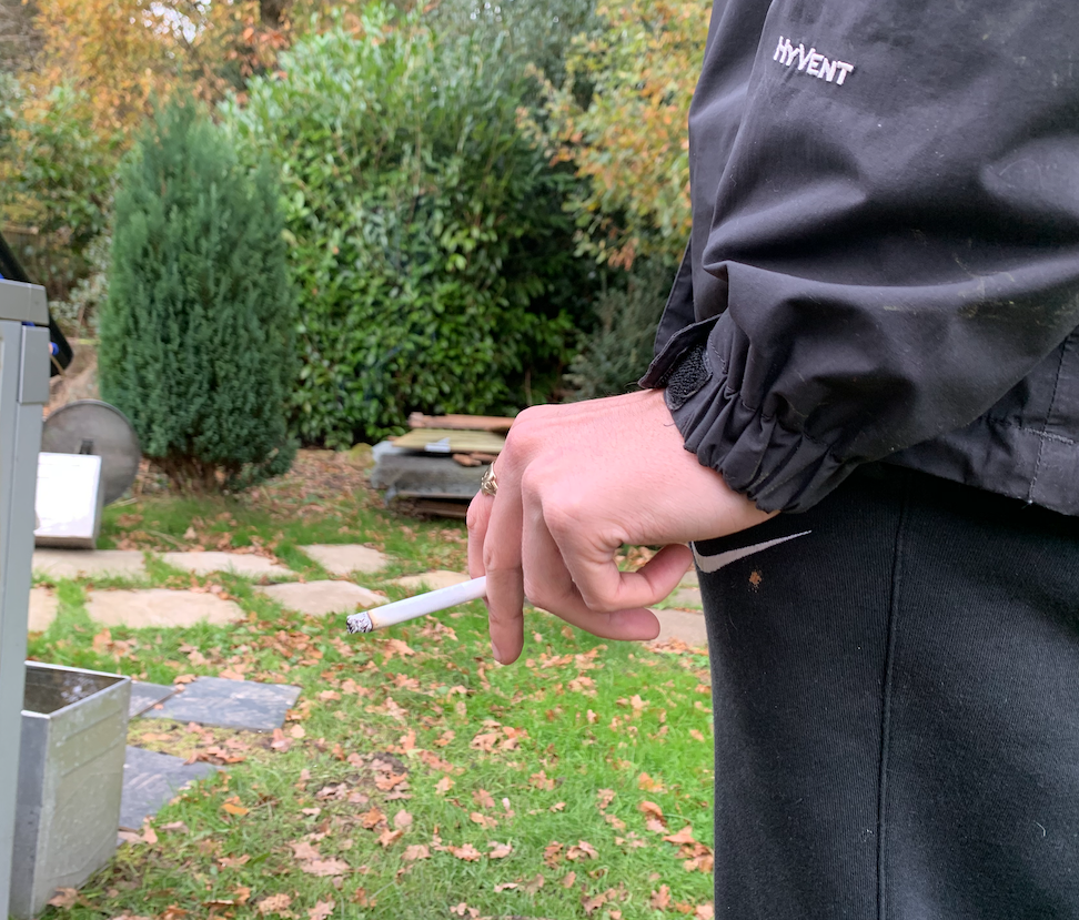
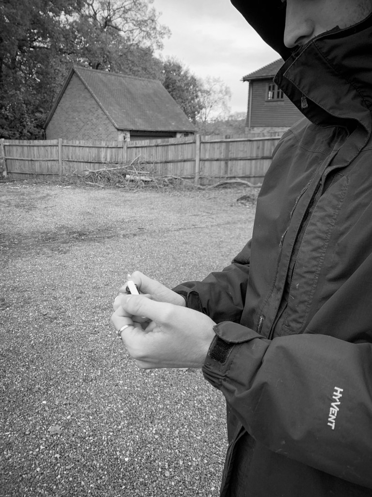
Below are just a few that I took to give you an understanding of the type of atmosphere I was going for within these designs. When I took the first set of pictures there was one of my brother with a fake cigarette and it was angels up so you could just see the cigarette and the background was blurred creating depth of field. I then wanted to continue this through some of the designs and use this as sort of an act of boredom displayed. the cigarette symbolises boredom, and wasting money on the not so important things in life. I shot different photographs in different scenarios to display this, I made sure it looked rough in the background. I wanted to create more photos that displayed objects and materials instead of emotion in faces of what life was like, and these would then feature within the magazine aspect of the campaign.
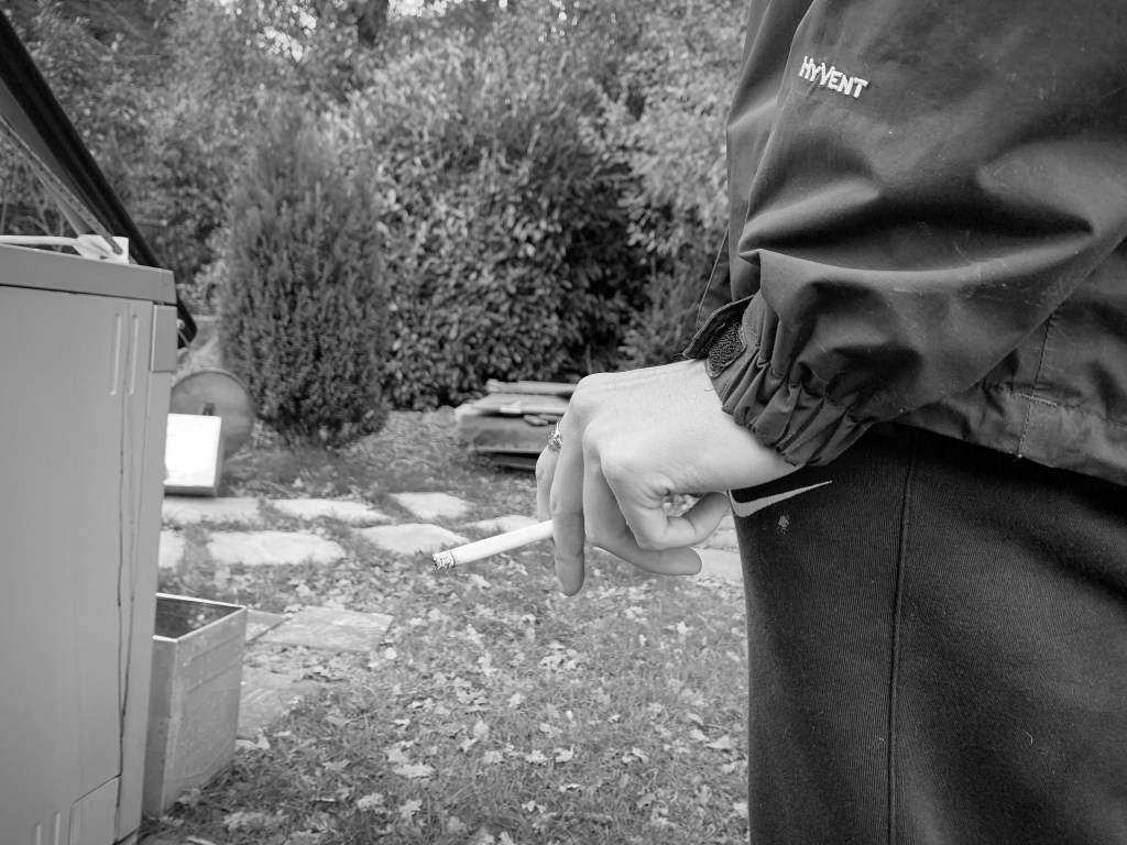
Some black and white edits
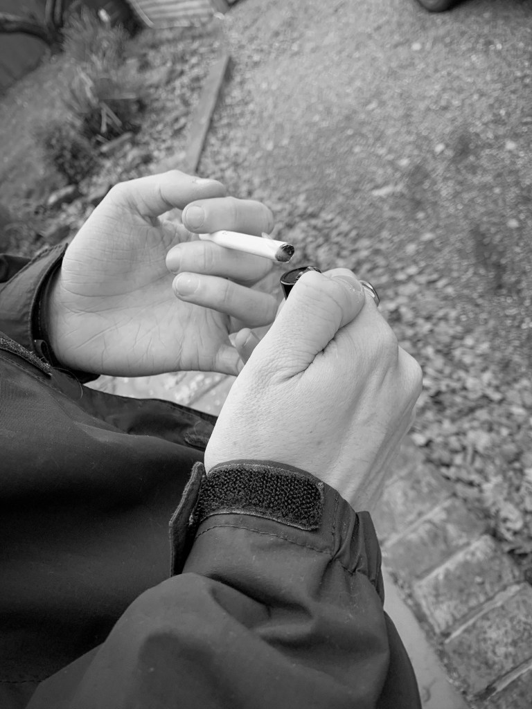
Again, the cigarette was part of the photograph and some of these are from the non edited images above. I shot it from alternative angles, and I wanted to showcase that not everyone in poverty looks like they are and this stereotypical aspect has too stop. This boy has a coat and has a ring on, but his home income makes him sit on the poverty line, And I hope these photos all showcase this some how or another.
Where would these photos feature?
I wanted all these photos to feature within the magazine. I did not want to use them for posters just because personally did not think they were as powerful with emotions compared to the poster designs. I wanted photos that indicated poverty in house hold and I think these photos achieve that well.
I decided to go towards photography within my designs to enable my message to come through … therefore I wanted to make sure I was analysing photo that was already out there to understand the techniques used within poverty photography.
Already looking at poverty photography the majority of the photos are portraying the most stereotypical idea of poverty. Poverty is known for the less fortunate countries however it happens right here in the (UK) and that’s where my idea sparked from. I wanted to analyse the stereotypical photography to get na understanding on the techniques used within the photographs and then narrow it downforce global poverty to (UK) poverty photographs.
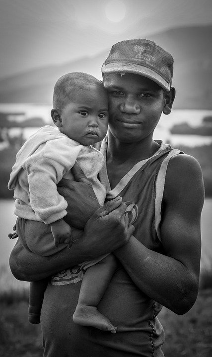
This photograph display poverty using depth of field. The focus of the design is on the two people portrayed – they display poverty by the young boy (who seems quite young) holding a baby – the baby has snot running down their nose indicating the lack of facilities – the baby also has no shoes on indicating poverty and lack of materials. the young boy is half smiling, wearing a hat that is falling apart and a top that seems to be years old as its starting to fall apart. I think what makes the audience connect with this photo is the way in which the older boy is smiling despite the conditions they live in. In the background you can slightly see in the blur the muddy area , indicating a less fortunate town. I think its quite a stereotypical image but it does portray poverty the characters due to their clothes and appearances.
Taken from google
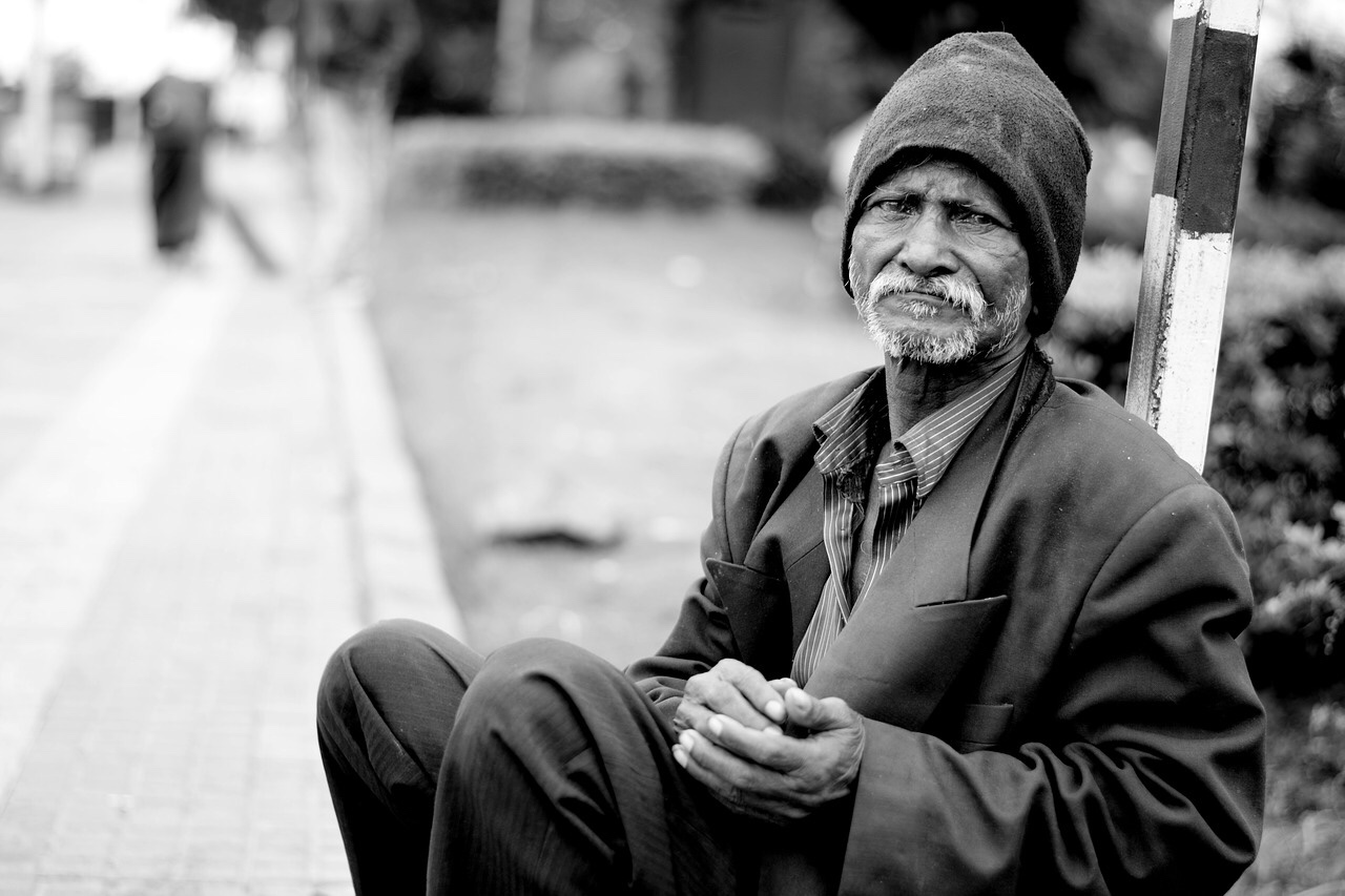
I chose this image to portray the idea of different generations through poverty, and portray the fact that poverty happens through whatever age, and can effect anyone. This photo below displays an elderly man his posture is the main focal point of him being in poverty. his clothes are not muddy but send to be slightly large for him, with a dusty hat. His hands are shaped sort of like when someone is begging for money,. The man is sitting on the edge of the pavement indicating no home or lack our place to stay. Again it sousing depth of field as mentioned and sits in. A lack and white format..,this I’d icates slight depression within 5e photograph and tells more of a story.
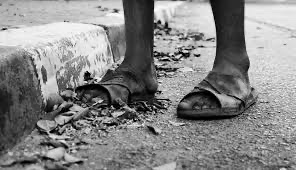
I chose this one because unlike the others it does not focus just on the persons face and appearance. this photo indicates no person but their feet. They are walking along the road (that’s quite messy and not clean) the fact that they are no trainers that they are sandals indicate it’s a hot country, maybe like Africa.. one of his feet is hanging out the shoe making it difficult to keep his foot in place. This shows you can portray poverty in other ways not just the face or person.
photographs (UK)
i then decide to focus just on photography poverty based in the uk as these photos do come across slightly different in comparison to the other designs. Some of them are in black and white and others are not therefore I thought I would analyse both and compare them. There actually is not a lot that represent Britain and it’s poverty very well.
Now when typing into google poverty uk photography I noticed a common ground. These images below are all based in the UK when typing into google. They are all black and white. They all display house hold poverty. They could off easily displayed these photos in non black and white but it would not have the same meaning behind the design. Adding the black and white portrays the idea of alone, isolated and struggling like there is a black cloud always above you. Each one touches you, makes you feel compassion towards people and make you want to help them, they are all normal families and kids and thats what makes these photos so powerful.
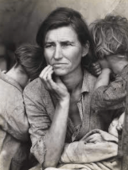
I then thought about understanding the effects black and white photography have on the eye. When looking into poverty there was something that stood out to me and that was migrant mother. I am currently writing about this in my dissertation and thought it would fit in so nicely here.
The photograph popularly known as “Migrant Mother” has become an icon of the Great Depression. The compelling image of a mother and her children is actually one of a series of photographs that Dorothea Lange made in February or March of 1936 in Nipomo, California. She captured this horrific time, and making it black and white made it more powerful and told more of a story than if it was in non black and white. You can feel the sadness of the mother, the surrounding being horrific and you feel that from this image, and thats what I think should be portrayed when displaying a sensitive topic such as this.
Effects of black and white imagery:
Black-and-white photographs comprise only highlights, shadows, and the shades of gray between. In contrast, each hue in a color photograph adds an element to the image, which can distract viewers from the subject. … As a result, black-and-white is more likely than color to create an abstract visual.
From researching into black and white photography, I thought it would be interesting to see what people say. on one website someone said they they get distracted when the photo is not black and white meaning their focus goes all over the place where as if its just black and white you focus on the one subject the camera has tried to portray. Which explains why a lot of poverty and depressing photography is black and white so people
I then found this article above that was so interesting and felt it was appropriate to discuss here.
Black-and-White Photography
Has Reductive Simplicity
There’s a reason so many students learn to photograph (and draw, for that matter) in black-and-white first: a monochromatic palette is simpler, with fewer elements.
Black-and-white photographs comprise only highlights, shadows, and the shades of gray between. In contrast, each hue in a color photograph adds an element to the image, which can distract viewers from the subject. By reducing an image’s elements with black-and-white, there’s less for photographers—and viewers—to contend with.
Composition can be seen more readily in a black-and-white image because structure and spatial relationships take precedence. A silhouette, for example, can be particularly powerful in a black-and-white image if it’s clearly separated from other shapes in the composition.
Similarly, shapes, lines, textures, and contrast within a black-and-white image are prominent. As a result, black-and-white is more likely than color to create an abstract visual.
The more complete the tonal range, the more dynamic the image. Black-and-white photographs with a deep black, a pure white, and lots of varying grays in between can engage the eyes and draw viewers in
“Black and white is abstract; color is not. Looking at a black-and-white photograph, you are already looking at a strange world.” —Joel Sternfeld
colour:
Colour plays a huge part in the story the photograph tells. So if color somehow detracts from the main point or subject of an image, the image has lost power. Ideally, the main subject is in a prominent hue while unimportant elements are in a less dominant hue.
The complexity that color invokes needs to somehow be resolved in an image. To make an image that coalesces, all of the colors need to establish some sort of relationship with each other.
One way to achieve color harmony is to photograph complementary colors. In the traditional color model of red, yellow, and blue, complementary colors are opposite each other on the color wheel: red and green, yellow and purple, and blue and orange. Pairing them can create a very satisfying visual experience.
Researching more into this made me realise, ow much black and white can effect the emotion through designs and defiantly something to use for ht future of designing for good.
Through my dissertation process I have produced a lot of research and development of ideas and thought in this entire blog post I would add the stages of my dissertation, the websites I have looked and right up to the here and now which is starting the dissertation design.
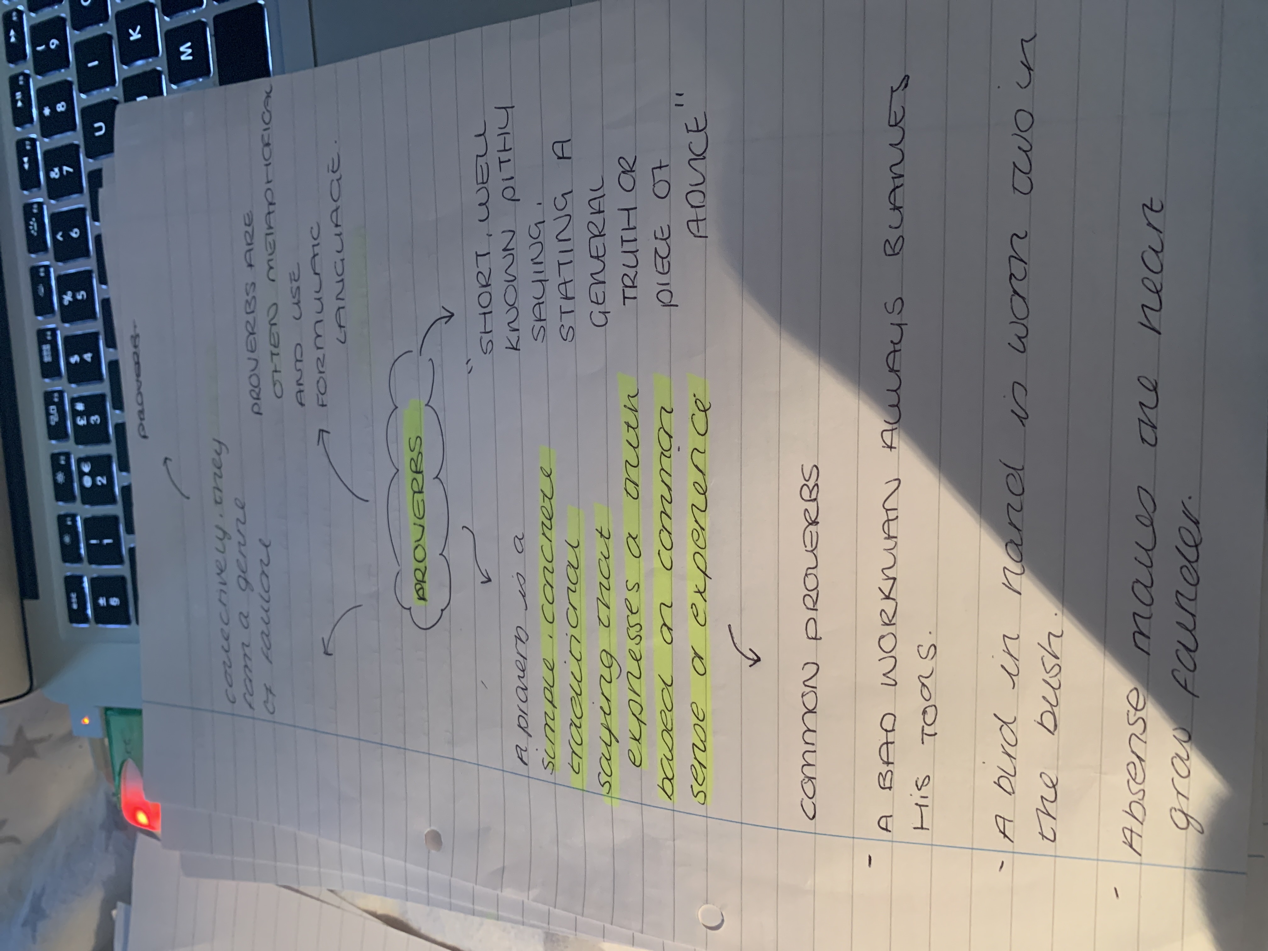
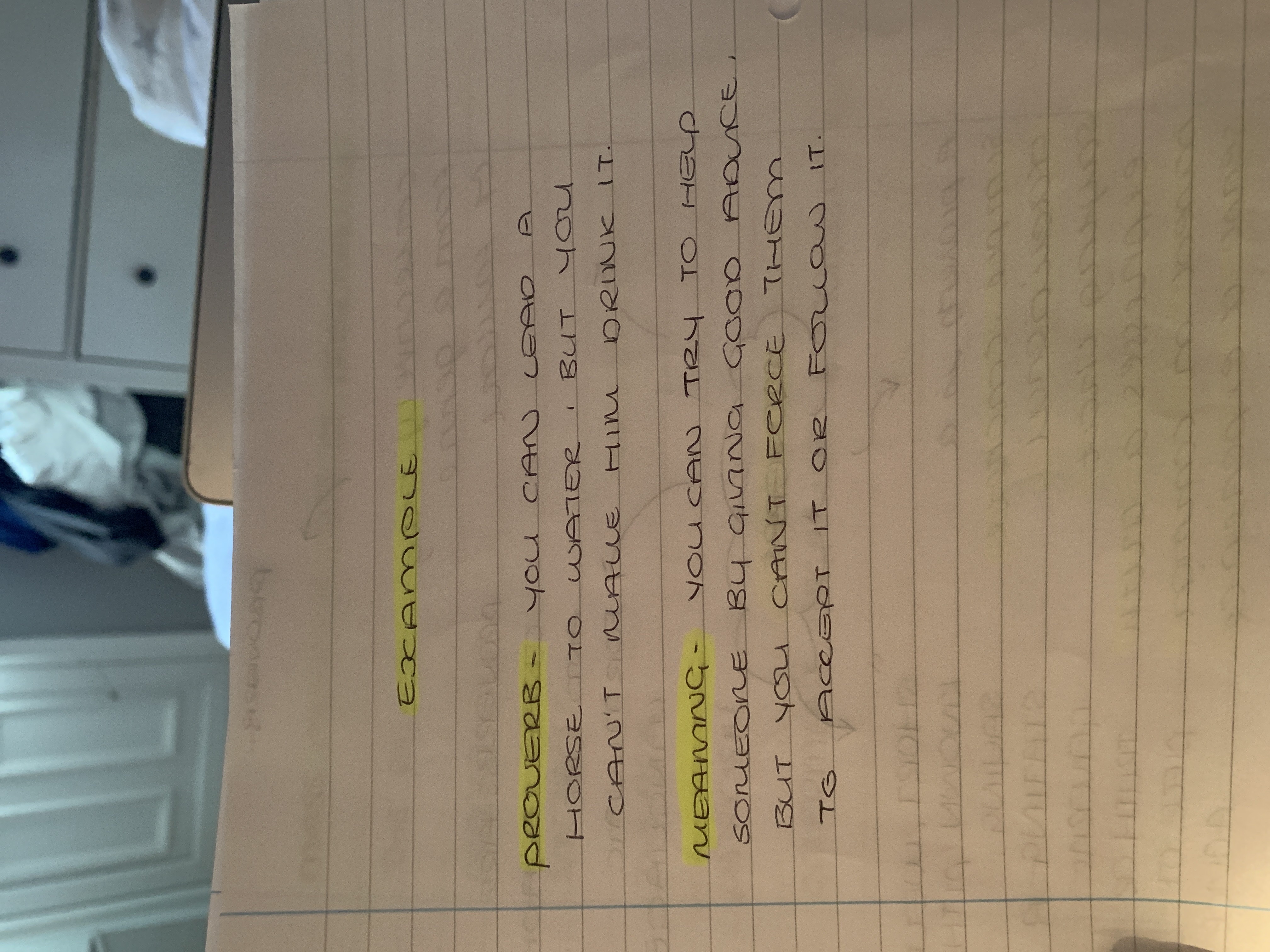
PROVERBS: short, well-known pithy saying, stating a general truth or piece of advice.
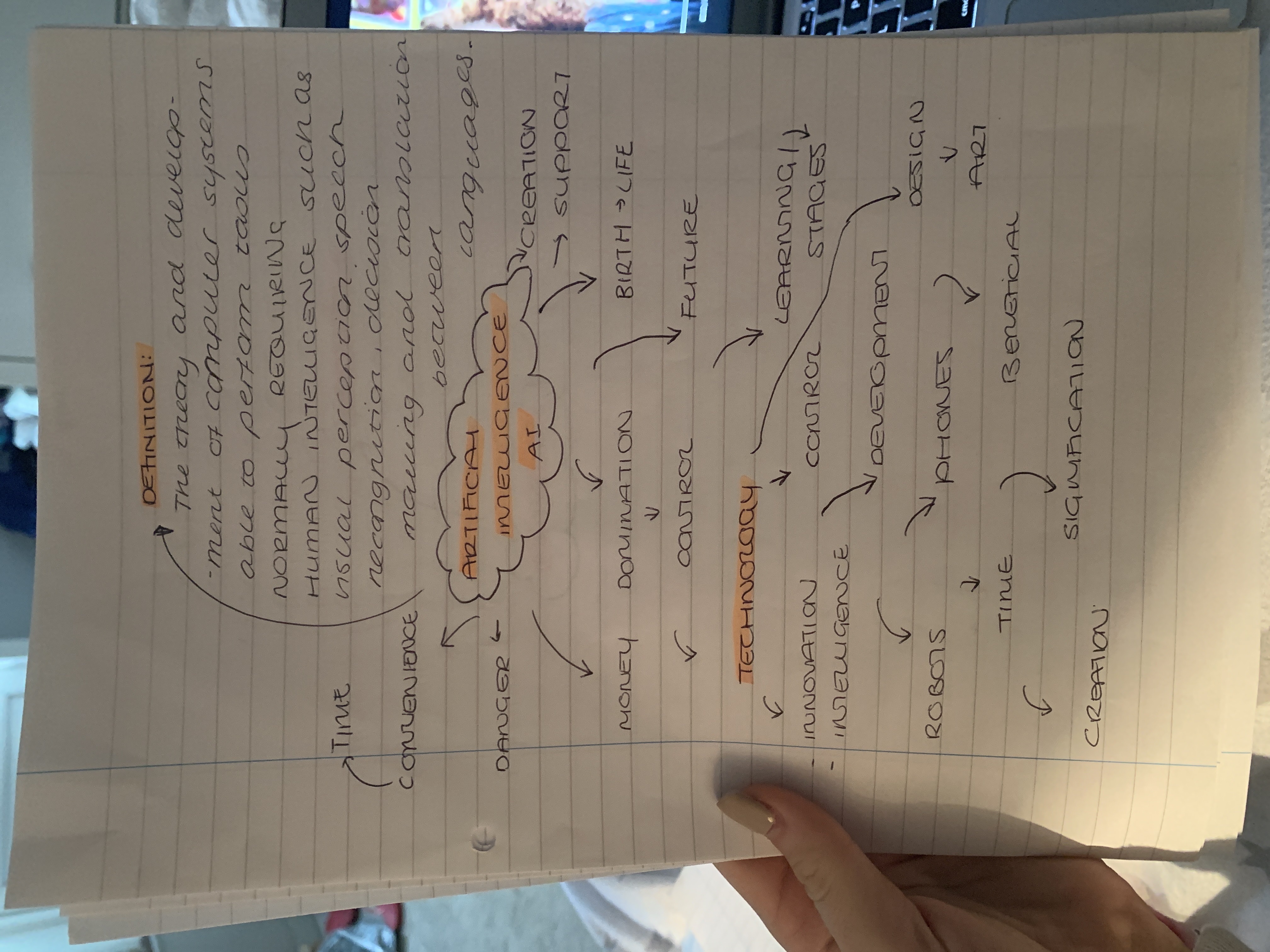
Artificial Intelligence (AI) – The theory and development of computer systems able to perform tasks normally requiring human intelligence, such as visual perception, speech recognition, decision-making, and translation between languages.
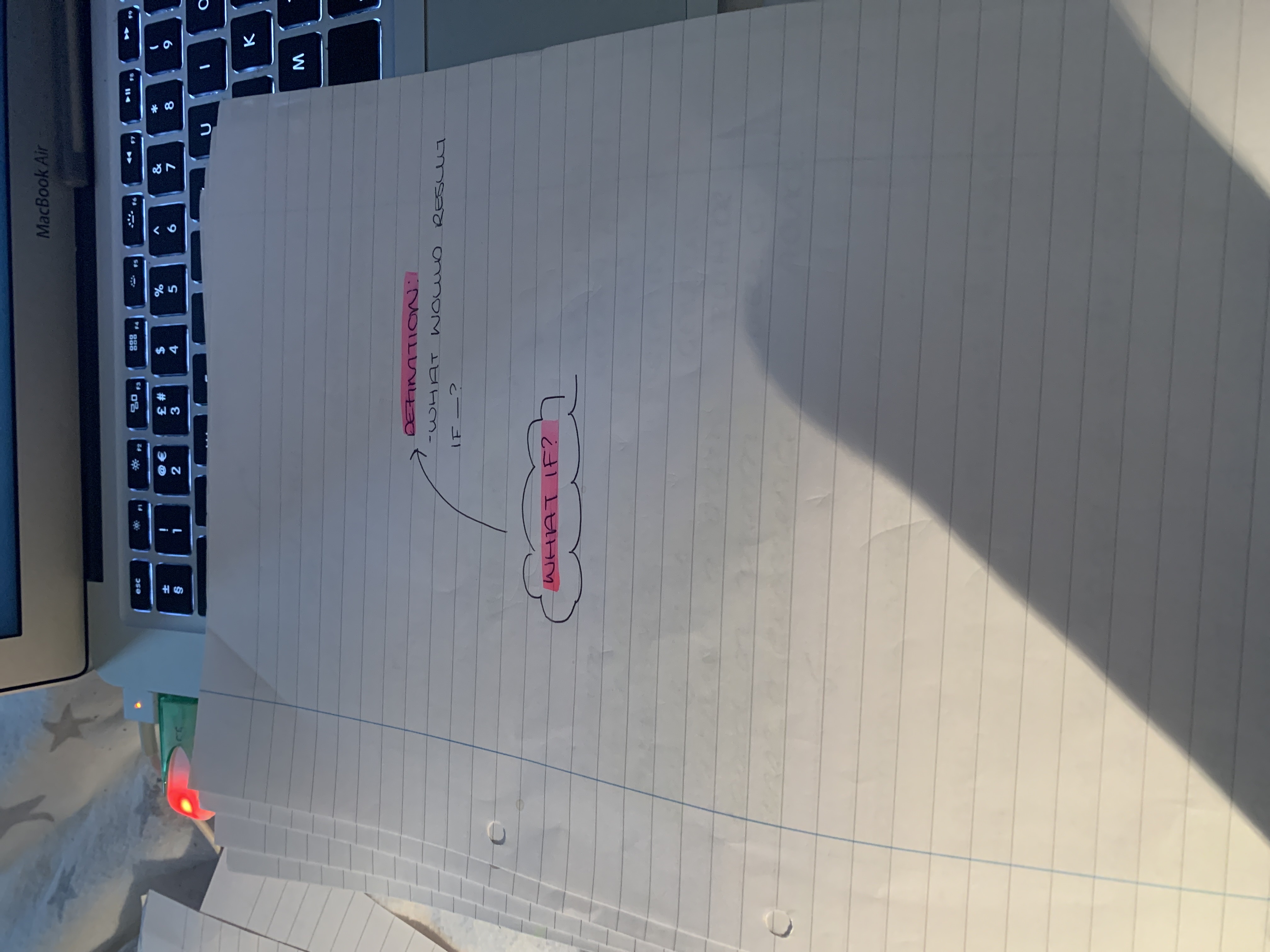
What if: what would result if —?”what if nobody shows up?” – .what does it matter if —?
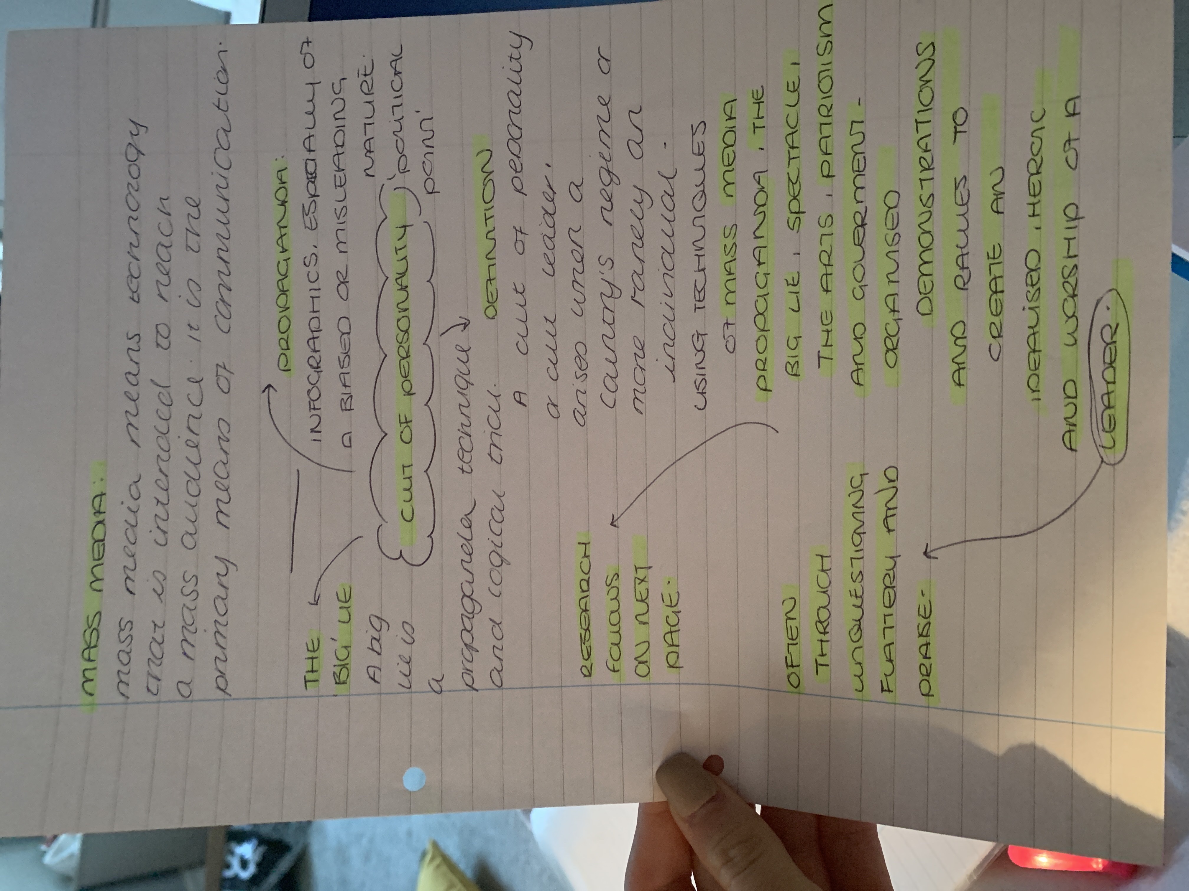
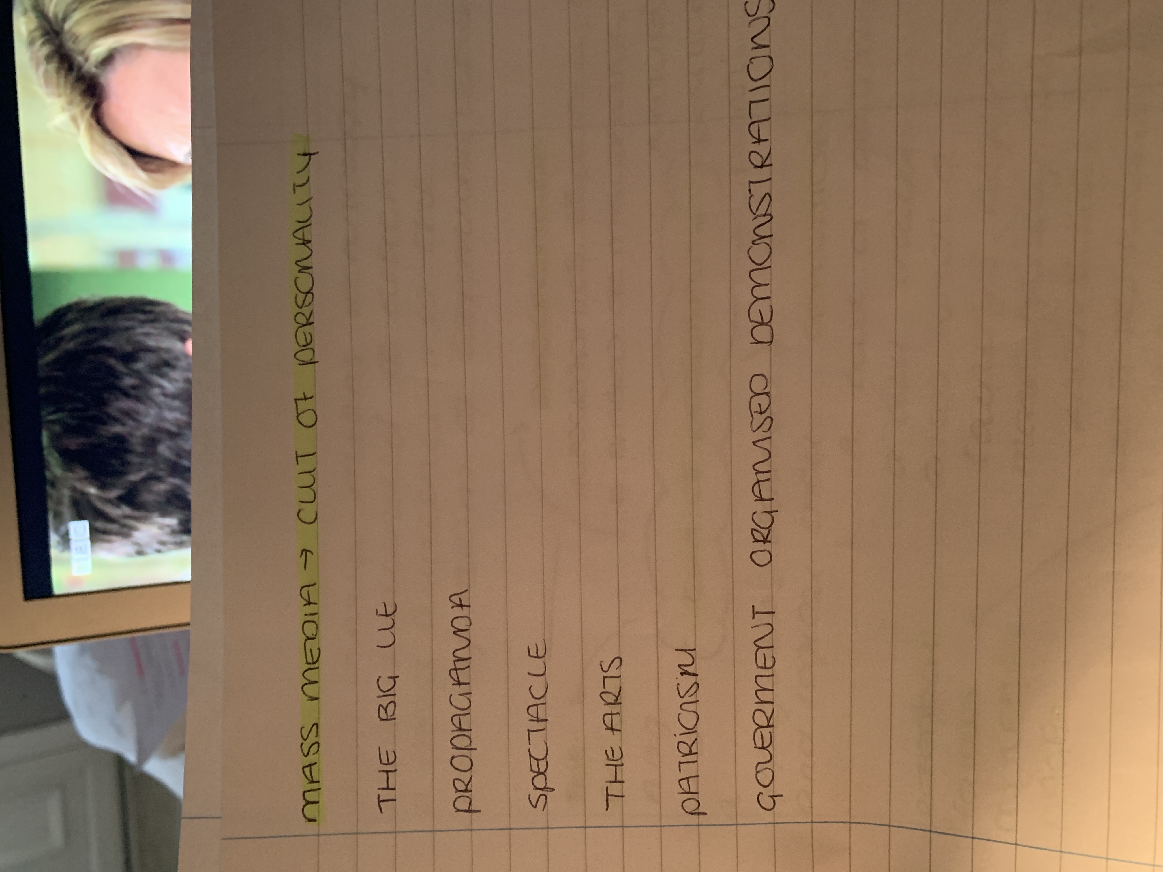
Cult of personality: A cult of personality or cult the leader, arises when a country’s regime or more rarely, an individual – uses the techniques of mass media, propaganda, the big lie, spectacle, the arts, patriotism, and government- organised demonstrations and rallies to create an idealised, heroic and worship image of a leader, often through unquestioning flattery and praise. source – WIKI
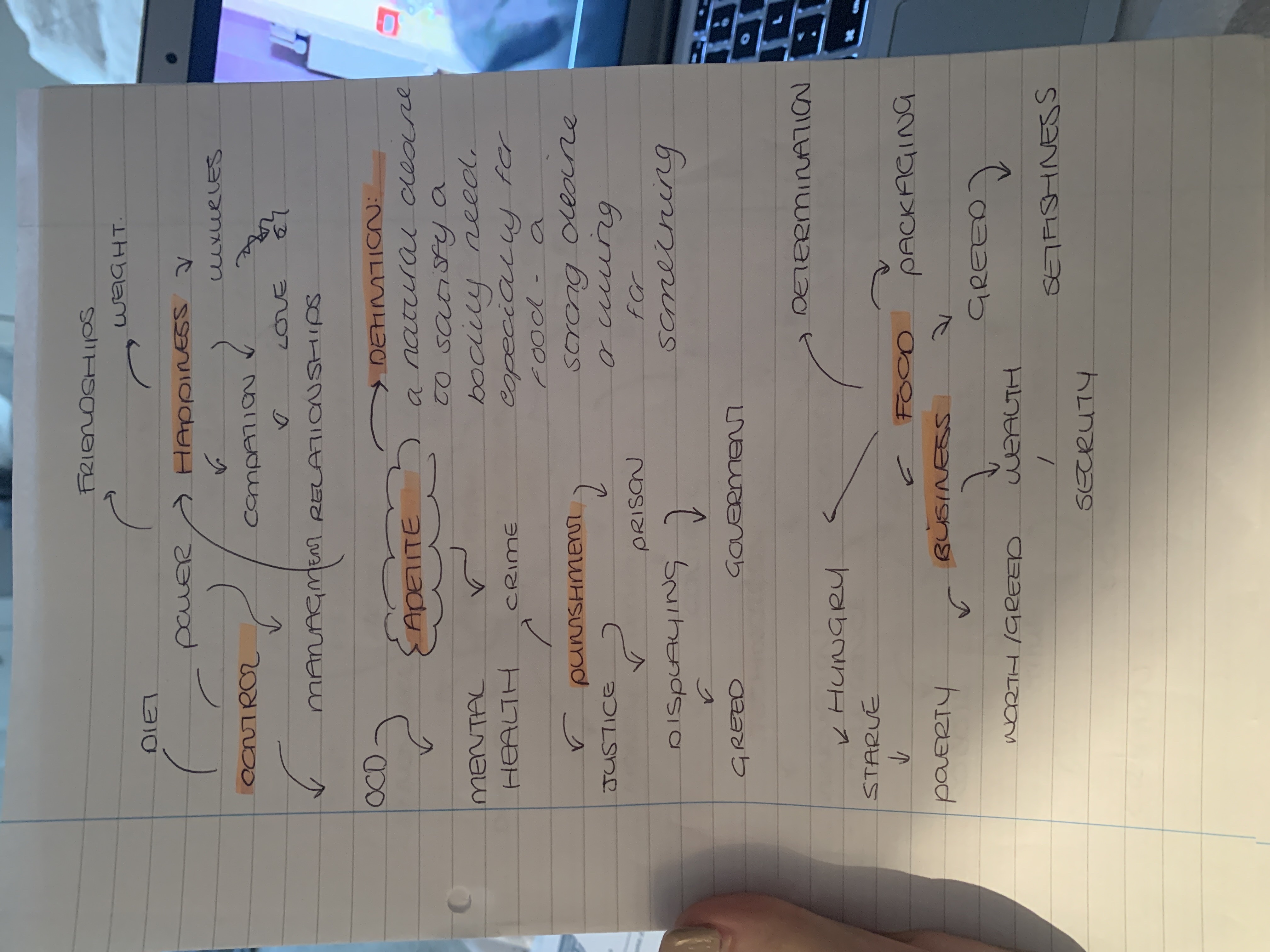
Appetite: A natural desire to satisfy a bodily need, especially for food – a strong desire or liking for something.
Mind maps of each topic:
I thought it would be best to create a mind map for each topic to make me have more of an understanding. The minute I did this it made me understand each topic in more and more detail as I didn’t even realise how much they would branch out!
Cult of personality Appetite AIWhat if ProverbsProverbCult of Personailty things to look into